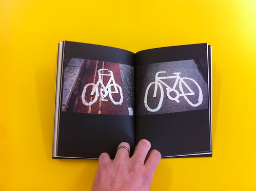
Phil Carter very kindly sent me a copy of his new book, A Cycling Lexicon.
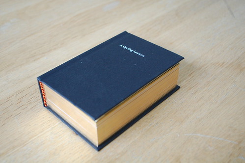
It's a beautiful collection of head-badges – the ‘shield’ on the stem, photographed one to a page.
More here and you can buy it here.
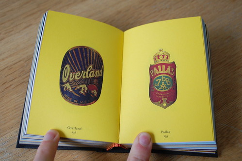
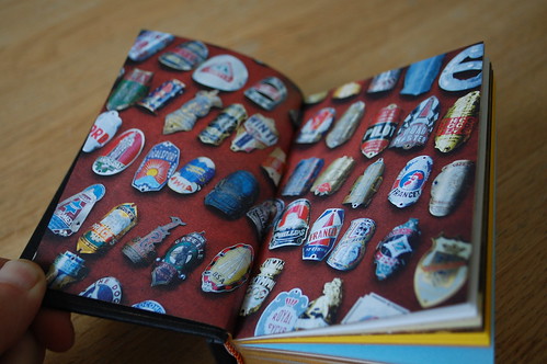
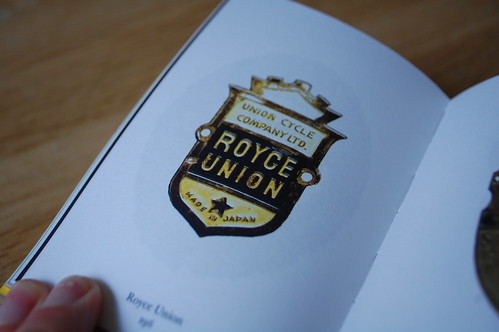
Goes well with his other book 1037.
Phil Carter very kindly sent me a copy of his new book, A Cycling Lexicon.
It's a beautiful collection of head-badges – the ‘shield’ on the stem, photographed one to a page.
More here and you can buy it here.
Goes well with his other book 1037.
I'm fortunate to work with talented designers who can write. Long term listeners will know that I think writing - articulating your work - is a key skill for designer.
I don't normally talk about individuals because that inevitably means I miss someone out (see last post). But there have been four posts in the last week by members of the design team and I think they are worth sharing.
First up, on the Inside GOV.UK blog Amy has written about how we're changing the Support section of GOV.UK. Henry talks about "browse" pages and some of the designs we're starting to test to make those pages better.
On the GDS blog Josh as brilliantly sums up a few talks he's given recently about accessibilty. The presentations are up there too. Essential reading.
And on the 100 Archive Stephen has written about "doing the hard work to make it simple" but it's much more than that, it's a lovely insight into a design career.
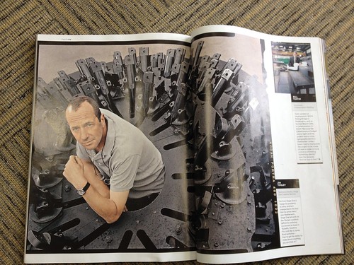
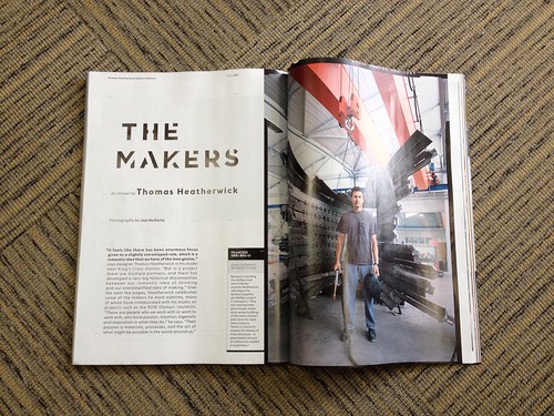
Good interview with Heatherwick in this months Wired magazine.
But by far the best bit is in the Editor's letter.
"Heatherwick was adamant we should champion the behind-the-scenes experts who turn such ideas into physical reality. So he selected eight makers for us to profile - the people, from welders to panel-beaters, who define "the art of what might be possible in the world around us"."
As I said yesterday, you can not design alone anymore. The era of a lone genius working in a garret is over and design writers should stop perpetuating that myth. Good design does not get made that way.
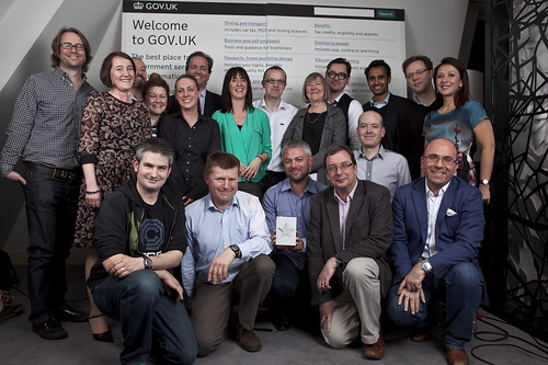
That's why when we went to the Design of the Year awards evening earlier in the year we took a broad section of people from across government and across GDS. In this picture below there are people from MoD, The Foreign Office, Ministry of Justice and the Cabinet Office. There are designers, developers, writers, product managers, project managers, operations people, policy people and others. And there were many, many more we could have taken.
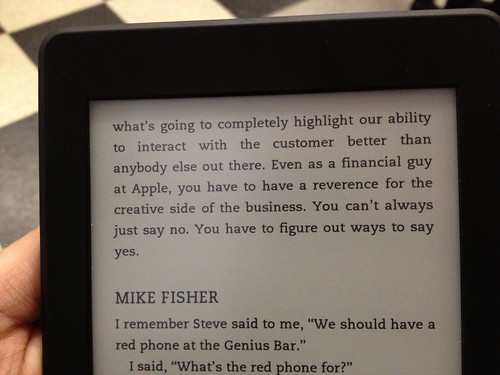
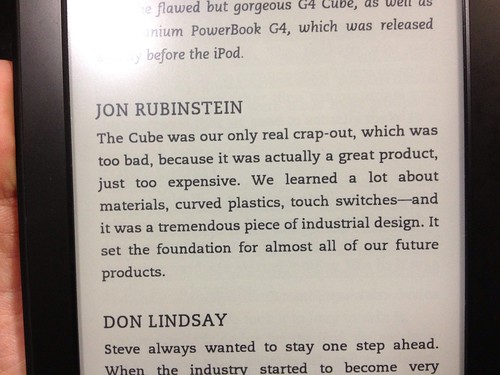
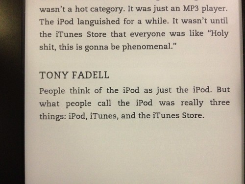
There's a series of articles on Fast Company at the moment about Apple and Design.
It's called an Oral History of Apple and they've interviewed ex-Apple employees and then just put that togeteher as a series of quotes. There's no Fast Co commentary and it's all the better for that.
Sadly trying to read the articles online is near impossible because of all the annoying whizzy Fast Companynesss. It's hard enough just to find where the series begins. So I bought it as a Kindle Single, much better and easier to read. Anyway.
The series is about "how Apple used design to rise from near bankruptcy to become the most valuable company in the world". You see articles like this written about Apple all the time and it really annoys me. Yes, Apple are very good at design. Staggeringly, consistently, good. But they are not just good at design, which is what these articles always seem to imply. Apple have not gone from "near bankruptcy to become the most valuable company in the world" just because of design. That success cannot be down to design alone. To even suggest that is crazy.
You can't get to be the most valuable company in the world by being good at only one aspect of your business.
I know nothing about Apple but I assume they are very good at procurement, at HR, at negotiating and so on. In fact, reading between the lines, the Fast Co article seems to suggest that.
Good at finance.
Good at materials.
Good at lawyers.
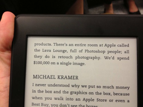
Good at retouching.
You can't design alone. The era of a lone genius working in a garret is over and design writers should stop perpetuating that myth.

Russell showed me an app called One Second Everyday. You shoot one second of video everyday and it stitches them together into a little film.
Russell posted his a few weeks ago.
So I started to make one, with the objective of making a better one than him, obviously.
I'm pleased with that. Despite working at an ad agency famous for making brilliant films, I've never been very good at making video. But making one second every day is surprisingly easy. And they seem to fit together in a nicely.
It's a good way of remembering things. I like this shortened version called 'Holiday'.
It's incredible to think each of those little clips is just one second long. Turns out you can cram a lot of detail into just one second.
Which brings me to another thing Russell and I were discussing - how come films are getting longer? YouTube seems to have allowed creatives to endulge their long form ambitions and make commercials that are 2 minutes long rather than 30 seconds. These longer ads aren't really any better, either, just bloated.
The trend for longer ads is odd given that people skip the ads anyway and watch the real YouTube clip. Why don't people concentrate on making a brilliant 5 second ad that would work with the pre-roll, not against it?
Modern media is full of this shorter stuff. Everywhere you go there are "digital six sheets" effectively press ads that wiggle about for 5 seconds.
Vine, Instagram and the like have loads of interesting content and should be breeding a culture where the 6 second video is king. Animated GIFs are internet catnip and are just about the shortest form of "film" you can make.

All that and the usual blah about attention spans shortening, media increasing, faster modern world blah blah.
Short - really short - film making would seem to be a skill worth learning. In his Campaign column Russell mentions a brilliant article called Trapped In The Loop with this incredible clip of all of LeBron James' scores in Game 7 of the NBA Finals.

As Russell says that is "the most interesting filmic idea you’ve seen in years".
And it's maybe 5 seconds long?
Maybe we should make 5 second films about the internet and how people use it.
(I have have no idea what the convention is for crediting gifs. Sorry if I've got it wrong.)
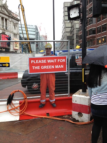
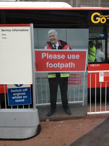
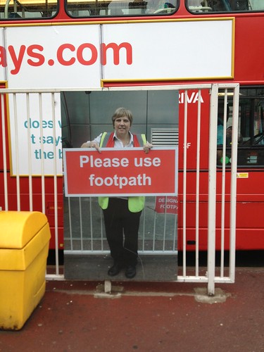
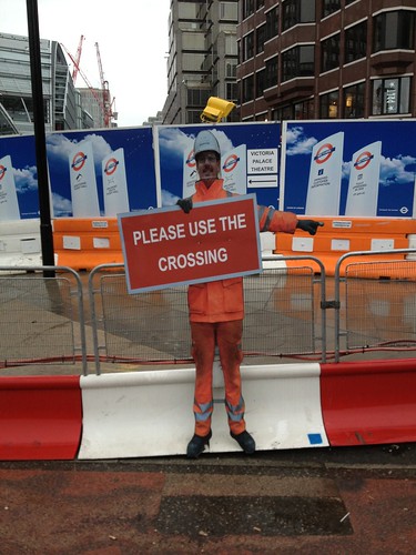
I know it's a gag that only works once, by that I mean you couldn't use them everywhere, on every building site because they'd lose the novelty that makes you notice them and makes you feel a little guilty about not using the crossing becuase the nice man is right there holding the sign. But here outside Victoria station - I love them.
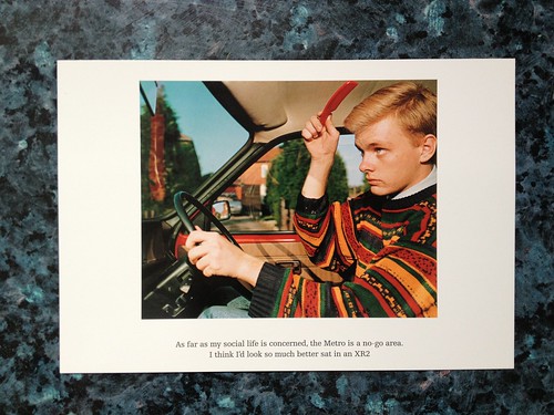
I've just spent a very enjoyable half an hour watching 'From A to B: Tales of Modern Motoring' a documentary about company car drivers, sales reps. It's from 1993 and it's absolutely brilliant. Telly gold.
I remember watching the original TV series and the one that followed it 'Signs of the times' about homes. Both absolutely brilliant. Martin Parr shot the accompanying photos (above) and these TV programmes sparked my love of the great photographer.
Lots of the modern "docu-drama" filming style was taken from these hugely influential documentaries. Particularly their use of the "locked off shot" where the camera doesn't move and the image on screen appears like a moving photograph. If you're a fan of The Office you'll love this programme about reps.
Anyway. I'm watching these because Russell has written a brilliant blog post about this and car ads. You should pop over there, read the blog post and watch the programme.
I didn't really want to comment on this, but that's what blogging is for, so I decided to write this:
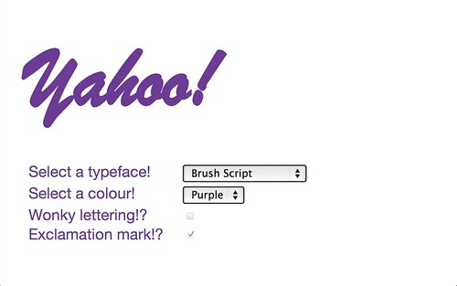
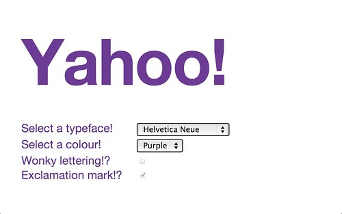
This isn't a blog post about logos or about designers or even a moan about how the logo could be better, or God forbid one of those Dribble style things where I have a go at a logo. This is a blog post about how Yahoo! came close to how you should "do a logo" these days and yet managed to miss it by mile.

Last week Yahoo! announced they were going to release a new logo. Or as they put it, "Yahoo! is making exciting changes daily. To celebrate where we're headed, we'll be unveiling a new logo in September. To get everyone warmed up, we are kicking off 30 days of change."
I have to admit I was quite excited.
Some background. Yahoo! used to be the big exciting web giant, lost all that, neglected various bits like Flickr and ended up as the new AOL. Last year they announced a new CEO Marrissa Mayer a big shot from Google and everyone got excited again. She's made some visible, dramatic changes, launching a good Flickr app, a good new weather app, buying Tumblr for one billion dollars (and announcing it via animated gif) and redesigning Flickr to much grumbling on the forums.
Lots of stuff going on. Momentum. The Flickr app is good, not without fault, but good. The acquisition of tumblr is crazy money but overall a smart move. A platform and an audience worth having. Undoubtedly a gamble, but if you're going to go might as well go big. The Flickr redesign is a step in the right direction, hurried and unfinished, but a step in the right direction nonetheless. So unfinished I was expecting that to get better iteratively, and it hasn't but at least they've gone from statis to Doing Something.
Back to the logo. I was cheered when I first heard the news because I thought at last here is a big brand that's not "launching" a logo, they're going to do something smarter, subtler. They're going to have a 30 day period of iteration and show progress at the end of every day.
Maybe.
Or maybe they're just going to develop the new logo (and branding) over a period of time, in public. That might be a good idea.
At the very least they're going to do something in the open, quickly. That can only be a good thing.
I realise that was incredibly naive of me, but I'm an optimist.
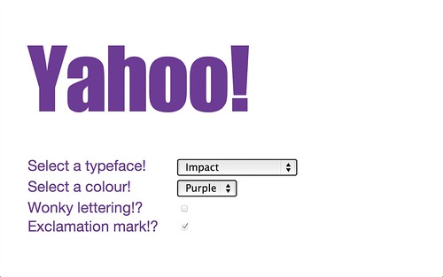
Instead what they've actually done is show you a completely different logo every day. A finished, fully visualised logo. And when I say completely new, it isn't really, because early on they declared "we’ll be keeping the color purple, our iconic exclamation point and of course the famous yodel." Which restricts the brief somewhat. Even the language is horrible, "Here’s day 1’s logo".
What they've ended up with is 30 versions of Yahoo! written in different typefaces.
Paul summed it up really with this fun little site where you can make your own Yahoo! logo. As someone said on Twitter, it's like your Dad emailing you and asking what typeface they should put the parish newsletter in.
The actual new logos are poor. The whole thing is unedifying. Derided on the forums. When Russell is having a go at logos you know you're in trouble.

Russell's Day Two logo.
 The official Day 3 logo
"Launching" a logo is always a bad idea, it's set up to fail. You are asking for Change Rage. Almost no-one will prefer the new, strange, different thing to the old, familiar thing. That will be magnified by the echo chamber of the forums and your CEO will be on the phone in no time. GAP, UAL etc.
As Michael Bierut once said to me, you almost never need a new logo what you need is the old logo with a haircut. Shell, Ford, etc.
 The official Day 4 logo
A brand or a visual communications system is about so much more than a logo, focusing on that on mark is insane. Simon Manchipp calls this Brand Worlds, I'm not a fan of the expression, but the essence of that is dead right. The logo is a tiny part of a much bigger picture. Simon has written about it here and elsewhere on the web.
This debacle reminds me of an inexperienced agency rocking up to a pitch with 30 different options. There's no strategic thought, there's no clear direction, there's no editting and no expert advice being given. When you present work like this you make it impossible for the client to make an informed decision. You're reducing it to a meaningless lottery. You might as well turn the lights off and chuck a dart at the wall. Pin the ! on the Y.
 The official Day 5 logo
What should they have done?
Impossible for me to answer properly, of course. But seeing as this is a blog post, here's some things I would have tried.
They could have had a proper rethink of the "brand world". I can't see how starting from a firm position of not losing the ! or the purple is helpful.
They could have neatened a few bits up, given it a "haircut" and changed the jpeg without anyone really noticing.
They could have kept quiet and tried a few different options in public. Two or three progressive versions on different parts of their huge web real estate.
Or they could have done nothing.
If I worked at Yahoo! a company with numerous digital products, and I had a design team and 30 days, the last thing I'd tackle is the logo.
Follow the logos new here, we're pretty early on into the 30 days so in theory it might get better and we might end up with a decent logo.
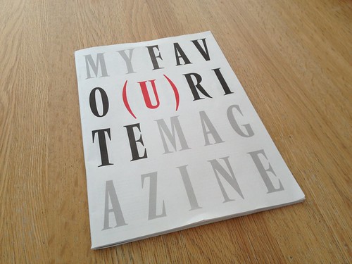
Jeremy Leslie (and others) last week launched their publication in support of Bob Newman. (Read the backstory here.)
It's a lovely project where lots of well known designers, especially magazine designers, have written about their favourite issue of a magazine. As Jeremy says, "My Favo(u)rite Magazine features images and words contributed by 88 magazine makers from around the world, including senior names from the New York Times Magazine, Pentagram, Anorak, Harper’s Bazaar, Port, Bloomberg Businessweek, Eye and NME."
Pretty impressive collection of contributors. I bought a copy last week, it's a great publication. The magazines are more varied than I expected, I thought it would be full of Face and Raygun, but it's much smarter than that. Also of note is the global nature of the contributors, it's not just London and New York.
It's a fascinating publication. Well worth getting a copy. You can buy one here as a print edition or a PDF.
Jeremy asked me to contribute but sadly I was too busy to make the deadline. It's not an easy decision and it takes ages to think of a favourite - just one magazine!
I would have probably gone for one of these Sky's

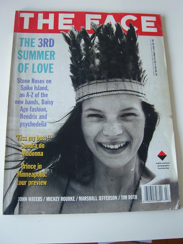
or maybe this Face
picture from Planet X.
or maybe this Vogue.

Or another Vogue. Oh I don't know, it's too hard!
It was printed by Newspaper Club, or the "ever-busy Newspaper Club" as It's Nice That called us. I rather like that.
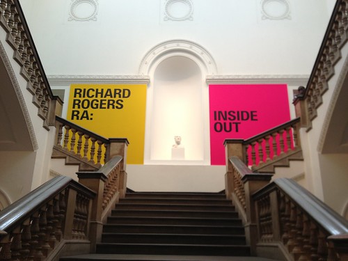
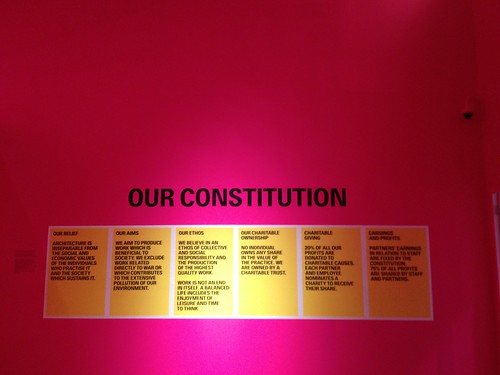
A few of us from the design team visited this exhibition last week. It's very good, recommended.
Rogers is an incredible architect and a good influence on London (and beyond). I found his beliefs quite powerful, especially as he'd established these at the start of his career not post fame.
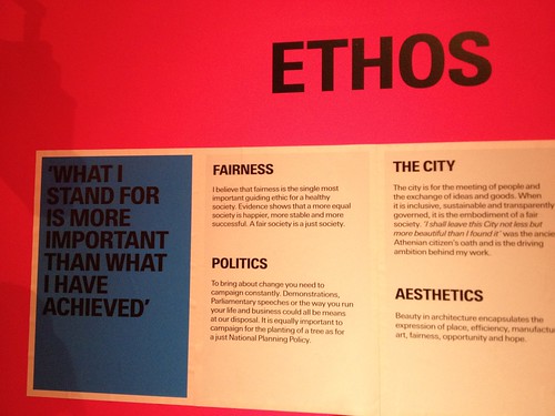
His take on modernism, transparency and public service still feel relevant now.
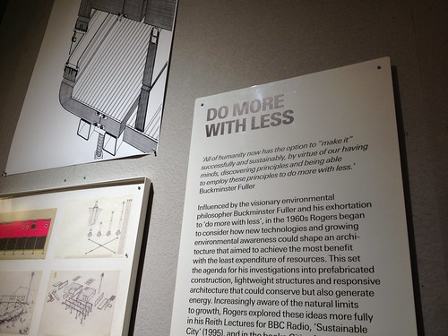
His use and understanding of colour is incredible and has quite rightly been seized upon by the exhibition's designers. Visually the exhibition is stunning.
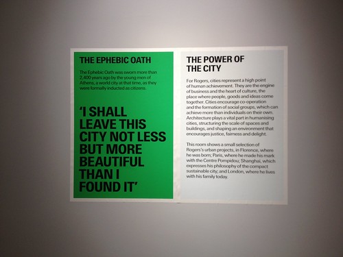
These signs worked really well. They unnecessary hyphens disturbed me and seeing as GTF did the graphics I can only assume they were deliberate. I'm not a fan of that gratuitous hyphenation you see these days. Sorry.

Usual caveats about architects' exhibitions apply, I think. Lots of miraculous back-of-napkin sketches that look uncannily like the finished building. Lots of competitions they didn't win (why is only architects that can get away with showing work that didn't run, in exhibitions? Dan Wieden always said, if the client doesn't buy it, it doesn't count.) There's one room of "grand visions" for various cities, admirable and mostly good, but very broad brushstrokes. There are lots of pictures of good looking Italian meals. But anyway.
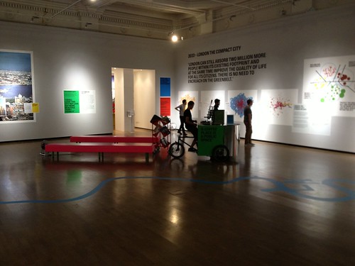
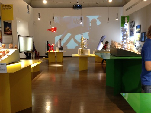
Overall - very good. You should go.
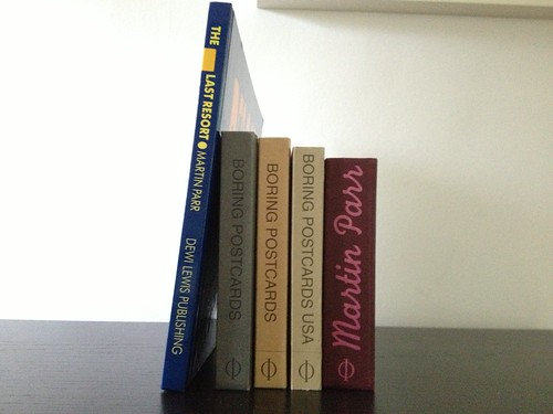
Oh, and I picked up a new book for the shelves.
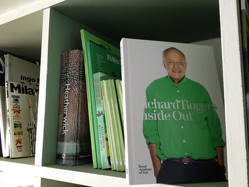
More pictures on Flickr.
They just made the background yellow.
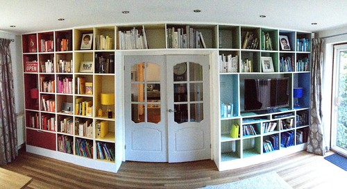
Design shelves for those with the Design Disease. Painted inside and then supported by books arranged by colour.
Unlike my bathroom these aren't based on any shoes, although the shelves at Moo were an influence. Works well if you remove the bloody book jackets.
So gorgeous I just sit there looking at them.
I'm extremely gratefuly to Russell Thorn who did the hard work and made my idea real.
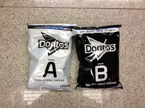
What's this about? Why the black and white? Why A and B?
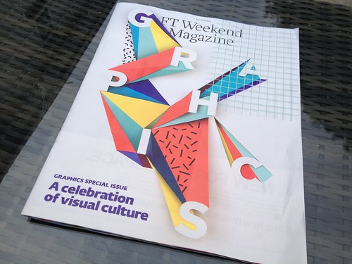
The FT ran a 'Graphics Special' in their magazine on Saturday.
Don't worry if you missed it, you didn't miss much. I almost didn't blog about it except it feels like the sort of thing one should blog about. It wasn't bad, it was just a bit meh, as the internet might say.
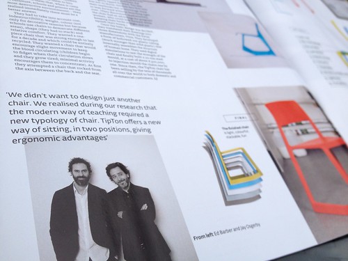
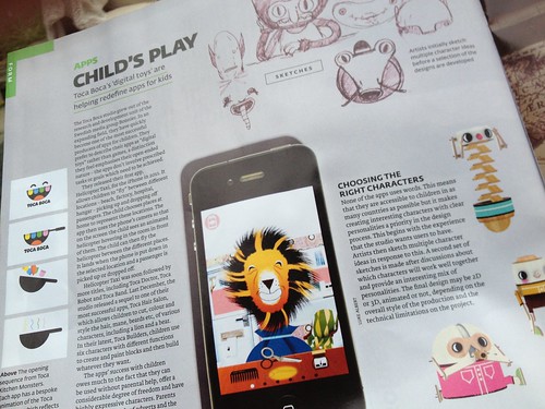
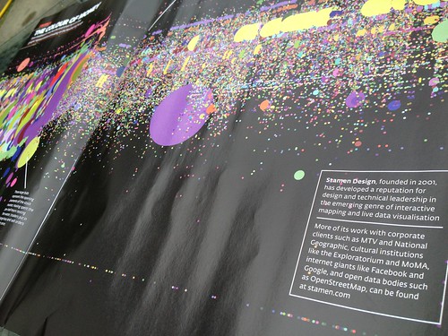
It included good people, Toca Boca, Stamen, Tom Hingston, Barber Osgerby and so on. But it wasn't very detailed. I think one of the problems was that they called it a 'Graphics Special' when it was really a design special. Barber Osgerby, Yves Behar and Toca Boca aren't really graphics. But maybe they didn't call it design as they have an Arts and Design section which is mostly diamond chandeliers you can buy for your stables. I don't know.
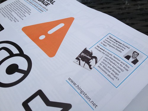
Anyway. It was OK. You can read it here, you may need a subscribtion of some sort.
Oh I don't know, maybe I'm just getting old and impatient and maybe I've lived in a big city too long and maybe I'm just a wally - but I'm getting more and more frustrated with what I see as unnecessary stuff, process or systems, getting in the way. A bit like the stuff I mentioned in this post. Unnecessary complications. Faffing. Milling.
But there's a whole extra layer to this that really annoys me and that's the unnecessary complications that people think are helping. Unnecessary complications that people think are doing you a favour or aiding you in your task, somehow.
The best example I can think of and my most hated example is the pilots announcement.
You know, this one,
"This is the Captain speaking, the weather at Atlanta is currently a temperature of 70 degrees with light winds. We're cruising now at 35,000 feet. Today our routing takes us over Memphis. We show 50 minutes remaining, arriving 5 minutes ahead of schedule. The selt belt sign is currently off, in case of turbulence we recommend keeping your selt belt on when you're seated. Thank-you."
I hate this so much. I don't care how high we're flying! I have no idea what the difference is between flying at 35,000 feet or at 25,000 feet and I have no idea what you want me to do with this information. And worse - I WAS WATCHING A MOVIE and you interupted to tell me this useless stuff. Every. Damn. Flight.
There's a good page here which encourges pilots to keep up this antiquated, annoying, process. They think they're helping. They think it makes them appear superior and that they're doing a good service. They're not.
Another one.
When the hotel asks if you've had anything from the mini-bar. Grrrrr - there must be a better way of getting that information that doesn't delay me when I'm trying to leave your hotel. Or better still get rid of the stupid mini-bar...
Sorry, I'm ranting now.
Anyway.
I'm calling this the pilots announcement problem from now on.
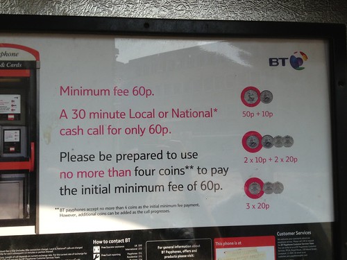
Also - this madness, "please be prepared to use no more than four coins".


Recent Comments