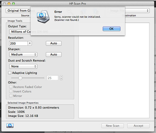
Every time I want to scan something, which is rarely, I search for scan in the finder and I'm given two choices.
The HP software always does this.
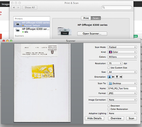
And the via the Mac System Preferences I always get this and I can just scan in a few clicks. It's not easy but it's easier than the software that actually came with the printer and only has one purpose - to scan with just one, known, machine.
I know very little about scanning. Although, because of my profession, presumably more than the average punter. But even so, scanning feels like something from another era to me. And era of print software and ripping and files that take a whole afternoon to pop out a grey box.
I signed up for online booking with a cab firm a few weeks ago. Went to book a cab on Thursday and I had seemingly forgotten my password. I clicked forgotten your password? and was sent an email that said,
For lost passwords please contact our Accounts Dept. on 020 XXXX XXXX
Which is bad enough, but when I called the number the person on the other end of the phone had no idea why I was ringing. When I explained, they said 'what's that go to do with me?'.
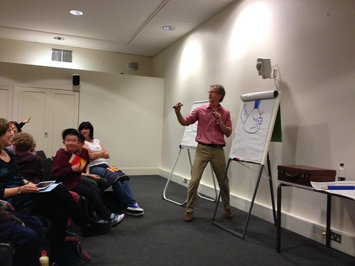
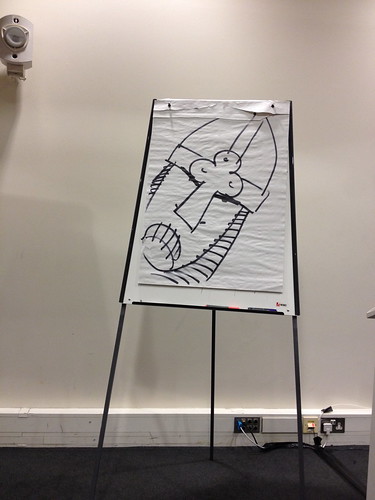
We went to a thing at the Imperial War Museum at the weekend. One of the Horrible Histories artists (illustrators?) gave a talk workshop thing. Sort of for kids but not really, suitable for all ages.
The other week while building some Ikea stuff I had 606 on the radio.
Over the course of the show listeners got to hear the whole story of Canterbury City's home game against Whyteleafe, which was called off becuase Whyteleafe's away kit was identitcal to Canterbury's home kit.
Managers and fans all rang in.
The Whyteleafe manager said he'd asked to play in bibs, training tops or even skins, but the ref said no.
The fans said the Whyteleafe players were stood on the pitch in just their shorts, warming up.
The Canterbury manager said he'd driven across town and bought 11 spare shirts for the Whyteleafe players but when we got back to the ground the ref had said it was too late to start the game.
And then the ref rang in.
He said the football ground was booked for a wedding at 6 and so if they hadn't started the game by 3.30 they would not have had enough time to play. The manager returned just after 3.31.
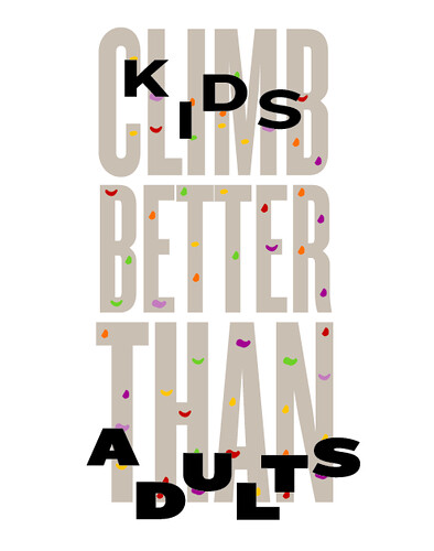
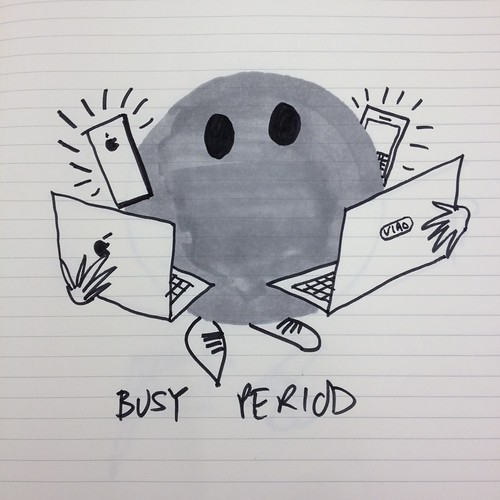
That was a better week down in the design-operation-a-day mines. Last update I said, "They seem better when there's type, but maybe that's a coincidence and it's all linked to the stories thing. It's hard to do the type ones justice as a sketch but for the next ten days or so they have to be type based. Mandatory. Let's see if that makes them better." It semed to work although I worry they are all getting to computery.
These are good, some of the best yet.
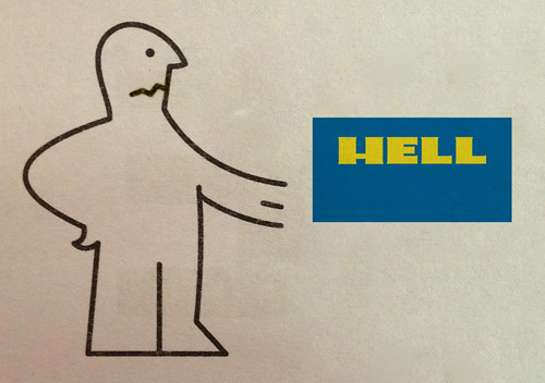
This could have been so much better
and this is terrible.
As I said before, the hard thing is the story not the idea of the graphics. Get that right and everything else becomes easy. They're also easier to do if you have the story early in the day. Allows you to be thinking about the idea in the background all day. When I've left them to the last minute I've rushed it and they've been rubbish, like the two above.
So for this week I'll try and have the story by lunchtime. Then perculate the idea in the afternoon. I'll stick to type for now, although I'm becoming less convinced of that.
And I'm going to try and think of them as tshirts. Like these ones by howies, neat simple graphics with just the right amount of idea.
Recap. Some days are easier than others. Some ideas are easier than others. I said they wouldn't all be good. But they need to get better.
These ones worked out well.
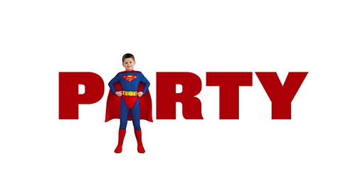
Day 1 - children's superhero party
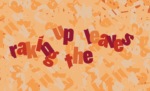
Day 8 - It's that time of year when we rake up the leaves
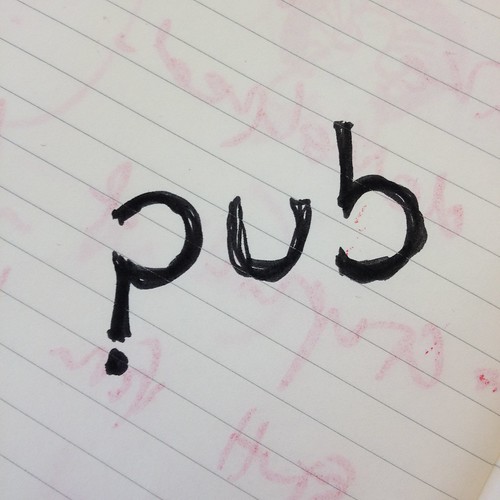
Day 11 - pub quiz
Day 15 - today we went to IKEA
It's possible I like those better because they are more finished. I think the secret is to choose a good "Op Ed" to start with. That's where all the effort needs to go. Then the design is easy.
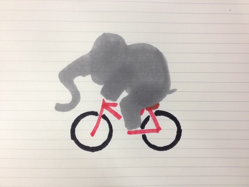
The elephant riding a bike was the most popular on Flickr.
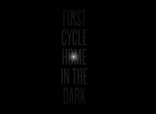
Day 3 - Bizarre as it sounds I need to remember to cycle home today
Type or not type. They seem better when there's type, but maybe that's a coincidence and it's all linked to the stories thing. It's hard to do the type ones justice as a sketch but for the next ten days or so they have to be type based. Mandatory. Let's see if that makes them better.
This is a question I frequently get asked when people find out about GDS and what we're doing. I don't get asked this by government organisations, but other people more generally.
The answer is that I don't know.
I do know that you should have a digital culture that means you have the people with the knowledge and the skills to make that decision and then implement it. Because this isn't about Twitter. Of the web, not on the web.
You can read that blog post again and swap Twitter for any other service, technology, whatever.
I have been boring people and misquoting this clip for years. The other day I finally got round to getting it off YouTube.
It's a clip from the film Margin Call. Set over 36 hours it depicts a Wall St bank caught up in the start of the banking crisis. A junior employee discovers some serious debt held by the bank that could bring the whole organisation down. During the night the information goes higher and higher up the bank's chain of command until someone takes the major decision to call the CEO, who flies in, landing his helicopter on the roof of the bank.
In a tense board meeting a series of terrified executives try and explain what's going wrong to the CEO who becomes more and more frustrated with their reports and their jargon. Eventually he asks the junior employee to explain it to him by saying, "Please, speak as you might to a young child, or a golden retriever".
I love that.
Two things.
Firstly, don't be afraid to ask people to explain things simply. Don't be afraid to admit you don't know. When people use complicated language and jargon they are often doing so without thinking. They're using those terms because that's what everyone else is using. Asking them to explain it simply will force them to think about what they're saying. You'll be surprised what they say.
Secondly, I sit in loads of meetings where I have no idea what people are talking about. Often when I admit I don't know what someone means other people nod and say they don't understand either.
As a communications professional you are at a huge advantage if you can explain things clearly to the widest possible audience.
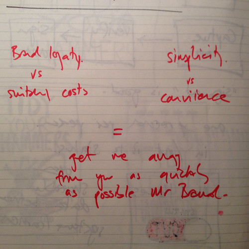
I said, "I wonder when marketing people say "brand loyalty" they actually mean "the switching cost is to high". Apple etc.
I also wonder when people say they want simplicity they actually want convience. Which isn't the same thing."
Russell said, "What you should have said was that what people are actually saying is that they want to get away from the 'brand' as quickly as possible and get on with their lives. "
And then we both remarked that in the old days we'd have blogged about that.
And then we sat back in our chairs and admired the view over the water.
I've always wanted to try it and last week I saw Michael talk about some of the little graphic illustrations he's done for the NYT and I wished I had done more work like that. Simple, quick, throwaway. So that's what I'll do for my 100 days.
I'll imagine my life is a NYT Op Ed and every day I'll do a little graphic illustration.
Here is one he did about saying No to the expansion of NATO (apologies for the rubbish screengrab.)
Michael has written about the project here. Here's the brief.
Do a design operation that you are capable of repeating every day. Do it every day between today and up to and including the last day of the project, by which time you will have done the operation one hundred times. That afternoon, each student will have up to 15 minutes to present his or her one-hundred part project to the class.
The only restrictions on the operation you choose is that it must be repeated in some form every day, and that every iteration must be documented for eventual presentation. The medium is open, as is the final form of the presentation on the 100th day.
I'm looking forward to seeing how the project changes and letting little rules emerge throughout the 100 days to help me get through. But here are my thoughts as I start.
1. I don't really need any more design work so I'll make these as quickly as possible. They'll mostly be sketches in a notebook I imagine. I'm not worrying about production quality.
2. They'll involve type. For now. But they won't all be word puns. No-one needs more of those.
3. I'm tempted to only use Knockout, it's a beautiful family and has loads of flexibility. But that contradicts number 1. We'll see.
4. I'll do a blog update roughly every 10 days.
5. Seeing as I'm not in a class I might try and engineer some presentation on the 100th day.
If you think I can do 100 brilliant graphic illustrations in 100 days based on a life that involves going to an office for 71 of those days you're insane. But I'm hoping I'll get one or two good ones. Maybe towards the end.
I started on Saturday so my 100 finishes on 6 January.
On Saturday we went to a children's Superheroes party.
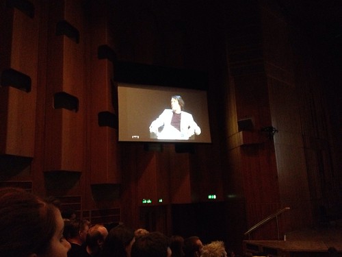
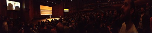
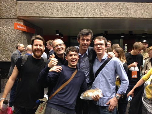
On Thursday and Friday I went to the AGI Open at the Barbican with some of the design team. It was a fantastic two days.
It was very graphic designy – it didn't pretend to be anything else. It wasn't about the The Future Of or The Designer As and it was all the better for that. The organisers wisely kept the slots varied; a mixture of interviews, group panels, short 20 minute talks and big keynotes. That worked well.
There were lots of chances to mingle and meet other people, speakers and 'famous names' were visible and approachable. I saw a group of 5 young designers (students?) grab Michael Bierut in a doorway and he chatted to them, animatedly, for at least 15 minutes.
Kenya Hara was a highlight for me, I was familiar with the work but not the man. He came across as humble, thoughtful and brilliant. His House Vision Expo gave me ideas for the London Design Festival.
The Roundheads vs Cavaliers debate was a bit silly but Sagmeister and Marian Bantjes hijacked it in a brilliant way, screengrabing all the minimalists' websites and redesigning them.
Alt Group even accepted their proposal and changed their homepage overnight. Fun.
Poyner interviewing Saville was a huge missed opportunity in my opinion. Saville is a fascinating character with an amazing body of work, but neither was given a chance to shine. He touched on ineresting topics, being open about being motivated by money for example, but Poyner swung the interview back to, well back to Poyner. Frustrating.
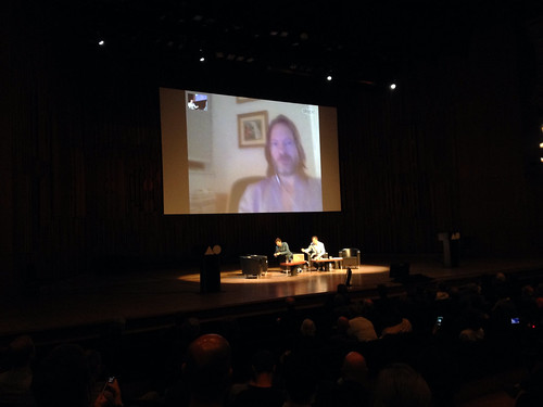
Patrick Burgoyne did a good job of holding together the second morning. Jan Wilker & Hjalti Karlsson from Karlssonwilker did a Mr & Mrs style quiz over Skype, which worked surprisingly well.
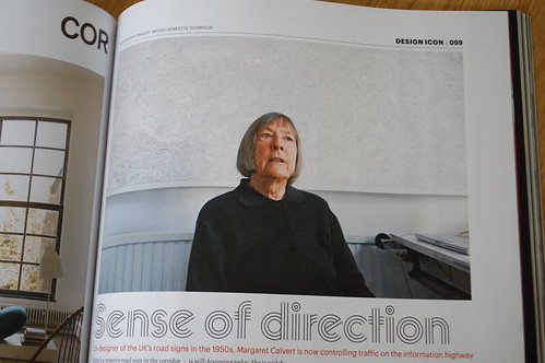
Patrick also interviewed Margaret Calvert which was a rare treat as she doesn't often appear at these sort of things. She was a huge hit with the crowd and was nice enough to mention GDS (even if she did forget my name!).
Christoph Niemann gave a fantasic talk. Hilarious, insightful and moving. His video about Maurice Sendak had most of the audience in tears. It's not an easy feat to keep a conference audience of nearly 2,000 people enthralled by a video for 5 minutes. Stop what you're doing and watch this, it's an incredible piece of work.
Chip Kidd gave an extroverted performance worthy of any stage and pretty much narrated the whole of a Japanese Batman comic strip. Striking and incredible. (He also did some good heckling of other speakers.)
He also gave Newspaper Club a shout out which was nice. (Someone told me that Michael Bierut mentioned GDS during a fringe talk with Ken Garland which was especially nice as Ken Garland is a big inspiration to the design team.)
Last up was Stefan Sagmeister.
I'm not a Sagmeister fan but his closing keynote was amazing. He brought the house down and finished the event off in style. His animated typography in particular was stunningly beautiful. He had people roaring with laughter and at one point stood on their feet singing and then watching in stunned silence as he played stunning typography video after stunning typography video. This kind of stuff.
His talk was clever, polished and entertaining. A perfect ending.
AGI is a slightly odd organisation to understand but Eye Magazine do a great job here. As crazy as it sounds I would consider going to the Sao Paulo event next year.
There are lots of terrible adverts and in some ways it's unfair to pick on just one. But this highlights a common example of bad advertising - things only marketing people say. Watch the first 11 seconds of this.
"Look at the state of your clothes! Go and get some detergent and clean them up, and don't forget the softener."
No dad has ever said that to their son - ever.
No real person has ever said that to another real person - ever.
I used to work with a copywriter who would say to me, 'read that out loud, would your Dad say that in real life?'. This would fail that test.
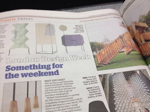
Earlier in the year Sir John Sorrell asked me to be on the Advisory Board of the London Design Festival.
To be honest I've not paid that much attention to the Festival before and I'm going to use this as my main advantage - looking at the Festival with fresh eyes.
I haven't had anything to do with the current festival, my first Advisors meeting is in October.
And so I'd like your help. What do you think of the festival? Please comment below. I know no-one leaves comments anymore but please make an exception in this case.
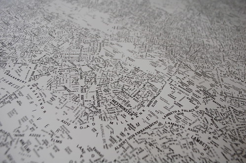
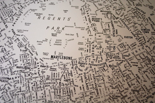
Really simple idea - a big A-Z of London with all the lines taken out leaving only the words. A typographic map of London. All the main rivers and parks remain as empty wordless shapes. You can clearly identify the shape of London.
Made by NB Studios a few years ago I've always loved it. It's been out of stock for a long time, but they just re-released it. Buy one here.


Recent Comments