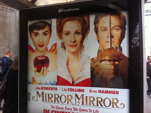
1. It's well known that in Hollywood studios and agents fight over who gets top billing on a film. Essentially whose name is at the top of the bill. Or these days whose name comes first in the opening credits. It also translates back to the film poster, the equivalent of the 'bill'. So you'll always see the biggest stars name first on the poster. But visually, the picture of the biggest star may not appear first. In fact the biggest star may appear in the centre because that's where, visually, the most important thing often goes.
So you often get the scenario depicted above where Julia Roberts' name is not underneath the picture of Julia Roberts. In fact you could be forgiven for thinking that Julia Roberts is the young dark haired lady on the far left and that the older red haired lady in the middle is called Lily Collins.
Look out for this. You see it all the time on movie posters. Often you see a male name under a picture of a female. Because the two decisions, who gets top billing and which picture goes where on the poster, are taken in isolation. Politics getting in the way of the punter understaning the communication.
- - - - - - - - - - - - - - - - - - - - - - - - - - - - - -
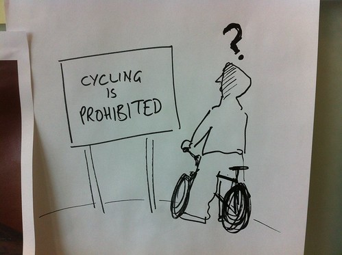
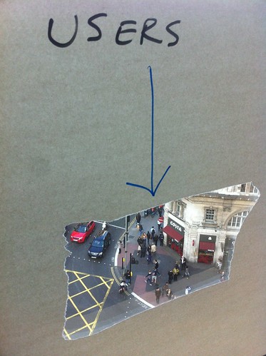
2. This really annoys me. When people use language that makes sense to the creator of the piece of communication but makes little or no sense to the intended recipient of the communication.
Like in this example. How many of the kids in hoodies riding through the park on low slung BMXs do you think know what prohibited means?
OK, they may know what it means if they stop and think about it. But is it commonly understood language aimed at them that they can understand instantly?
- - - - - - - - - - - - - - - - - - - - - - - - - - - - - -
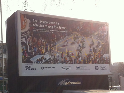
3. Too many logos. I'm not against logos. But I bet what's happened here is that everyone of the these agencies has contributed to the cost of this ad and so everyone of them wants their logo on the ad.
Why? So they can prove to their boss that something has been done.
But the end result is meaningless for the reader, the user, the punter. The man on the street needs to know that this is an official piece of communication and not something by Coca Cola or Persil, so it needs a logo and probably the 'highest authority'. I'd guess at that being TfL or Dept for Transport. If it were me I'd go with Tfl. And that's it.
As we say at GDS you shouldn't need to have to understand how government works to be able to find something out. That same rules applies here. The punter doesn't care about the Highways Agency or the National whatever.
- - - - - - - - - - - - - - - - - - - - - - - - - - - - - -
You see these three things all the time and they annoy me.


Recent Comments