I went to the new velodrome at the weekend. It was magnificent.
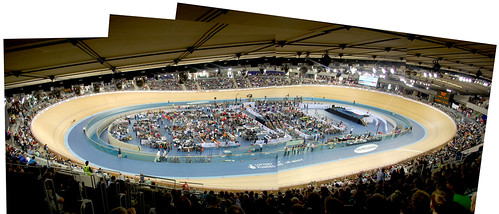
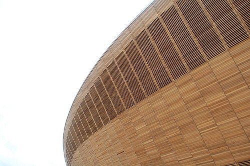
A wonderful building inside and out. It looks stunning as you approach it and there are some nice details inside.
But as is usual with these things it was let down by the graphics design.
The wayfinding stuff was OKish.
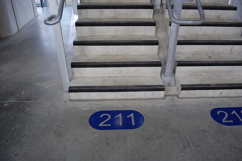
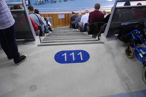
An opportunity missed there, but it's not offensive.
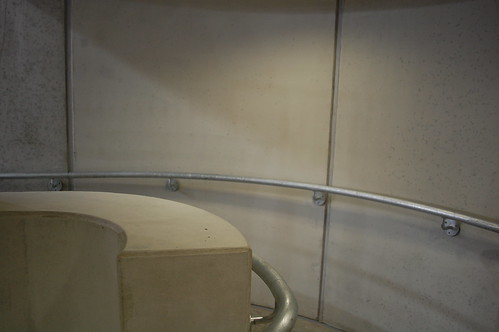
What bothers me is, yet again, the faliure of anyone to design something to counter, or accomodate this:
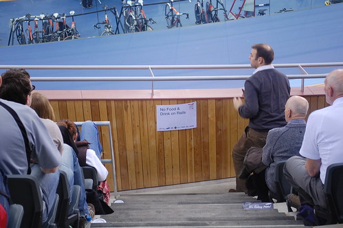

We know people are going to put A4 signs on things. That's part of a human nature now, ingrained from birth. So PLEASE can we find an elegant way to incorporate this into buildings?
And I don't just mean clip frames.
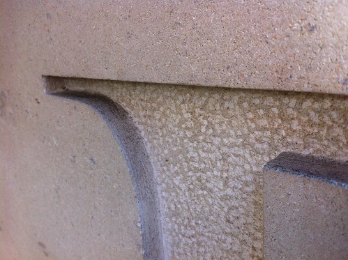
This one for example:
They must have known beforehand that they would need that sign, so either
a) make the ledge so you can't but drinks on it, make it slope or something, then we don't need a sign
or
b) get a proper sign made, maybe something out of that nice wood.
Thanks.


Recent Comments