I was at the launch of It's Nice That 4 last night.
Alex and Will did a sort of 'live magazine' where contributors explained their stuff fomr the magazine in short presentations. It worked very well, interesting evening. You should buy a copy.

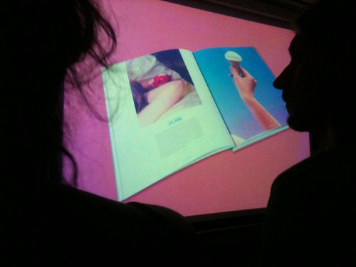
But I want to talk about colours.

The colours they photograph these magazines on are fantastic. Sure, it's a pretty simple concept, yellow on green. But THAT yellow with THAT green. Awesome.

THAT pink, THAT green, THAT yellow, THAT blue. Really sharp colours that ping out. Every single time. Picking the exact colour, that's a reall skill. A simple thing that makes the world of difference.

It really works doesn't it. Nice.
Posted by: Rob Mortimer | Oct 06, 2010 at 10:39
The stacking is nice too. Always 4-2-1.
Posted by: JC | Oct 08, 2010 at 18:06
Yes, good point JC. I forgot to mention that.
Posted by: Ben | Oct 09, 2010 at 19:41