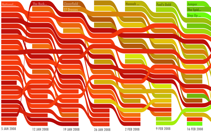
I had a few ideas on posts lined up as I approached my term here, but to throw the net out I asked my friends and family if there was anything they thought was worthy of your attention.
Now, we've all seen box office figures - week gross, ranking change on last week, number of weeks on release etc. It's normally presented in tables - nothing special. But my friend Emma told me about this, and it has totally blown the posts I had in mind out of the water.
It's easier to understand than the conventional way of presenting this type of information, you can track the success of films over time at a glance, you can see how oscar success impacts on ticket sales, plus it's beautiful. I'm scratching my head wondering why they don't use this method of presenting information more often.
Thanks Emma.


"It's easier to understand than the conventional way of presenting this type of information"
I would have to disagree with this. It's a fantastic method of displaying box office takings, but upon first glance, it looks quite daunting.
I believe the best method of displaying box office takings is a little similar to this: http://www.nytimes.com/interactive/2008/02/23/movies/20080223_REVENUE_GRAPHIC.html The Ebb and Flow of Movies, by the New York Times. A fantastic piece of work.
Posted by: Neil Martin | Aug 02, 2009 at 00:18
That's really interesting. Thanks Neil.
Posted by: Matt Dent | Aug 02, 2009 at 00:25
http://www.amazon.co.uk/Envisioning-Information-Edward-R-Tufte/dp/0961392118/ref=sr_1_1?ie=UTF8&s=books&qid=1249216190&sr=8-1
This book is full of things like this.
Posted by: Morgan | Aug 02, 2009 at 13:30
One of my favorites that. I'd like to pick up his The Visual Display of Quantitative Information.
Posted by: Matt Dent | Aug 02, 2009 at 19:07
you should have a look at this too:
http://junkcharts.typepad.com/junk_charts/
if you're into charts of course.
Posted by: Matt Cooper | Aug 03, 2009 at 13:07
Hello Matt!
It's a great interactive chart, shame it's a bit hard to follow at times but the numbers make up for that. Seeing as people have also suggested Junk Charts, there's another blog called http://dataviz.tumblr.com/ which you might already know but is filled with data visualisation images!
Posted by: andrea n | Aug 03, 2009 at 13:22