It's just over 2 years since the London 2012 Olympic logo was launched to such derision.
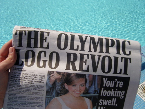
Being a prominent design blogger I wrote about it back then. I've just reread that post and I agree with everything I said. Which is reassuring.

Actually I think I agree even more. I like the logo even more.
The chief argument from the loverz at the time was that it would grow on you as it was used in different applications. That it was so ahead of it's time, everyone would catch up by 2012.
Has it grown on you? Honestly?
We haven't really seen it used in a big way yet, there are still 3 years to go before the Olympics, but we have seen graphic design work creeping out of LOGOC HQ so now seems like a good time to stop and take a look and see how we all feel about.
The best piece of work by miles is this fantastic map by Stamen.
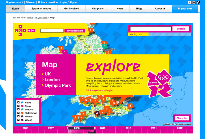
Without question the best piece of graphic design and the best use of the branding to have emerged so far. Vibrant and exciting but still easy to navigate. Lovely.

To take one small detail, look how they've used those shapes in the water of the map above. That's a sensible design decision, but it's also exciting and different. I hope this is how the branding was intended to be used when it was conceived.

This is some digitally eventy work from Matt and the guys at Universal Everything. Nice isn't it? EXCITING.
Some of you are getting a bit scared now because we haven't seen an Helvetica yet. Look again, there was some on that Stamen map.
This is the main LOGOC website. A pretty standard corporate affair in terms of content. Looks good though.
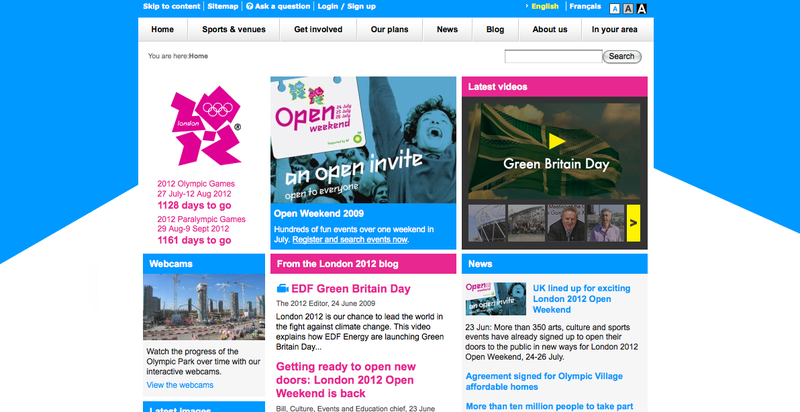
The colours are nice. They are lively. All that stuff above seems to have a fast moving pace about it which is good and appropriate. It doesn't look like clarity has been scarificed for style.
Managing this brand must be very difficult. Bureacracy and vested interests at every turn, so it's even more impressive that they manage to eeak exciting graphics out.
Not everything is rosy though. Take a look at this hideous beast.

That's breath takingly bad. Just stick the logo over there by the swimmers head it'll be alright. Incredibly insensitive and ill thought out. Terrible.
But to me the success of this logo will be how it's used by non roster approved LOGOC people. If it's a great logo even the fake shirt sellers will make it look good.
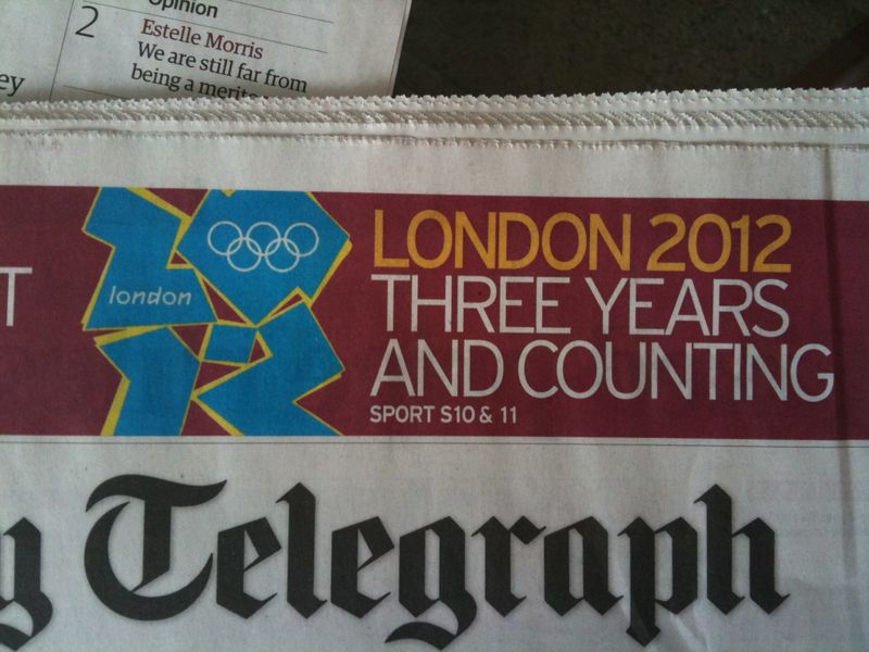
Or the press. That up there looks good to me. Obviously it's not gonna win any design awards, but it looks exciting. The colours are good - and those colours have been forced on the Telegraph by the attitude of the brand. That's a good thing.
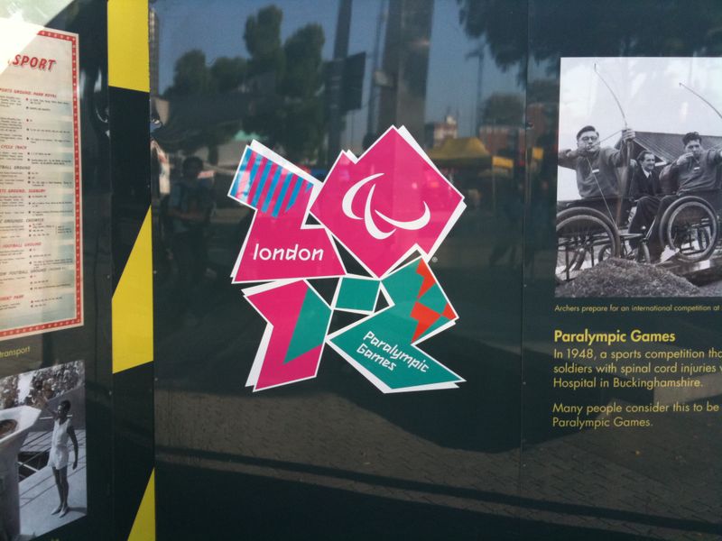
I like it. I like it more. What do you think?


















Recent Comments