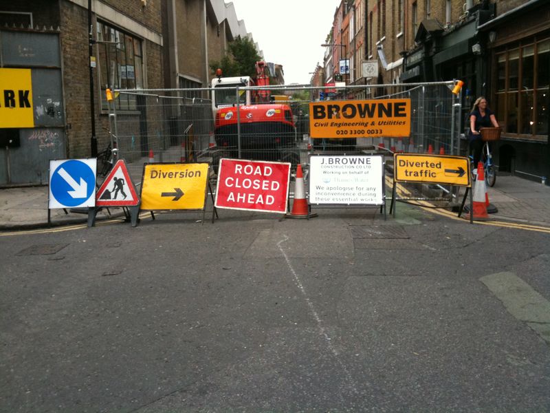
We understand that the road is closed, that's pretty obvious from the massive steel barrier shielding the huge orange digger. But still the red and white sign is a necessary notification.
It's helpful to know which way to travel as we can no longer continue straight on. The yellow sign that says 'Diverted traffic' and points to the right does that job perfectly well.
The contractor has the right to advertise his firm.
The other four signs (six if you count the cones) are unnecessary, ugly, make the street considerably more unpleasant and are insulting to my intelligence.


What's Bjork advertising on the left there?
Posted by: davidthedesigner | Jul 23, 2009 at 11:34
best bit about it is the lady cycling with a smile down the pavement... shows why they've added all those signs I guess...
Posted by: Matt | Jul 23, 2009 at 11:58
Ha! Why are London roads constantly being dug up? I live near Ladbroke grove and it is in a state of constant, absurd road closure! You have to laugh though
Posted by: sarah | Jul 23, 2009 at 13:37
maybe it's a mark wallinger art installation instead?
Posted by: lauren | Jul 23, 2009 at 14:43
Great post Ben.
Would have been perfect for the Attention Please book, just published by the Manifesto Club (who campaign against the increasing visual pollution of public space). We blogged about it here:
http://www.creativereview.co.uk/cr-blog/2009/july1/attention-please
The cone in between the two signs is brilliant.
Posted by: Mark Sinclair | Jul 23, 2009 at 15:41
I don't use emocons or lol's.
BUT LOLOLOLOL!!
Posted by: Andy Coff | Jul 23, 2009 at 17:48
I always thought that street was unnecessary anyway.
Posted by: Tom | Jul 27, 2009 at 09:40