I spent a really good day this week assessing all the work on my LCC project.
A big thanks to Matt Biddulph from Dopplr who gave up a day of his time to help me assess the work and provided a helpful non-graphic designer viewpoint on things.
Let me explain very briefly the project. There were three parts to it. !. Collect some personal data about yourself. 2. Visualise that in a clear, beautiful and fun way. 3 Present your idea back to me.
These guys are on a Foundation Degree so it's before a BA (degree). You can go on to the 3rd year of the degree at the end of the course. A bit like an HND in old money.
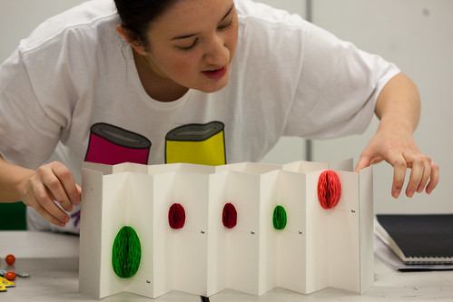
I was really pleased with the work. There were some lazy buggers, obviously, but most people worked really hard and produced some great stuff. I have no concept of how helpful/useful i was but people seemed to enjoy the project.
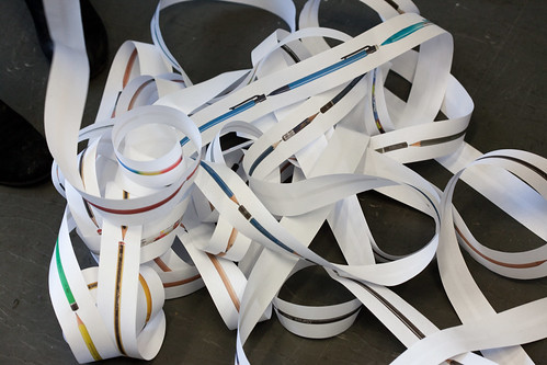
Matt took some splendid pictures, which means I can show you some of the work.
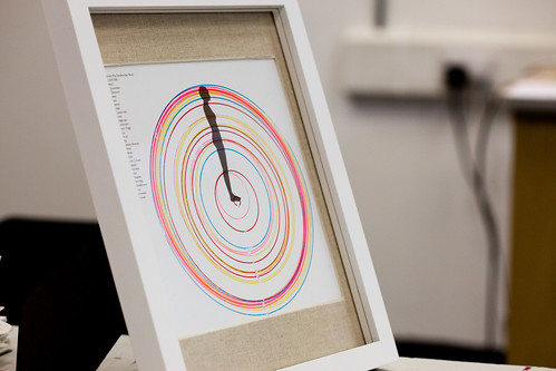
Kate made these lovely screenprints of her body measurements. She also did the same for her four siblings and has made a set of five screenprints which she's had framed and has given to her Mum and Dad. They're going up on the lounge wall. That's nice, isn't it?
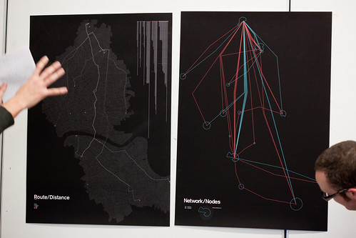
Tom made the wonderful posters you see up above. Very elegant, sophisticated graphic design. Good enough to be 3rd year degree level, I would humbly suggest.
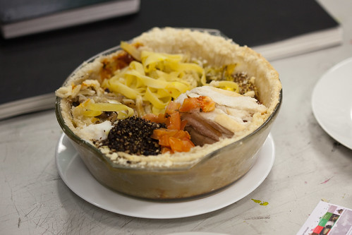
Jamie made a pie chart. He measured all the ingredients he ate in a week and then made a pie. In the presentation. Great fun.
Well done everyone. I enjoyed working with you. There are a few more pics here.

Thank you for the brilliant pictures!
It's great to see what was presented in the other assessments. (Tom, that work is particularly beautiful)
I'm glad you enjoyed working with us - we really enjoyed the project too.
Kate
Posted by: Kate Burn | Feb 13, 2009 at 14:41
This is lovely. The idea of using a pie to house a pie chart is fantastic. Kudos to you for this endeavor.
Posted by: Ian | Feb 13, 2009 at 14:53
I'm also enjoying nosing at the other work, it was a great project to work on, interesting and loads of fun, cheers for coming in and making it all happen
Posted by: Tom McEvoy | Feb 13, 2009 at 15:06
Nice work. Infographics have always interested in me, but at the same time annoy me. The reason being that so often, a designer will go to great lengths to make it *look* appealing, but as soon as it's time to actually make sense of the information, it becomes completely confusing.
Posted by: Neil Martin | Feb 13, 2009 at 20:55