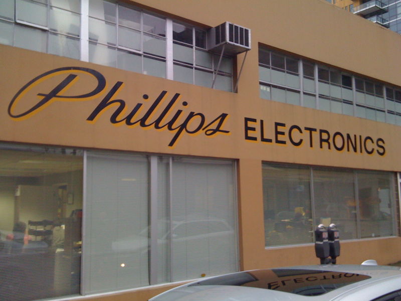
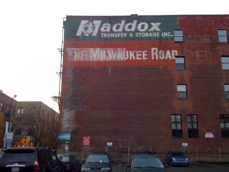
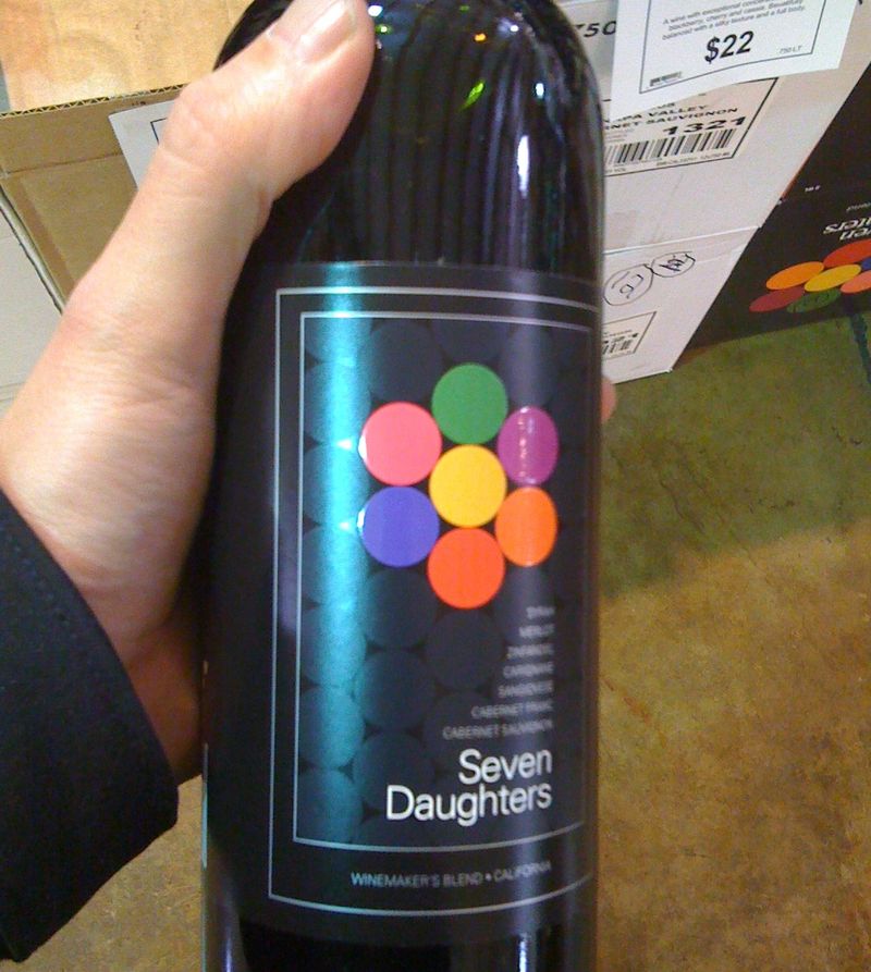
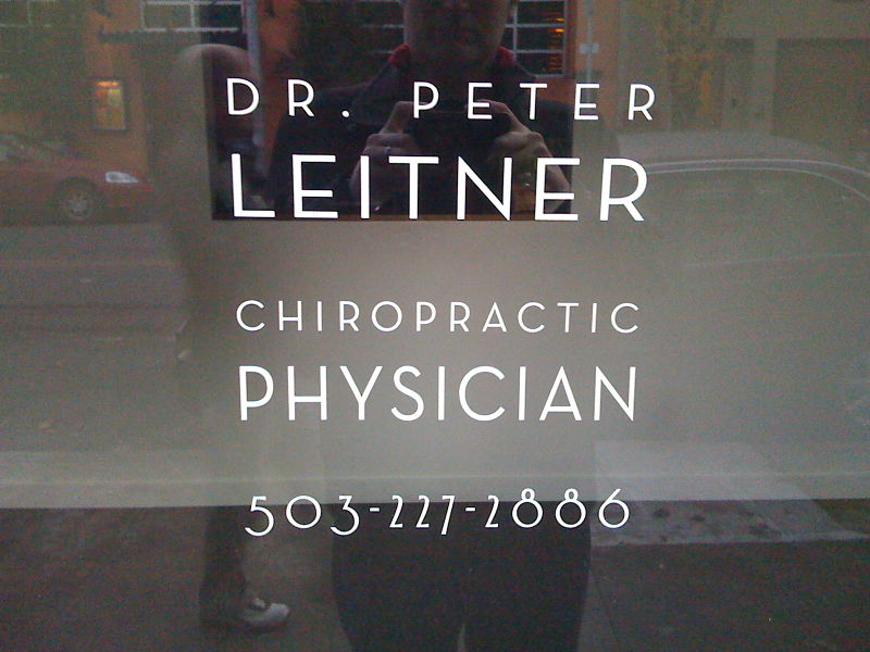
Portland, Oregon, USA has some of the best typography I've ever seen in a city.
There's loads of good stuff everywhere. I didn't manage to photograph all of it, but here's a small selection.
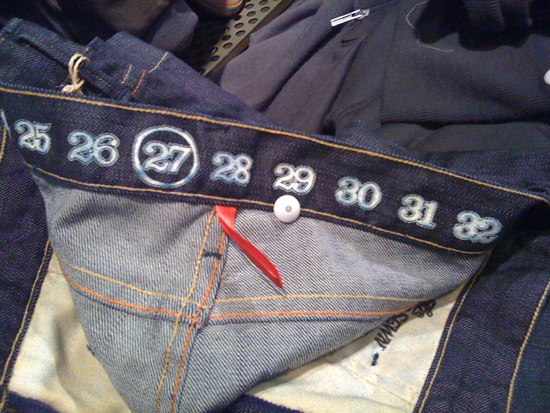
I liked this too. The best trouser measurement typography I've seen in a long time. Nice big serif numerals. Lovely.
And this. This is great. This explains lots about what's good about America in one simple piece of type.
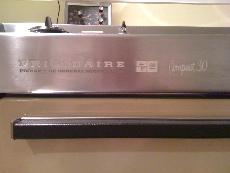
To most people these fonts would look old fashioned. But they don't, they look great. And they look American, so that makes it relevant. They are classic display faces yet they've been used on a cooker. Fantastic.
The GM logo. GM make cookers? Cool. Imagine if Land Rover made fridges? That's an iconic American brand right there on the side of the cooker, with the logo nice and proud. Simple, fun, bold, good.
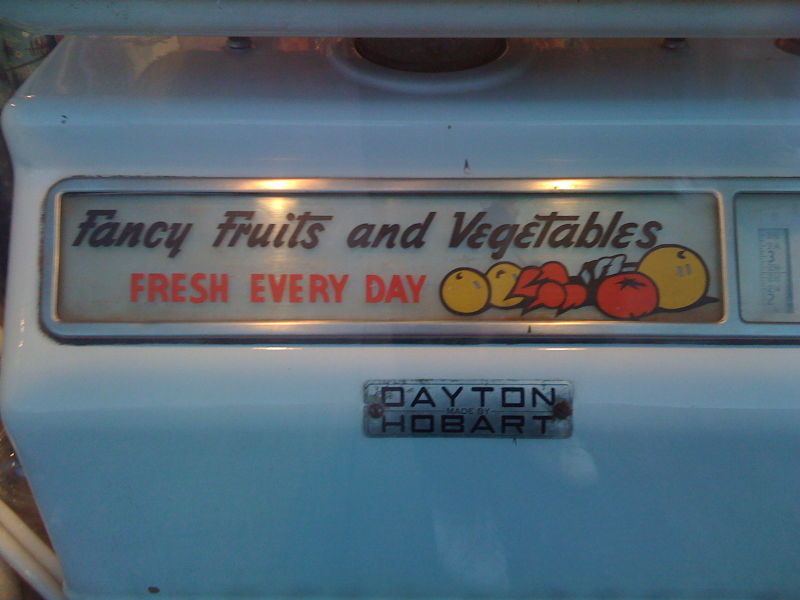
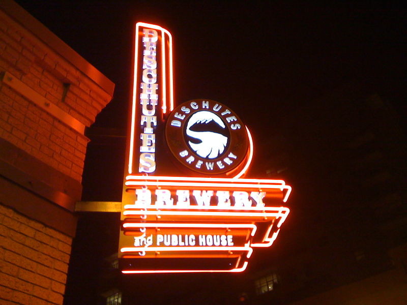
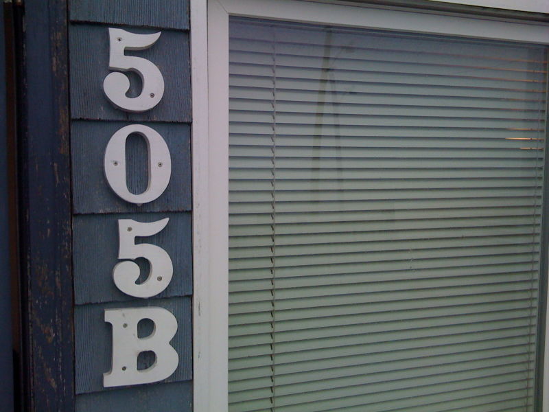

Like the way you've managed to emerge from that 'Fancy Fruits and Vegetables' dispenser like the genie from the lamp. Clever that.
Don't try and kid me that you're only a 27 inch waist, though.
Posted by: davidthedesigner | Dec 06, 2008 at 15:14
Wow! Great stuff for people who suffer from the design disease. I have to wear those jeans, who designed these?
Posted by: Loïc | Dec 06, 2008 at 15:30
David - well spotted! Of course I'm a 27 inch waist.
Loic - I don't know. Possibly G-Star, or something?
Posted by: Ben Terrett | Dec 06, 2008 at 17:43
Thanks! I walk by that Phillips sign every day, sometimes you forget how cool all the stuff you see every day is until you get it from fresh eyes.
Posted by: Heather | Dec 09, 2008 at 02:04
I was amused by the 2nd person in the chiropractic photo, clearly not as enthusiastic as you, turned sideways. And I have to agree with the classic american feel fonts, it just looks right.
Posted by: danielle | Dec 09, 2008 at 16:40