I went to the brand new St Pancras station the other day. It really is a lovely place. What struck me most was the graphic design of the station clock.
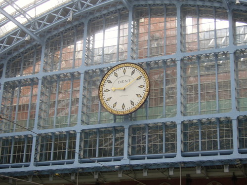
The original St Pancras clock was made by a company called Dent who also made the clock for Big Ben. This was sold to an American for £250 in the 1970s. Workmen dropped it
during its removal and an engine driver bagged up the
bits, which were crucial in making an exact replica for the new station.
The clock itself is a lovely thing, all slate and gold leaf. It's quite dynamic and graphic with all those diamond shapes. But what I really liked was how they've used the clock, digitally, throughout the station.
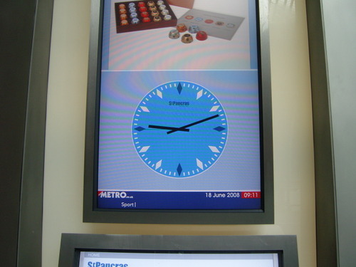
Here it is on the interactive information boards. They didn't have to do that, but it's a nice stylish little touch. It also adds a slight classy feel to those otherwise fairly soulless interactive boards. It helps to slow down the feel of the constantly changing information.
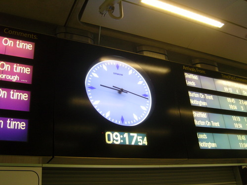
And here it is again on the announcement board thing. Good stuff.
That my friends is what we call Tangible Digital. Sort of.


This is probably just me, but in its stylised blue incarnation it just reminds me of a nasty Argyle sweater :(
Posted by: Bez | Jun 19, 2008 at 15:55
Although not such a good design is the thing that looks exactly like a clock over the Eurostar departure gate, and is actually the number of the train. So you think it's 09.14 and go and get a paper, when in fact it's 9.24 and your train's about to leave. That could be user stupidity, of course.
Posted by: Emma | Jun 19, 2008 at 18:18
nice clock...dent. like arthur dent - galaxy hitch hiker? the [not-so] late dentarthurdent.
Posted by: lauren | Jun 20, 2008 at 14:19
Nice implementation around the station - but I agree the blue looks a bit horrid. Plus isn't it a bit sad that they have to put a digital clock underneath it in the last photo?
Posted by: Daniel | Jun 20, 2008 at 15:45