Noisy Decent Graphics
A series of blog posts by Ben Terrett about me | archives | atom feed
« May 2008 | Main | July 2008 »
Jun 30, 2008
Jun 29, 2008
Jun 27, 2008
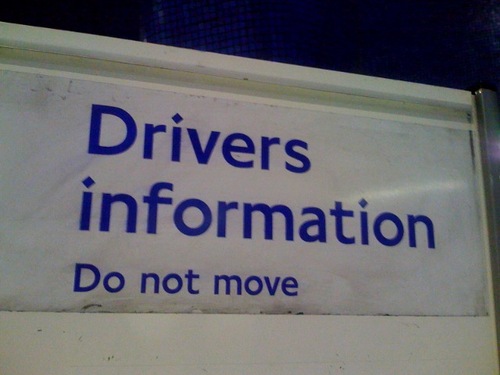
Drivers information
Posted at 07:17 in Seen and heard | Permalink | Comments (4) | TrackBack (0)
Jun 26, 2008
Summer of Design Books (Again)
Let's try again shall we?
Log on to Typepad and using the username [email protected] and the password summer you'll be able to post a book review on this blog. It will wait in limbo until I've approved it and then it will go live. Any book you want, as long as it's about design
Part of the Summer Of Design Books series.
Posted at 08:56 in Summer of Design Books | Permalink | Comments (5) | TrackBack (0)
Jun 25, 2008
Web Mach Turbo 3.0
The internet is like razor blades. At the moment we're on 2.0 blades, soon there will be 3.0 blades and someone somewhere is working on 4.0 blades.
Which reminds me, if you work at Gilette or something and you're the 4 blades guy, how bad would it feel when you meet the 5 blades guy at the Christmas party. And if the 6 blades guy is there as well?
Posted at 20:34 | Permalink | Comments (5) | TrackBack (0)
Jun 24, 2008
Balloon thing: good or annoying?
So this balloon thing, good or annoying?
I've wasted a decent amount of time playing it today and I've had fun. I was even 5th at one point! But I can totally understand that it's very annoying seeing all those balloons when you arrive at this site.
On the internet some people seem a little confused by it (I was at first) and some people seem very annoyed with it all. What do you think?
I've made a list of what I think are good and bad points.
Good
It's genuinely fun when you start playing. It takes a while to get into it but once you do it's quite addictive. And I've never seen anything like it before.
It doesn't seem impossible. A lot of online competitions feel like you've got absolutely no chance of winning, this one doesn't feel like that.
The techie stuff is very, very clever. If you stop and think - what they're doing is pretty amazing and it's being done well and pretty slickly too.
It looks gorgeous. By that I mean the craft, the edges of the balloons, the little balloon loading bar, the detail on the strings - all fantastically well done.
Bad
There's no getting round the fact that basically it's annoying when you visit a site you love and all these balloons are there. I know you can click it off and I like it when I'm playing the game, but it's not hard to envisage people getting annoyed at this.
It's a little clunky. I mean a teeny, weeny, weeny bit clunky. Because what they're trying to pull off is so complex I can forgive a bit of clunkyness. But still, the clunk is there.
Sometimes it repeats that "your balloon has left this site" thing twice. I refer to my point above.

There's my site with a token on it!
I've had some decent traffic from playballoonacy.com today and I'm not writing this so that people from Orange or Poke come on and defend Ballloonacy.
I'd just like to know whether you, my beloved listeners, find the balloons annoying on this site. Should I take them off?
Posted at 23:57 in Complaints Dept., Graphic Design Reviews , Just Me Doing Stuff, New Thinking and Ideas, Seen and heard | Permalink | Comments (21) | TrackBack (0)
Jun 23, 2008
Cancelled
I'm terribly sorry but the Museum visit on Wednesday is canceled. Well, I'm not going, you of course can go without me. The was always one meeting that I'd have to cancel this for and that one meeting is on Wednesday morning.
I'll try and arrange for another time.
Posted at 11:15 in Just Me Doing Stuff | Permalink | Comments (1) | TrackBack (0)
Jun 19, 2008
Tangible Digital Clock
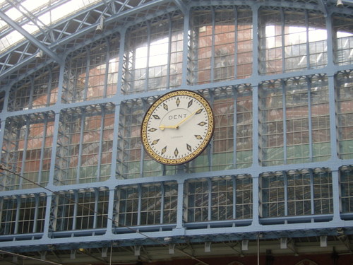
I went to the brand new St Pancras station the other day. It really is a lovely place. What struck me most was the graphic design of the station clock.
The original St Pancras clock was made by a company called Dent who also made the clock for Big Ben. This was sold to an American for £250 in the 1970s. Workmen dropped it
during its removal and an engine driver bagged up the
bits, which were crucial in making an exact replica for the new station.
The clock itself is a lovely thing, all slate and gold leaf. It's quite dynamic and graphic with all those diamond shapes. But what I really liked was how they've used the clock, digitally, throughout the station.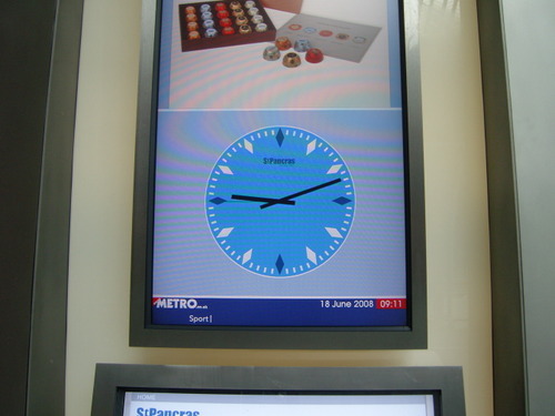
Here it is on the interactive information boards. They didn't have to do that, but it's a nice stylish little touch. It also adds a slight classy feel to those otherwise fairly soulless interactive boards. It helps to slow down the feel of the constantly changing information.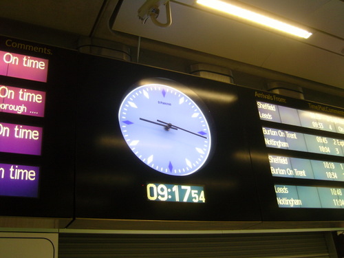
And here it is again on the announcement board thing. Good stuff.
That my friends is what we call Tangible Digital. Sort of.
Posted at 14:53 in Graphic Design Reviews , Tangible Digital | Permalink | Comments (4) | TrackBack (0)
Jun 18, 2008
Present & Correct
Present & Correct who made that lovely Endangered Species Alphabet poster earlier in the year have opened a shop. Spurning the glamorous boulevards of Oxford Street and Bluewater they've opened it online. And jolly bloody lovely it is too. Lots of gorgeous stuff. Take a look.
Posted at 22:14 in Seen and heard | Permalink | Comments (1) | TrackBack (0)
Magic and Logic Seminar
Posted at 16:36 in Conferences / Speaking, Seen and heard | Permalink | Comments (2) | TrackBack (0)
Jun 16, 2008
Summer of Design Books
I've got loads of design books that I ought to read. Like, properly read. Not just skim through them or leave them by the side of the bed or in the bathroom. Actually read them.
So I'm going to do that this summer. And then I'm going to give a brief report on this blog. It won't be a review, it's just be a few notes on what I've garnered from the book.
Would you like to join in? Great. Log on to Typepad and using the username summerof and the password designbooks you'll be able to post a report on this blog. It will wait in limbo until I've approved it and then it will go live. Any book you want, as long as it's about design. Or should that be Design. Anyway.
UPDATE: I think Typepad have changed it so that guest authors have to log in with an email address and not a neat username. But hold on a minute, I'm on the case.
Posted at 10:51 in Summer of Design Books | Permalink | Comments (9) | TrackBack (0)
Jun 12, 2008
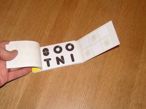
Interesting 2008 Moo Stickers Unboxing
Posted at 21:59 in Interesting 2008 | Permalink | Comments (5) | TrackBack (0)
Good Thing
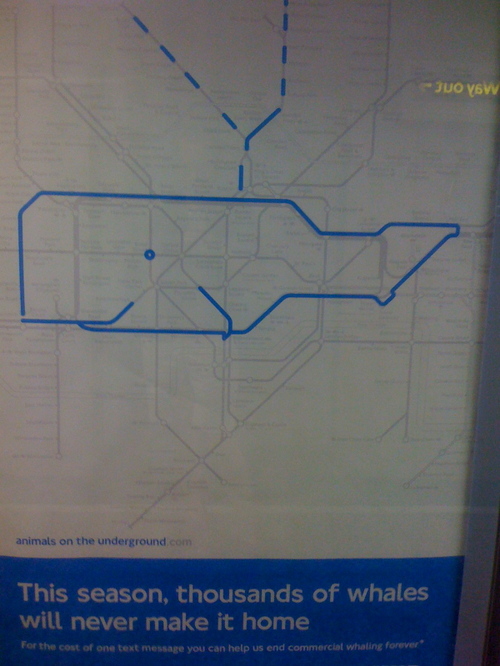
This is a good thing.
Paul Middlewick spotted animals in the Tube map ages ago. Russell even blogged about it back in March 2004 (that's ages ago).
Yesterday I saw an ad on the Underground, with a picture of a whale, made from the Tube map promoting whale saving. More specifically promoting the International Fund for Animal Welfare.
There are three animals on a series of posters.
That's just a good thing, isn't it? Pictures of whales made from Tube maps, whale saving charity, Underground media sites. Cheap, clever, good, nice. Good.
Posted at 07:55 in Graphic Design Reviews , Seen and heard | Permalink | Comments (0) | TrackBack (0)
Jun 10, 2008
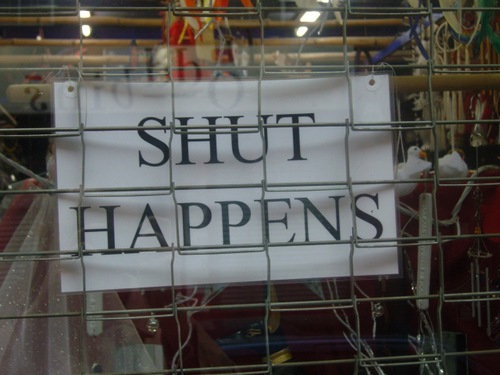
Not really. Honestly.
Posted at 13:12 in Examples of Bad Communication | Permalink | Comments (7) | TrackBack (0)
Designer or studio that is fluent in Arabic?
Jeff is looking for a "designer or studio that is fluent in Arabic and English design". Can anyone help?
Email him (not me) over here. Thanks
Posted at 12:11 in Listeners Questions | Permalink | Comments (2) | TrackBack (0)
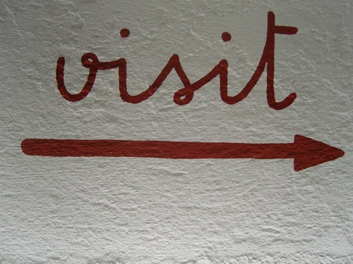
Museum of Brands, Packaging and Advertising
I've always wanted to go here, and so have loads of other people. But I (we) never quite get round to it. So how d'you fancy a group visit?
I was thinking Wednesday 25th June at 10am. Who's up for that? We'll all just meet outside, have a look around and then maybe go for a coffee or sommits afterwards? If you're interested drop your name in the comments.
Posted at 07:17 in Just Me Doing Stuff | Permalink | Comments (8) | TrackBack (0)
Jun 09, 2008
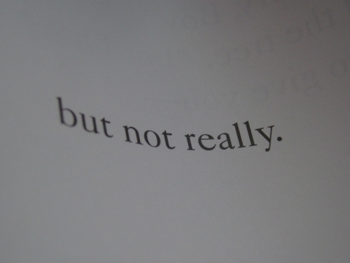
but not really.
Posted at 20:17 in Just Me Doing Stuff | Permalink | Comments (1) | TrackBack (0)
Jun 04, 2008
Good things you can do with the Interesting 2008 logo
Already the suggestions for Unofficial Official Interesting 2008 Branded Item ideas are flooding in.
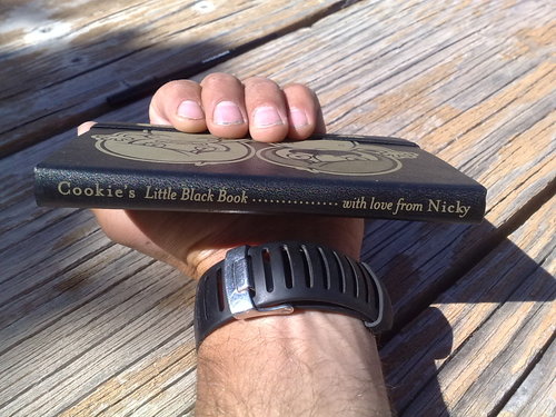
You could, for example, get your Moleskine engraved with the logo. They even do the spine. And they look fucking amazing.
Here's one that Nicky created which I found via Cookie.
You could also rework the logo like Alistair has just done. Great stuff.
Posted at 23:13 in Interesting 2008 | Permalink | Comments (0) | TrackBack (0)
Interesting 2008 Feed
This is what I saw when the Flickr version of the Interesting 2008 logo arrived in my Bloglines RSS feed. Great isn't?
Posted at 20:23 in Interesting 2008 | Permalink | Comments (0) | TrackBack (0)
Recent Posts
- Years in the domain, like tears in the rain
- Printing is still too hard
- No innovation until everything works
- "They'll be dancing in the streets of Total Network Solutions this evening"
- It was a pleasure
- Public Digital has won a King’s Award for Enterprise in International Trade
- Kids describing fashion ads
- Art at Mount St Restaurant
- Post match squeeze
- Unbelievably tickets are still available








Recent Comments