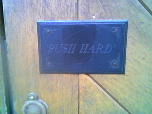
I saw this little sign on a big, heavy, wooden door the other day.
Those four little letters make all the difference. How many times have you pushed a door only to find you've used far too much or far too little strength. That little 'HARD' just gives you enough extra information to make the instruction so much more helpful.
Fantastic usability and so much better than this.


That is good.
I'm always amazed by how obedient we humans are. One wonders what would happen if someone put 'Lift Up' on a door or similar...
Posted by: Angus | Apr 17, 2007 at 09:44
Interesting that they put single quote marks around it, so it's an instruction not just a sign. And italics, so the letters look like they're actually pushing. And set in caps, because caps are "hard".
Posted by: Richard | Apr 17, 2007 at 12:15
The fact it is inverted commas suggests strongly a mistake.
A correct reading of the sign as it is, is that the other side of the door presents a house or room CALLED 'Push Hard'.
Now that's a shame because it's nice.
Posted by: TomLR | Apr 18, 2007 at 20:56
Tom, that's the kind of grammatical knowledge that's lacking around here.
Posted by: Ben | Apr 18, 2007 at 21:24
After making myself look foolish on another post of yours, I now realise this one has backfired on me also.
My first sentence is very clumsy - and would better read:
'The fact it has inverted commas strongly suggests a mistake.
And even that is unsatisfactory.
You see Ben - I feel design aesthetics through grammar (I am serious)
Posted by: TomLR | Apr 18, 2007 at 21:32
Tom, I might take you on as the first ever NDG Summer Intern. You can proof read throughout August.
Posted by: Ben | Apr 18, 2007 at 21:37
Can I keep my day job ?
Posted by: TomLR | Apr 18, 2007 at 21:43
Can I keep my day job ?
And wear T - shirts ?
Posted by: TomLR | Apr 18, 2007 at 21:43
Yep. Yep. And shorts.
Posted by: Ben | Apr 18, 2007 at 21:44
I am very hairy Ben.
Posted by: TomLR | Apr 18, 2007 at 21:53