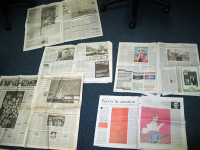
Yesterday we held a crit in the office of all the recent newspaper redesigns. We do that kind of thing here.
We looked at the new Indy, the old Indy, the new Guardian, the old Guardian and the new Neville Brody designed times2. It was very interesting to look at all the different fonts, leading, column widths etc. Interesting if you're a designer anyway.
The new Indy was our favourite.
The new Guardian is a nice size, but the headlines are too thin and it's lost a lot of the power of the Pentagram designed classic. There's too much colour and it only has 5 columns making the text hard to read. Interestingly when they dropped from broadsheet to tabloid the Indy went from 8 columns to 7, the Guardian went from 8 columns to 5.
times2 is just a mess. Neville, where did it all go wrong?


Comments