Noisy Decent Graphics
A series of blog posts by Ben Terrett about me | archives | atom feed
« July 2005 | Main | September 2005 »
Aug 29, 2005
Found him!
Posted at 18:42 in Seen and heard | Permalink | Comments (0) | TrackBack (0)
Aug 24, 2005
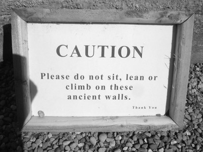
Ancient Caution
Posted at 21:08 in Seen and heard | Permalink | Comments (0) | TrackBack (0)
Without asking
We're in Design Week this week. Without asking.
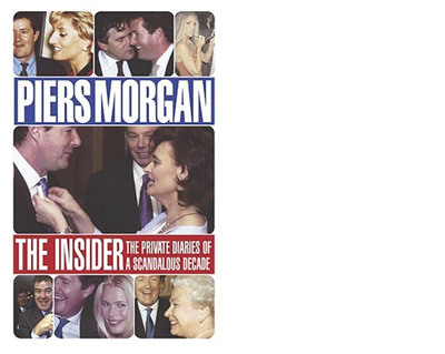
Seems a long way away from the days when we plagued them to try and get the slightest story in there. By the way, I'm supposed to be reading this but I've been side tracked by Piers Morgan's diary. It's a fucking great read. A bit like a tabloid in a book. You hav eto read it with a pinch of salt, but it's very interesting from a "who runs Britain" point of view.
Posted at 20:50 in Stuff I'm Reading | Permalink | Comments (0) | TrackBack (0)
Aug 23, 2005
There on the stairs
A visitor in our reception just asked where the stairs were. The receptionist replied, "The stairs? Through the brown door and up the stairs."
I just found that very amusing.
Posted at 19:14 in Seen and heard | Permalink | Comments (0) | TrackBack (0)
Aug 17, 2005
AKQ eh?
It seems that AKQA designed the Beattie McGuinness Bungay website.
Strange.
PS If you've ended up here because you searched for "Beattie McGuinness Bungay" on Google, what do you think of their website? Comments please...
Posted at 19:21 in Graphic Design Consultancies / Creative Companies | Permalink | Comments (2) | TrackBack (0)
Aug 14, 2005
Post Graphic Design
Saw this in the Observer this morning.
When Frank Warren invited people to mail him their secrets on a blank postcard, he was inundated with replies. Now an online gallery, 3,000 cards and 5m hits later, the regrets, fears and desires of the world are there for all to see.
It's great. Funny, tragic, sexy and voyeuristic.
But what amazed me was how almost all the postcards had been "designed". People hadn't just scrawled on postcards, they'd gone to the trouble of designing them.
I'm a little bit scared by that.
Posted at 11:09 in Graphic Design Reviews | Permalink | Comments (0) | TrackBack (0)
Aug 12, 2005
Willing and Able
Posted at 19:27 in Graphic Design Reviews | Permalink | Comments (2) | TrackBack (0)
7 Million Designers
I quite like this.
I say quite, because it's not exactly Tom Eckersley. But it is immeadiate, simple and (kind of) relevant.
Christ, that's a lot of caveats.
Posted at 19:15 in Graphic Design Reviews | Permalink | Comments (0) | TrackBack (0)
Aug 06, 2005
The Longest Piece Of Canvas In The World
Posted at 11:03 in Graphic Design Reviews | Permalink | Comments (0) | TrackBack (0)
Long, glamourous evening dresses
I was in Selfridges yesterday doing some research. Went to the loo. Saw this sign on the door of the Gents.
So, the top one obviously means "men". The one at the bottom means "kids". Or rather "baby changing facilities for new Dad's". But what the hell does the middle one mean? People with no legs? Women with two canes in long, glamourous evening dresses.
I have absolutely no idea.
Posted at 10:54 in Seen and heard | Permalink | Comments (2) | TrackBack (0)
Aug 03, 2005
Reading 1 - Brands and Branding
Posted at 22:36 in Stuff I'm Reading | Permalink | Comments (0) | TrackBack (0)
Last of the last minutes
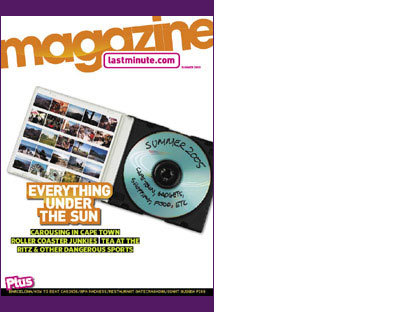
lastminute.com have produced a magazine
Cue rant about lastminute.com
When lastminute.com launched I was pretty excited. I thought it was a company where you could get stuff last minute. So it's Friday night, I've got loads of cash and I'm at a loose end. Fuck it, I'll go on lastminute.com and I'll be in Berlin by midnight. But, no, it's not like that at all.
And now they've brought out a magazine. How un-last minute is that? Not good at all. Their whole brand promise is based on being lastminute and they are not last minute at all. How much longer will they survive? 24 months max. You blogged it here first.
Posted at 22:17 in Graphic Design Reviews | Permalink | Comments (0) | TrackBack (0)
Eat Natural, Innocently
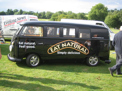
Saw this the other day. Brought to mind a few things I've been thinking about recently.
At the moment every start-up that approaches us for an identity says without fail, "We want to be like Innocent Drinks". I don't mean a few, or most, but all of them.
Now that's fine. I like Innocent a lot. I like the drinks, I like the people, I like their offices (I've been there) and I like the branding. But everyone can't be like Innocent. HSBC can't be like Innocent. BA can't be like Innocent. Tesco's can't be like Innocent.
Don't get me wrong, starting a company and aiming to be like innocent Drinks is no bad thing. It's just that when people say "We want to be like Innocent Drinks" what they really mean is "We want fantastic, consistent, witty, clever branding. You know like Innocent." Which is a different thing entirely.
Anyway, Eat Natural, are obviously trying to be like Innocent for a different reason.
I like it. Nice website too.
But what I really, really, like is all the black. Most people when faced with a start-up healthy food brand would have said, "you never use black on food products" "black is too... death" "black isn't fun" "black isn't healthy". But they didn't say that. They used black and it looks good. Pats on backs.
Posted at 00:07 in Graphic Design Reviews | Permalink | Comments (0) | TrackBack (0)
Aug 01, 2005
Too many graphic designers?
Posted at 19:26 in Seen and heard | Permalink | Comments (5) | TrackBack (0)
19 MPH
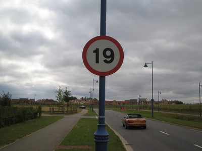
I saw this in a "new town" today. Apparently the idea is that by making the speed limit 19mph your brain will register it as unusual and you'll notice the sign. How many times have you driven past a speed limit and not registered whether it's 20 or 30 or 40?
I think it's quite a good idea.
I just wonder how long 19mph will be unusual for. Will we soon see towns and villages with 19, 21, 22, 27, 17 miles per hour speed limits? Imagine every town in the country with a different speed limit? How very British.
Posted at 00:01 in New Thinking and Ideas | Permalink | Comments (0) | TrackBack (0)
Recent Posts
- Years in the domain, like tears in the rain
- Printing is still too hard
- No innovation until everything works
- "They'll be dancing in the streets of Total Network Solutions this evening"
- It was a pleasure
- Public Digital has won a King’s Award for Enterprise in International Trade
- Kids describing fashion ads
- Art at Mount St Restaurant
- Post match squeeze
- Unbelievably tickets are still available









Recent Comments