Noisy Decent Graphics
A series of blog posts by Ben Terrett about me | archives | atom feed
Jul 31, 2005
The ultimate brand experience?
Posted at 23:53 in Seen and heard | Permalink | Comments (0) | TrackBack (0)
Jul 28, 2005
"No, you've been in Dubai because you're no fucking good old son"
A long time ago I used to work for a designer I respected a lot. A proper designer, trained at the RCA in the 60's and did things properly. Believed in ideas and communication, not style and trend.
Once, when we were interviewing someone, he asked why the designer in question had gone to Dubai for 2 years? The designer said that he was so good, the company had asked him to come out to Dubai. "No, you've been in Dubai because you're no fucking good old son. If you were any good, you'd be working in London." came the answer. Absolutely brilliant. And true.
Posted at 21:43 in Quotes | Permalink | Comments (0) | TrackBack (0)
UK Presidency of the EU 2005 Logo
When you design a new logo for a big organisation you can guarantee two things will happen*.
1. 50% of the world will like it and 50% of the world will hate it with a passion.
2. Someone, somewhere will claim to have designed one before that looks suspiciously similar. Normally students or designers in Sussex.
Michael Johnson's logo for the UK's stint at the EU has come under just such an attack. Design Week in particular is still printing letters by people covering both the points above. Design Week always does this. I suppose I can understand why; people send the letters in, Design Week has an obligation to print them. Fair cop.
I like it. The logo that is. I'm a big fan of Michael Johnson (I also know him a little bit) and he normally comes up with the goods. I think most of the commentators have missed the point. I gather from this BBC News interview that the whole point is that the logo is animated. So rather than think in 2D, Johnson Banks have thought in a moving, multi channel kind of way. Which is a good thing.
Sure, there are gonna be letterheads and other flat, printed stuff, but I bet this logo is used more on big plasma screens and presentations and the like. And so what if there was once something similar? It's only a load of swans flying about. As always it's the application of the idea that makes it good, not the actual idea. Remember, it's the ones that do things we admire, not the ones that had the ideas but left on the kitchen table with the residents association newsletters.
* Apart from that fuzzy Abbey logo. Everyone hated that and no-one dared claim they'd done one like that before.
Posted at 20:12 in Graphic Design Reviews | Permalink | Comments (0) | TrackBack (0)
Jul 27, 2005
Newspaper headlines
If you want to work in any form of media, in my opinion, it's a good idea to read (or at least look at) all the newspapers. If you want to be a graphic designer, it's essential. Newspapers are very quick, immediate, impactful pieces of graphic design. It’s a real challenge to make that important front page look great every day.
Now, it really fucks me off when people slag of The Sun because it’s such an important media icon in our daily lives. It’s pretty much the only newspaper that regularly makes the news, rather than just reporting it. This is an issue that will become more and more important as news media moves from print to digital.
You’ll also find that the people who slag off The Sun inevitably read The Mail or The Express. Ahem.
Graphically The Sun has a tabloid style which is recognised world wide. It has it’s own strong graphic personality or brand. So, if you are a visual person you need to look at all the newspapers. And if you are a sensible person you need to read all the newspapers to even begin to get an idea of a story. Most days I take a detailed look at The Sun, the FT and the Indy. You would be amazed at how the same story can be completely different, or how different papers can leave out massive bits of a story depending on their editorial slant.
OK, what’s all this leading to then? This morning I think we’ve reached a new low point in front page design.
Take a look at this front page from The Daily Express.
Whatever your political views, that headline is a disgrace. It’s not even a proper headline, more like a bad stand up joke. Absolutely no creative or journalistic writing skills have been applied to that whatsoever.
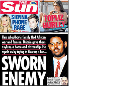
Now look at exactly the same story on The Sun’s front page.
They are communicating to, demographically, a less educated audience and yet it’s done in a much cleverer, much more professional way. And the point is so much better made because of it.
Isn't it funny how, in 2005, The Daily Express’ front page now looks like a Sun spoof? What would Beaverbrook say...
Posted at 09:10 in Graphic Design Reviews | Permalink | Comments (4) | TrackBack (1)
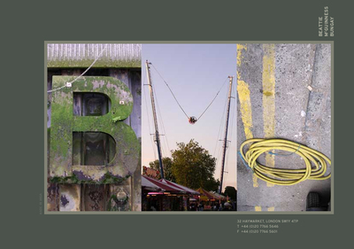
Beattie McGuinness Bungay
I was just reading that Trevor Beattie's new outfit, Beattie McGuinness Bungay, has won a £7M ad campaign for OK. This raises several points.
1. Like football transfers, media budgets are almost always overstated. An accountant for Man U once told me that all transfers are actually a third of the price quoted. So it's probably a £2M account.
2. Trevor, love him or hate him is one of the most creative people in the UK. And the best name he could come up with for his new firm is Beattie McGuinness Bungay. He's either;
a) not very creative at all
b) incredibly vain
c) brow beaten by his peers.
You decide.
3. Again, for what pomises to be an exciting start up by some very creative people the website is awful. A holding page simply isn't good enough, it looks like a student project online.
Posted at 08:20 in Graphic Design Consultancies / Creative Companies, Ridiculous Company Names | Permalink | Comments (6) | TrackBack (0)
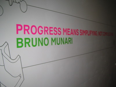
"Progress means simplifying, not complicating"
Which is the quote, by Bruno Munari, I was on about here. Currently on display on the wall of the Design Museum. Which reminds me, if you're from the Design Museum, your identity is lovely but your website is shite. A bit like the picture below, sorry about that.
Posted at 07:58 in Quotes | Permalink | Comments (1) | TrackBack (0)
Jul 26, 2005
Hello
This is my first post and I'm kinda new to all this so bear with me.
I'm a Graphic Designer in London and for a while I've been thinking about getting a blog together. What would I write about? Wife, kids, photos, work? I've finally opted for the Graphic Design industry as a whole. I've been hugely inspired by Russell Davies and I'd love to be to Graphic Design what he is to Planning. That's a lofty ambition, but stick around, you might be surprised.
All good design starts with a brief, so;
1. The design of this will be a simple as possible.
Just black and white if I can get away with it. I'm a big fan of function dictating form. Like Josef Muller-Brockman. I also agree with that great quote from the Design Museum, the one about "the object of mankind is to keep simplifying things not making them more complicated". Oh and I'll try and find out what that quote is.
2. I'll use photos.
I always have a camera with me, so I'll try and illustrate my points with decent images.
3. I'll update regularly.
Otherwise I'll look like a dick.
4. I'll only ever write about Graphic Design
Except when Graphic Design crosses over into other areas. But I certainly won't mention the kids, the wife, the dog, the car etc etc. This blog is about Graphic Design, OK? While I'm at it, I'll always spell Graphic Design with a capital G and D. Just because.
5. I will write about the industry warts and all, hence the anonymity.
I might change the anonymity bit, but for now it stays.
Posted at 22:17 in New Thinking and Ideas | Permalink | Comments (0) | TrackBack (0)
Recent Posts
- Years in the domain, like tears in the rain
- Printing is still too hard
- No innovation until everything works
- "They'll be dancing in the streets of Total Network Solutions this evening"
- It was a pleasure
- Public Digital has won a King’s Award for Enterprise in International Trade
- Kids describing fashion ads
- Art at Mount St Restaurant
- Post match squeeze
- Unbelievably tickets are still available


Recent Comments