
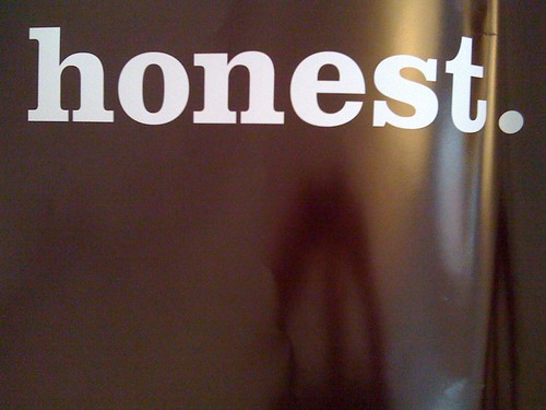
This is the worst ad I've seen in a long time.
I struggle to believe it was made. It's sexist, unfunny, cheap, badly photographed, hideously laid out and massively inappropriate for the audience.
This is the worst ad I've seen in a long time.
I struggle to believe it was made. It's sexist, unfunny, cheap, badly photographed, hideously laid out and massively inappropriate for the audience.

There was a fascinating obituary in The Guardian on Saturday of John Berry. He illustrated 20 of the Ladybird People at Work books as well as coming up with the 'put a tiger in your tank' slogan and drawing the Esso tiger for 10 years.
I'd be proud of any one of those things were in my obituary.
Read it in full here.

Typography by Joe Harries, found on Tom's blog.
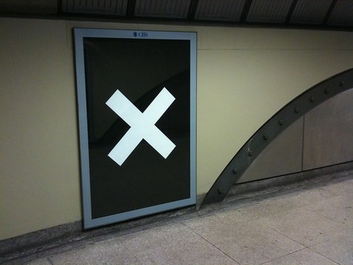
I love this.
It's an artwork by Knut Henrik Henriksen on the new bit of the Northern Line at Kings Cross.
Can't see it?
My friend Blech has a better picture.

The thing I like about it is that it's so easily ignorable.
It's the kind of thing you might not see for years and then you'd suddenly discover it. And it would bring a smile to your face. It's so elegant and beautiful and now it has been given, by accident or by choice, a position that makes it a hidden gem. A needle in the haystack of the commute.
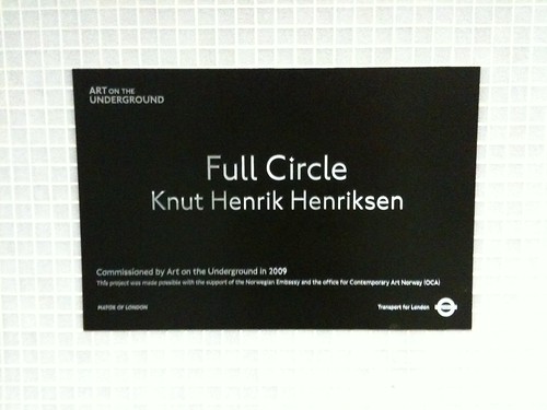
It's fantastic.
More details on the TFL website.

From the Design Disease Flickr Pool. Still awesome.

Seattle is a wonderful place. I've been there before, but only for a few hours.

There was this building was I was quite taken by. It gives the impression of being so precarious.

It isn't. Obviously.
And then there's this wall of gum.

Actually called Gum Wall it's apparently the 2nd germiest tourist attraction in the world, the Blarney Stone was the winner.
I was strangely attracted to it. It was the colours. Designers can see past all those germs if you have colours like these.

At the end of last year I was in Portland and Seattle. There were a few things I saw that I wanted to blog about, but I never really got the time. What with all that end of the decade madness.
I'll rectify that now.

I've always wondered why more towns don't do this. I guess everyone has. I know there are all sorts of boring bureaucratic reasons why you can't just turn empty shops into pop-up shops. Sometimes landlords actually want properties to be empty for a short period of time.
This is good though. Christmas seems the perfect time, with all that increased footfall, to do this.
What first struck me about this notice was the expression 'Pop-up Shops'.
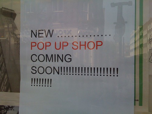
Pop-up shop is jargon which has entered (is entering) the civilian lexicon. I always find that a bit odd. Does it mean anything to anyone? Does anyone care what type of shop it is?
Pop-up shops used to be really quick, for a few days only, only for those in the know, retail experiences. Cool and trendy brands would open them is fringe areas. This year I've noticed an increase in pop-up shops in traditional retail areas by mainstream brands. Cath Kidston has called her new shops Pop-In Shops.
All this made me think about shops a bit more. It feels to me that as the longer the internet sticks around the more relevant the questions we first asked of it become. The 'death of print' is one, the 'death of the high street' is another. We were without internet recently and I had to buy a dishwasher. The thought of going into an actual dishwasher shop filled me with dread. The internet has made that such an easy experience. And crucially, when purchasing something you're unfamiliar with the internet makes you feel like you're being ripped off less than you would be on the high street. That might not be true, but in retail perception is everything.
And just like there are some retail experiences that are better online, there are days when it's better to shop in the real world than the virtual one. Christmas Eve for example.
Which makes me wonder if we'll start to see big, famous brands who only have high street shops at certain times of the year. The pop-up shop concept but slightly more permanent , regular and on the busiest high streets. Borders and HMV strike me as good examples. Everyone knows that the internet is killing the high street bookshop and record shop. Borders are in administration. That's old news. But every Christmas Waterstones and Borders are always packed. So maybe we'll see brands, old brands I guess, that exist all year round but massively ramp up their high street presence at certain times of the year. Most of these businesses make all their profit in one quarter of the year anyway. Greatly reduced costs, same profit.
Popped up not propped up.
Apple had a nice little promotion running over Christmas. They made an App which launched on Boxing Day and 'ran' for the next 11 days.

Every day the App gave you a free gift from iTunes / the App store. Songs, videos, films, games and apps.

The app looked really nice. They managed to pull of that lovely American Christmas graphic style really well. Seriously, that's not easy to do. Hard enough in print, even harder on a device.


The animation was good. And the gifts were of a good variety.

I found myself opening the app every day to see what the gift was. Some days I even opened it up at midnight. I looked forward to opening it up. Which makes me wonder if making Apps that have something that makes you keep going back to them if the marketing challenge for 2010.
The gifts were good. I got a Robbie Williams video, a Foo Fighters video, Peter & The Wolf film, a Golf game, a Trivial Pursuit game and some other stuff.
Nicely done.

If you read this, "The future as it happens" purely as a piece of copy, typed on a sheet of A4, black and white with no design whatsoever, you would probably assume it means "the future at the same time as it occurs".
Given the nature of the publication it is advertising you would assume it means the "the future reported at the same time as it happens".
However, the typographic treatment pictured above implies it's being said by someone with a heavy Essex accent which gives it a different, less dynamic meaning altogether.
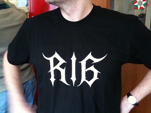
One of the reasons for starting RIG was to do things. To do the things everyone talks about in meetings. To experiment. And so using a 3D printer we made these Datadecs at the end of last year.
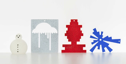
They're Christmas decorations based on individual social network data. So the size of the head on the snowman represents the number of Twitter followers you have. The silver cloud shows miles travelled per month on Dopplr. The red one represents monthly scrobbles on Last.fm. Blue, the apertures you've used over the year on flickr.

We made around 40 sets and sent them to friends of RIG.

Andy Huntington helped us with all the physical 3D printing stuff and he's written about that over here. He explains more about the data and the difference techniques used. Read it, there's even a video.
Russell has written a detailed piece about the thought behind the project. Read it, there are even charts.

And now I'm going to talk about the colours and the sparkly bits.
Visualising data is very hard to do well. It's hard to communicate the data clearly. Matt Jones talks about making it glance-able. As you should have come to expect from Matt, that's a brilliantly effortless way of describing what success would look like.
Designing in 3D is hard. In fact designing anything that doesn't stay still and flat on a rectangular page is hard for graphic designers. That's why most web pages look so shit. But 3D is another level of hard.
It was probably the snowman that gave us the most trouble.
Here's the first attempt.

Not very snowman like. For me this unlocked a key element of the creative work. Make it more Hallmark.
It's one of those things where you should make it look how it looks in everyone's head. Which is like this.

We had hats for a while. Innocent kindly agreed to donate some of theirs, but in the end they didn't make the cut.

We had changeable parameters to consider, but we were able to work with that.

As I've mentioned before there's nothing worse than a Christmas designed by designers. Christmas should be left in all it's gaudy uncoordinated glory. A good designer should recognise this.
Dopplr is a cloud because we're gently referencing CO2 usage. Originally we wanted to use Dopplr's CO2 data, but that was too hard. The other decs take colours from the host brand, Flickr is blue and Last.fm is red. But they needed glitter. So we added glitter. By hand.

It seems to me that there are 3 aspects to these projects. The idea, the production and then the dispatch. All of those things are hard, but the dispatch especially so. What size box will they go in? How will they arrive unbroken at their destination? And the unboxing. The unboxing is crucial.
Video from Toby.
Which is why we asked a friend of ours Russell Duncan to photograph the decs properly and why we designed this card to explain the project and so you could see all the data next to each other.

Picture from Foe.

This picture from Iain shows how glance-able they are.
I think that's about it. We made something trivial, playful and unimportant using data and 3D printing. We learned lots. And I feel like we're further along a path than we used to be, which is the goal.
There's more if you're interested; people have been writing about them on the internet Beeker, Julian, David, Dan, Anne, and Iain.

Picture from Anne.
Credits

Andy Huntington who did all the 3D data stuff.
Russell Duncan who took the official pictures at short notice.
Ravensbourne College who explained and demo'd all sorts of 3D printing and rapid prototyping for us.
Innocent for donating 40 hats.
James who made The Art of Penguin Science Fiction website has made another corker.

As he says:
I’ve admired the Op Art-inspired covers of these books for a long time, so I finally contacted some of the art directors and cover artists that were involved in the series and wrote the story of the books, which has just been published as The Shape of the Century in the latest issue of the graphic design magazine, Eye:
www.eyemagazine.com/issue.php?id=170
However, the website goes further, and tells the story of the Fontana Modern Masters from the 20th-century abstract art that inspired the covers, through to the 21st-century art by the young British artist Jamie Shovlin who, in turn, was inspired by the covers.
I’ve also signed a deal with HarperCollins (which bought Fontana some years ago) to produce a 'retro' fine art print of all 48 covers in the series which will shortly be going on sale in design shops and museum shops, but is also available via the website.
Lovely stuff. And available as prints too? Very smart.
UPDATE: The url was incorrect, here's the correct one: http://www.fontanamodernmasters.org/
More soon.
Shame.
Oh well.
The entire NDG team are spending Christmas in a house without internet, so that's your lot for now. Thanks for listening, have a great break.

Some of my favourites tweets from 2009. You're a funny bunch.
london bridge was so packed I was like is that a t-mob advert or flash mob. Then saw the board all trains delayed.
Great stat - Spotify has spent less than £5,000 on marketing (advertising) in the past 3 years
Reading a classic design brief: "...a cross between Innocent Drinks and the Obama Campaign"
Nokia products say "Made in China" on the back. Chinese-made Nokia-knockoffs say "Made in Finland."
I gather a repulsive nobody writing in a paper no one of any decency would be seen dead with has written something loathesome and inhumane.
"Blew up the moon, and won the Nobel Peace Prize. On the same day, bitches."
"Oh daddy, I forgot to tell you. I left your harddrives outside on the patio last night. Is that ok ?"
About to go through Lockerbie. As in the place that got bombed..
One word pissed off
Tot up all you get for your licence then ask Sky how much they'd want for it
cv finished. depressed.
[insert grumpy emo tweet here]
Right now yoga is done it is time to get Mum pissed.
Digital Dudes rock. But hate being called Digital Dudes.
I'm doing some 'research' have just seen some great copywriting on their website: 'Click here to enter Girls Aloud'
Cycling behind Boris Johnson. He's on his fucking phone.
Getting the feeling The Economy is a big, mystery machine, & the Bank of England just goes, "Well that button didn't work. Try this one."
Back in January I noticed Mike Migurski had started using a tag on delicious called everyoneiknowisdoingawesomeshit.
Mike works for, IMHO, the best design company in the world right now, Stamen. Based in San Francisco they do all the work you all talk about in meetings. So it's it's interesting to see what Mike bookmarks. To save you the trouble of going to delicious, here's a list of his everyoneiknowisdoingawesomeshit bookmarks for 09.
The View from Above: Custom Aerial Imagery for OSM
Humanising data: Chernoff Schools
Immaterials: the ghost in the field
Analog Voronoi Grid Distortion with Magnets
Maps as service design: The Incidental
designswarm thoughts » Blog Archive » Traveltag or how we thought of mapping in 2005
Six Questions from Kicker: Jack Schulze
Oakland Fucking Rules (Blogs and Local Reporting)
Digging, Or The Importance of Creative Throughput
"You guys are moving on this stuff too fast!"
My first Cloudmade map style: "Lynchian_Mid"
24 Hours of Geotagged Photos on Flickr
This Happened, Really Interesting Group
Looking toward EveryBlock's future
All the ephemera that's fit to print
How to make a newspaper out of blog entries
The Renegades at the New York Times
the most fun Ben's had all year
This year saw several new articles to back up my strategy of "Good design is as little design as possible". Dieter Rams said that, not me.
There's currently a Dieter Rams exhibition on at the Design Museum and accordingly there's a whole raft of interviews on the web, which is a good a time as any to review his 10 design principles. They're all great, but "Good design is as little design as possible" is the one that's closest to my own personal design philosophy.
Often, more design gets in the way. Often, more design doesn't help, it merely adds more problems. The trouble with this philosophy in a job where you get paid to design is that people think you're shirking the working. Or that you're trying to get away with doing very little.
This isn't the case.
As Rory Sutherland (again more eloquently than I) points out, "the problems arising from excessive intervention – because “we must be seen to do something” – outweigh the benefits." In July he wrote a brilliant article about the perils of intervening because you have to justify your existence. And in the way only Rory Sutherland can he cited the examples of the many people with personal physicians who die young.
"I can imagine what it must be like to be a personal physician. Every day you must feel you have to do something to justify your existence. Yet, in truth, most of the time people are better off being medically left alone most of the time. And most illnesses may be best treated with rest and a little warmth."
It's a brilliant article, well worth a read.
To further elaborate on my point eloquently read this article by Michael Bierut. As I pointed out earlier in the year he lists several pointers to being a successful designer. Here are the first three.
1. Keep it simple.
2. Don’t reinvent the wheel [Part 1].
3. Don’t reinvent the wheel [Part 2].
Can you see a pattern building?
Good design is as little design as possible. The problems arising from excessive intervention outweigh the benefits. Keep it simple. Don’t reinvent the wheel
Very eloquent.
We've already mentioned the EU Organic logo competition, what else caught our eye in the murky world of identity and branding?
Early on Creative Review featured Mr Chicken. He's the chap who designs all the Fried Chicken logos in London. Amazing stuff.

Coke continued their branding resurgence with these great summer special edition cans. Big corporations listen up: THIS IS HOW YOU DO BRANDING.

Michael Bierut tweaked the Guitar Hero logo. There's an element of 'you couldn't make that up' isn't there? Looks great though.

Another example of 'how to do branding' from a designer at the top of his game. I could easily have mentioned The Oak Room or continued work for MAD.

London went a bit logo mad including the dreadful experience of trying to create a Brand for London. When will they learn, the city doesn't want or need a logo. Michael Johnson has a good round up here.

Of much more importance to London, the Olympic icons were launched. Just as I really like the 2012 logo (sorry David) I really like these icons. Actually, I don't really like the black and white ones, but I love the colour ones and I really like the way it links in with the tube lines thing. Colourful, interesting, different. Exciting. Well done Someone.


I designed the Newspaper Club logo which you all hated and the Noticings logo which you all loved. (Actually lots of people love that one, not just you lot.)

And then right at the end of the year, because we all know heavy metal bands have the best logos we asked Christophe Szpajdel to design the new logo for RIG.


Recent Comments