Apr 19, 2012

Apr 18, 2012
Android brand guidelines
Meant to blog about this ages ago. Didn't. Saw this picture the other day which reminded me. So, doing it now, in note form.
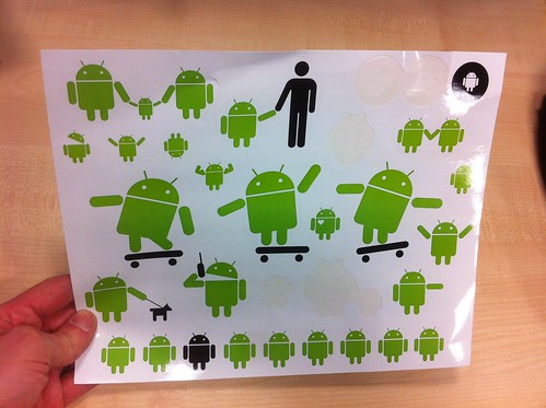
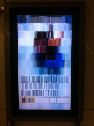
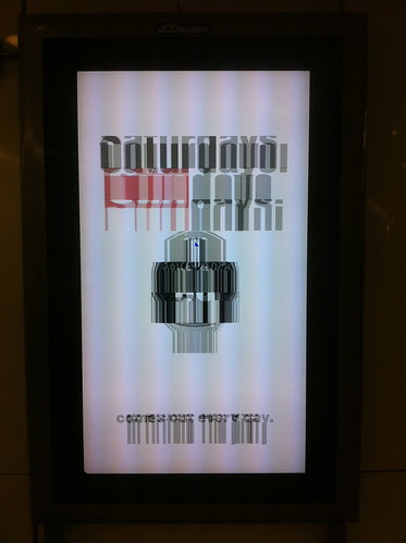
At w+k last year we did an ad for the Guardian's new Android app. We had an idea that needed us to play with that robot to work. I looked at the guidelines, they said this
"Android Robot - Can be used, reproduced, and modified freely in marketing communications."
Isn't that brilliant? Brilliant that they explicitly say "Can be used, reproduced, and modified freely".
I have talked to people before about open source brands, something where modification is encouraged. But normally people are too scared to do it. (And you need a big enough brand for it to work.)
Let's be clear - this wouldn't work for every brand. Some brands need really strict guidance and rules. But it's great to see Android taking this approach. Especially given the ecosystem of apps / device etc etc
Here's the ad. A full page press one and the banner mpu which is kinda cute. Note no ugly handsets, there are so many of the app ads these days that flicking through a newpaper can feel like looking at a Carphone Warehouse catalogue. Also notice no huge flash saying - NEW APP - we felt the robot was strong enough to say that as we're only advertising to Android customers and they'd been asking for a Android app for a while.


Breaking Davies's 3rd law
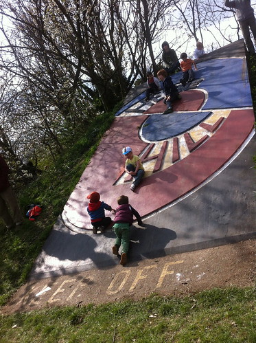
"if you make something that looks incredibly climbable, you shouldn't be allowed to say people can't climb it... especially if it's an entirely decorative thing. You should either make something actually climbable, or something that doesn't look climbable."
Apr 17, 2012
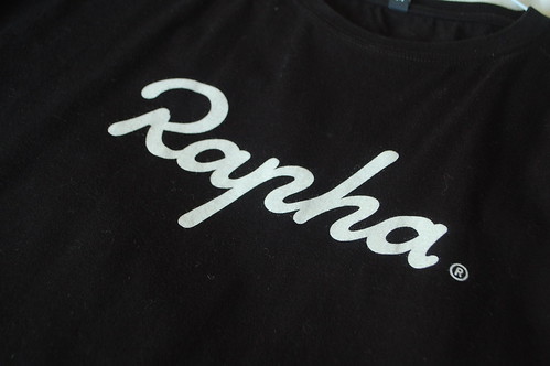
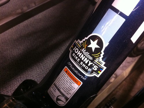
Rapha and Mellow Johnny's logo love
I love the Rapha logo. Amazing craft in the hand drawn type. The curves and proportions are gorgeous. Luscious and rich and yet simple. Beautiful.
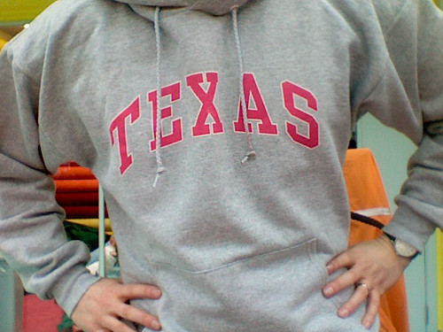
The other week we visited Lance Armstrong's shop Mellow Johnny's in Texas. I bought this tshirt.
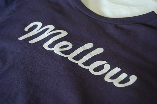
It's not the Mellow Johnny's logo, it's just a graphic on a tshirt. Similar to the Rapha one, isn't it.
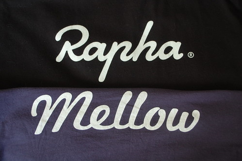
An homage, maybe? I'm not complaining. They're both good brands and they both look great. I'd like more stuff like this.
Interview with me on It's Nice That
Talking about the GDS Design Principles over here.

Apr 16, 2012
I based our new bathroom on my Nike ID trainers
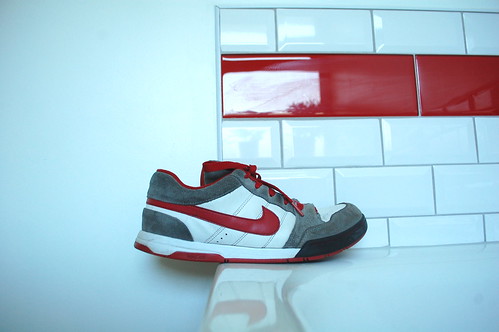
We've just fitted a new bathroom. And I based the colour scheme on a pair of my trainers which I created with Nike ID two years ago.
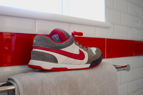
Personalisation + graphic designers = endless possibilities. And ever escalating Design Disease.
Apr 02, 2012
Visualisation of linked pages within GOV.UK
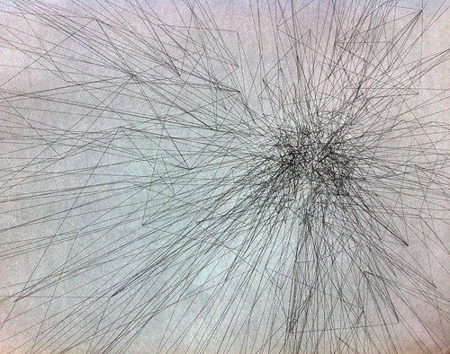
Not by me. But looks cool.
Mar 26, 2012
Three things that annoy me
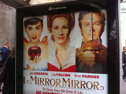
1. It's well known that in Hollywood studios and agents fight over who gets top billing on a film. Essentially whose name is at the top of the bill. Or these days whose name comes first in the opening credits. It also translates back to the film poster, the equivalent of the 'bill'. So you'll always see the biggest stars name first on the poster. But visually, the picture of the biggest star may not appear first. In fact the biggest star may appear in the centre because that's where, visually, the most important thing often goes.
So you often get the scenario depicted above where Julia Roberts' name is not underneath the picture of Julia Roberts. In fact you could be forgiven for thinking that Julia Roberts is the young dark haired lady on the far left and that the older red haired lady in the middle is called Lily Collins.
Look out for this. You see it all the time on movie posters. Often you see a male name under a picture of a female. Because the two decisions, who gets top billing and which picture goes where on the poster, are taken in isolation. Politics getting in the way of the punter understaning the communication.
- - - - - - - - - - - - - - - - - - - - - - - - - - - - - -
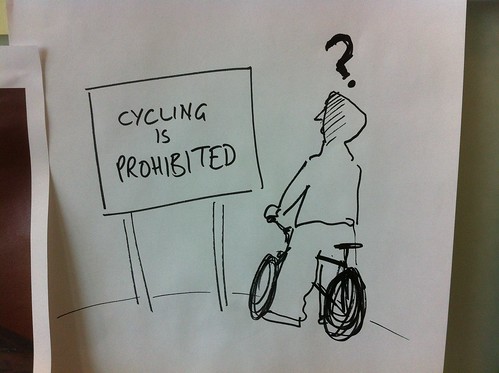
2. This really annoys me. When people use language that makes sense to the creator of the piece of communication but makes little or no sense to the intended recipient of the communication.
Like in this example. How many of the kids in hoodies riding through the park on low slung BMXs do you think know what prohibited means?
OK, they may know what it means if they stop and think about it. But is it commonly understood language aimed at them that they can understand instantly?
- - - - - - - - - - - - - - - - - - - - - - - - - - - - - -
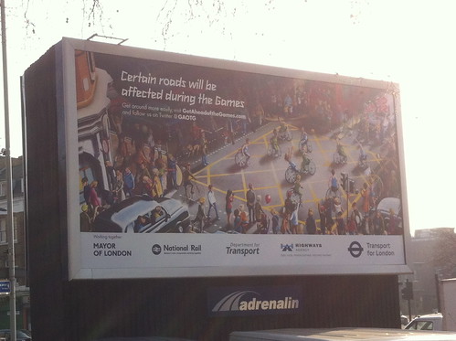
3. Too many logos. I'm not against logos. But I bet what's happened here is that everyone of the these agencies has contributed to the cost of this ad and so everyone of them wants their logo on the ad.
Why? So they can prove to their boss that something has been done.
But the end result is meaningless for the reader, the user, the punter. The man on the street needs to know that this is an official piece of communication and not something by Coca Cola or Persil, so it needs a logo and probably the 'highest authority'. I'd guess at that being TfL or Dept for Transport. If it were me I'd go with Tfl. And that's it.
As we say at GDS you shouldn't need to have to understand how government works to be able to find something out. That same rules applies here. The punter doesn't care about the Highways Agency or the National whatever.
- - - - - - - - - - - - - - - - - - - - - - - - - - - - - -
You see these three things all the time and they annoy me.
Mar 19, 2012
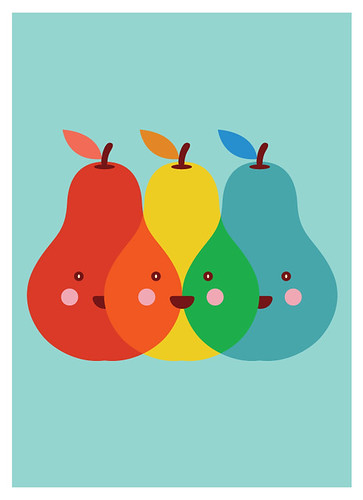
The Happy Pear Project
OMG I love these.

Yeoh Gh's illusrations of Mr. Pear are brilliant. So refreshingly free of laboured meaning. Just a little pear having a few laughs. Or as Yeoh says, "I want to bring joy and happiness to people in this world. Happiness is one of the key ingredients for good health and peace. I hope my Mr. Pear is able to make people smile."
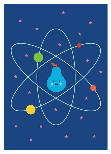
One of the things that makes it good is that there's hundreds of them. They are on Flickr and you can buy prints from Etsy too.


Mar 16, 2012
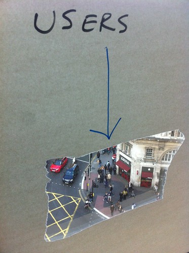
USERS
I had coffee with David The Designer the other day. He's a smart man.
He told me that he'd always thought people in Govt departments should be made to sit with their desks facing the windows, so they can look out and see the people they are working for - everyone.
I like that idea. It stuck with me. And yesterday I made this. I might make another one, vinyls or something.
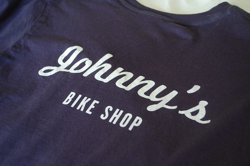
Lance Armstrong's bike shop Mellow Johnny's
Also from the Texas visit; Lance Armstrong's bike shop so called because one of his nick names was Mellow Johnny (from maillot jaune, French for yellow jersey).
It was great. A bit like Look Ma No Hands, but bigger and sunnier.
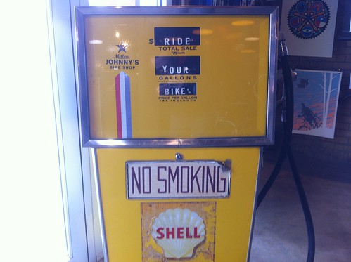
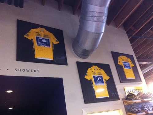
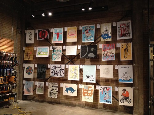
There was a great exhibition of cycling prints but I din't manage to get any decent pics. There's more detail over here.
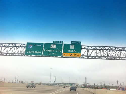
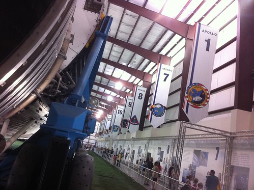
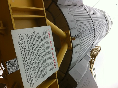
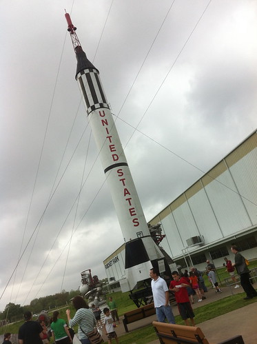
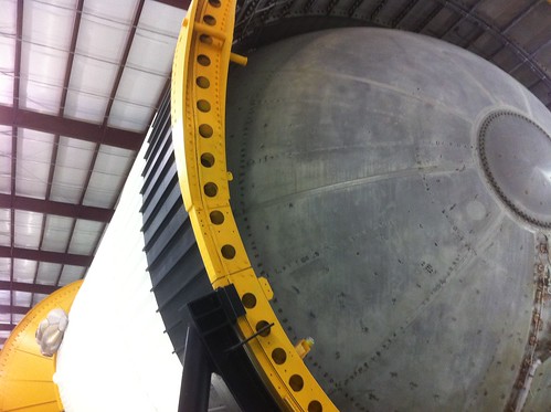
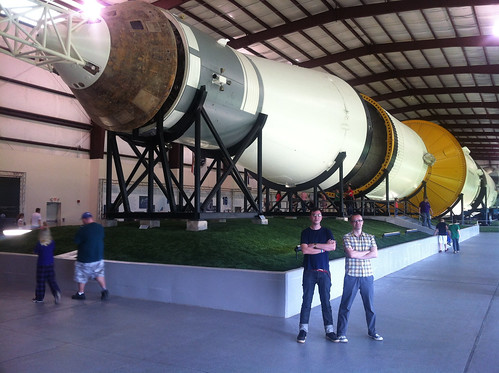
Lyndon B. Johnson Space Center visit
On the way home from SXSW we popped into the Lyndon B. Johnson Space Center, better known as Nasa Mission Control.
It was good. Amazing to think of the history.
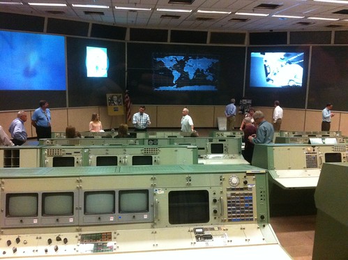
But it was also quite sad. Whilst the stuff (Saturn V, mission control room) is incredible the actual museum stuff is a bit tired and tatty. I know we're not there for the quality of museumography but it really felt symbolic of the whole space programme.
Everyone also says that the moon landings were a triumph of science, or engineering - and they were. I've always thought they were also a triumph of politics. It shows what can happen when the political focus is shone, fiercely, upon any particular area. Sure it needs the engineering and science as well (obviously) but it was the politics, namely the Cold War, that got the project off the ground.
Anyway, this isn't a space blog. (This is though.)
My point is that now the political focus has moved on; there is no longer a space race to be won, there are no longer votes in space exploration and you kind of sensed that from the tiredness of the visitor centre. It felt like a dusty old museum that we visited to remember a glorious past.
Still good though.
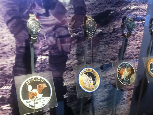
And Nasa have great colours. And awesome patches and watches.
Mar 14, 2012
SXSW, the new aesthetic and commercial visual culture
I was on a panel on Monday, at SXSW. It was called The New Aesthetic: Seeing Like Digital Devices. And it was organised by fellow RIGster James Bridle. People seemed to like it. it was the most fun I've had speaking for ages, partly because I got to play a James Bond video but mostly because I was doing it with Aaron, James, Joanne, Russell and Kevin.
We all talked about different aspects of the New Aesthetic and my job was to talk about how it affects commercial visual culture. I deliberately called it that because I don't just mean how it affects advertising or graphic design, I mean all aspects of commercial art including stuff like the cinema. It's extremely short as we each had 10 minutes or so. You could talk about this for ages, in fact it could probably become a book.
I started by explaining how commercial art is such a hungry culture it constantly demands new ways of looking at things, which is why they're always looking for what's novel. For example in the 70s the cool, novel thing was the space race which is why you got hundreds of ads and logos and album covers that had space in them for no reason whatsoever. Like this ad for mashed potato in a tin.
I showed some other examples of this and then I talked about the worst, most tenuous example - Moonraker.

The Bond series is very good at rebooting itself but this one is a clunky film, it doesn't fit with any of the others in the series and the space stuff really jars.
One of the big problems (term used loosely) in visual communication over the last 15 years (or so) has been how to visualise the network. It started with telcos, moved through dot coms, mobile phone brands and now it's data. How do you visualise all that cool internet stuff? It's a lot easier to represent space than it is internet.
So then I showed this Argos ad, the one where everything is pixelly. You can see what they're trying to do here. Argos is a catalogue / warehouse business and it makes perfect sense that they could shift the catalogue bit online and you can see why the marketeers would try and get the business repositioned as one of those cool dot coms.
There are loads of other examples, and then there's the Data Baby (who was very popular).
If you're reading this and you're from an ad agency you'll be thinking 'they don't work because the ads aren't very good, whereas the Smash martians is a brilliant ad'. You're right that the ads aren't very good, but you're missing the point. This isn't about whether the ads are good or not, I'm just showing how visual prfessionals aren't interested in how these things work, they're just interested in the aesthetic of the novel thing. Which is fine. Neither good nor bad. Just a thing.
I actually think the data jelly fish are cool. Nice AE work. Wrapped around a new born baby it feels extremely weird, but that's not the point either.
And where all this ends up is things like QR codes - all the novel aesthetic and none of the understanding about how this culture works. Therefore we get stuff like this.

This is when Pepsi started running some QR code competition on their cans. This sort of makes sense as a formula in a brainstorm; big brand, partner media in The Sun, glamour model holding/ wearing/ wrapped around the novel thing. Except when you see it, it doesn't make any sense at all.
In fact, it makes about as much sense as a man wearing a tuxedo under his spacesuit.

And that's an abbreviated version of what I said. Note I didn't talk about the graphic design of the new aesthetic or anything like that. That's for another day. Or maybe never.
Mar 10, 2012
Mar 05, 2012
Maybe the building got slightly damaged?
Come out of our office, turn right and keep walking down the Kingsway. Eventually you'll walk past an LSE building and you might notice this odd thing.
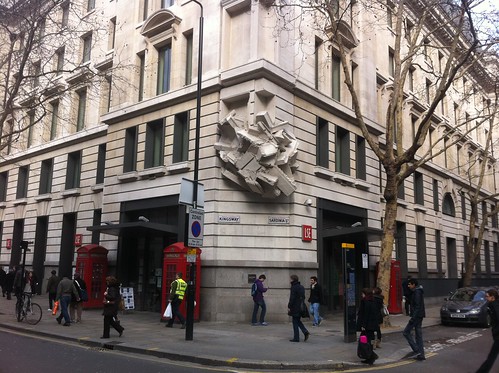
It looks like a giant has crunched up the corner of the building. Or maybe the building got slightly damaged when it was delivered by Home Delivery Network. Or maybe it's some damage from the war?
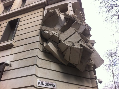
I love it. Its mixture of subtle and dramatic is wonderful. It's so unassuming you could easily walk past it and yet if you stop it's so bizarre you wonder how you've never noticed it before.
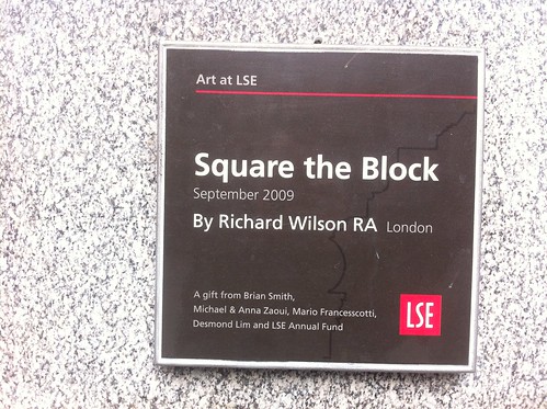
It is, of course, art. But don't let that but you off. It's called Square the Block by Richard Wilson RA and the website doesn't really make much sense, "At the corner of Kingsway and Sardinia Street stands a vertical manufactured corner of a building located in the space offset marginally from the chamfered end wall."
Anyway. It is ace. Reminds me of this.
Mar 01, 2012
Yes, I'm going to SXSW this year
Before we start and to be clear: I'm attending on my own time as a holiday, paid for by myself.
Yes, I'm going to SXSW this year. A few of us from RIG are. We're speaking on Monday about the New Aesthetic.
I'll try and not get pulled over by the police this time.
The best thing about SXSW last time was the chance to have a beer with people I don't get see very often, or people I only know from the internet. If that's you, get in touch. It would be nice to say hi to some folks.
If you're interested in what GDS or GOV.UK is doing (or what you think GDS should be doing) get in touch too. It would be nice to chat to you as well.
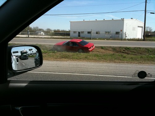
If you're the owner of this red car get in touch as well. It would be nice to go driving again.
Feb 27, 2012
Gorgeous ceramic gradient cladding
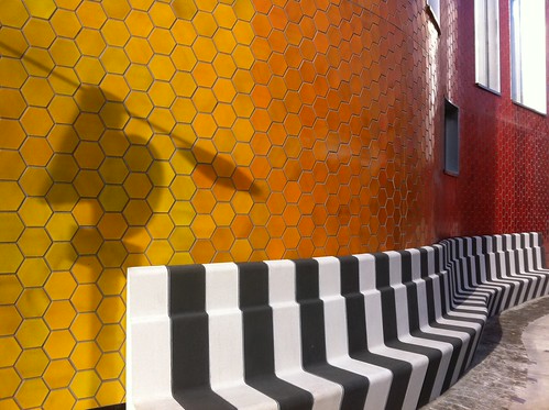
This building has appeared in Walworth behind the Elephant and Castle.
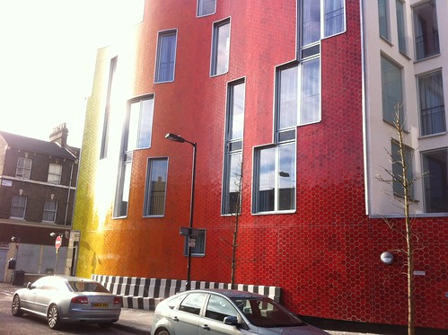
These coloured tiles look gorgeous. And they're ceramic too which gives them a sensible robustness most building cladding doesn't have.
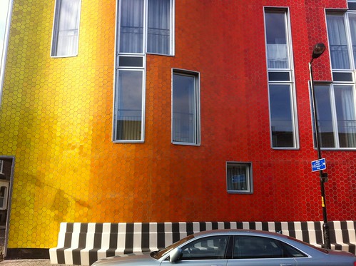
I love the way they merged the colours in a pixelly way. It gives a must nicer gradient than a straight vignette would. The black and white bench is a nice touch too.
Lovely.
Feb 21, 2012
Type nesting
Really lovely. Sent in by some planner down under.
Recent Posts
- Years in the domain, like tears in the rain
- Printing is still too hard
- No innovation until everything works
- "They'll be dancing in the streets of Total Network Solutions this evening"
- It was a pleasure
- Public Digital has won a King’s Award for Enterprise in International Trade
- Kids describing fashion ads
- Art at Mount St Restaurant
- Post match squeeze
- Unbelievably tickets are still available
Recent Comments