Branding, tone of voice, lightness of touch, charming, humour etc.
Good.
Branding, tone of voice, lightness of touch, charming, humour etc.
Good.
Hi, it's been too long since we talked about work, my work. Some updates.
I am delighted that GOV.UK is nominated in the digital category for the Design Museum's Designs of the Year. We made a few things for the exhibit and I wrote about it on the GDS blog.
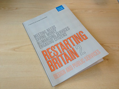
There is a parliamentary Design Commission and they have written a good report about design in public services. Something I'm obviously interested in. It speaks favourably about GDS and once again I've blogged about it on the work blog.
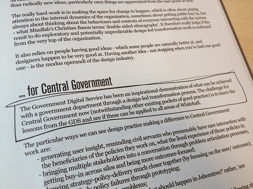
Questions about that report in parliament are what led to Francis Maude talking about user needs, which I blogged about t'other day.
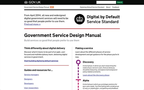
Last week we laucnhed the Government Service Design Manual. It's similar to the Design Principles but much wider. It covers words, open source, building a team, agile and lots more.
If I'm honest the design stuff is a bit thin, I need to add more, or you can grab the code on GitHub and suggest changes yourself. Make it better.
A beta of the digital service standard to be applied to all UK Govt services by April 2014 bit.ly/YbDLqH US should do this too
— Tim O'Reilly (@timoreilly) March 14, 2013
A few weeks ago I was in Cape Town speaking at the wonderful Design Indaba conference. That deserves a whole blog post on it's own, so I'll do that soon. Incredible conference, wonderfully organised.
I spoke at the Design Council on Tuesday where I basically made a plea for "less reports, more delivery" and I'm speaking at the RCA next month as GOV.UK is featured in a Helen Hamblyn exhibition of 20 Inclusive Design projects.


It will be summer soon.
The kids are doing brilliant in their piano exams.
The dog is still with us, but getting older every day.
Joan has taken up croché.
I hope you have a great Easter.
Art direction. We spoke about that along time ago. Nearly 7 years ago - remember?
I keep seeing these two posters around town, one is an example of bad art direction, one is an example of good art direction.
First, the bad.
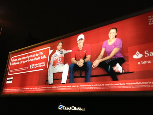
You would think these ads would be a gift for any agency. They feature three hugely recognised sports stars. Rory McIlroy is probably the most famous golfer on the planet, after Tiger Woods. Jess Ennis is stilll basking in the glow her amazing Olympic performance. (And Jenson, bless.)
But who on earth decided to put Rory in a red polo shirt? On a red background! I'm guesisng the red background is a standard brand thing for Santander, in which case someone has to ask Rory to wear or different shirt. Or, more likely, provide him with a different shirt on shoot day.
And Jess! Star of the Olympics! Inspiration to a nation! Who put her in that purple? Which is redish and doesn't really stand out from the red. Both of them just blend into the background.
From a distance its really hard to notice them.
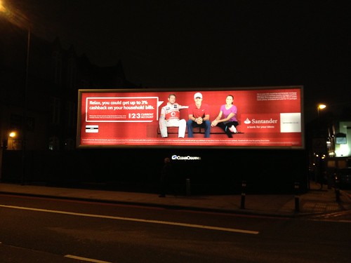
It's lazy art direction. Bad.
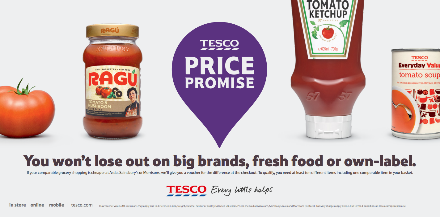
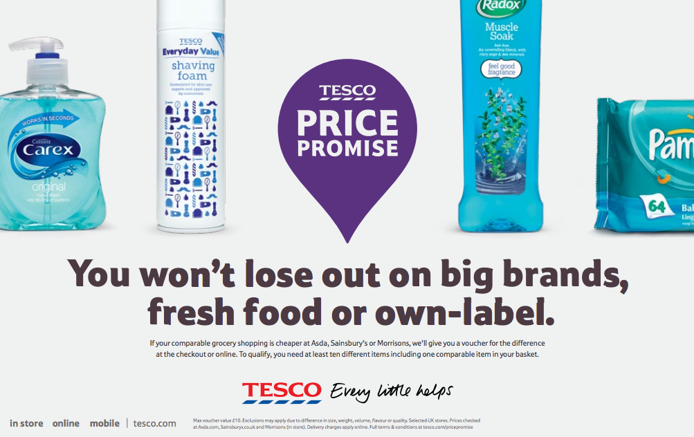
Now here's the good. Disclaimer, this is done by my old agency.
These ads don't feature any glamorous celebrities. They're pretty straight retail ads. The feature groceries. Groceries. Yet the art direction is exquisite. Crafted. Considered. Clever.

There's a whole series of them and the way they're based on the colour spectrum is beautiful. It makes my design disease heart leap for joy. Such a simple idea. The use of the slightly off white colour is well thought out. The lighting and the typography creates the feel of the checkout in an elegant way.

But they're cleverer than that. All the ads feature something big brand, something fresh food and something own label, which is the point of the ad. Not just beautiful - smart and communicating a message. Brilliant.
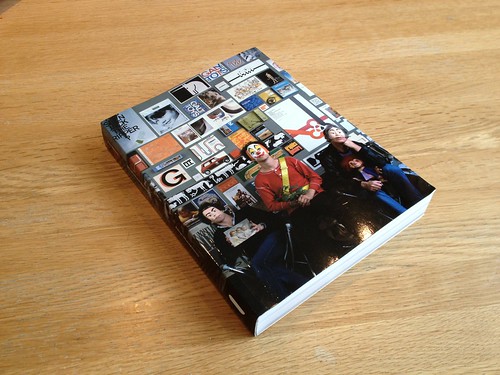
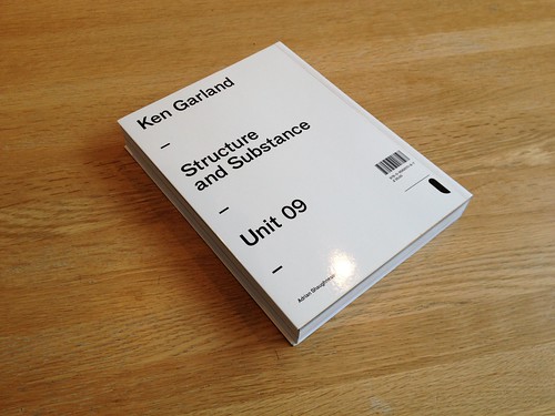
I just finished reading this book on Ken Garland, from Unit Editions.
It's really good. Garland has lots of good work which is illustrated well, and he's a very interesting person which is also handled well by the lengthy interview. Unit Editions continue to make good graphic design books.
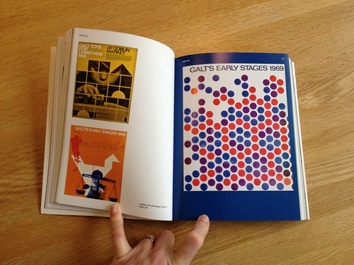
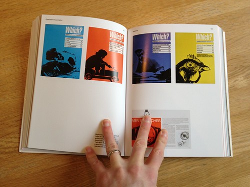
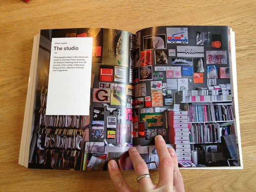
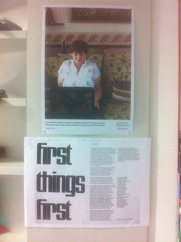
Garland is most famous for his First Things First manifesto, even though there's much more to him than that as the book is testament to. The First Things First manifesto is interesting to me in my current job for obvious reasons.
Worth buying the book.
More details on the Newspaper Club blog.
I'm guessing all the writers were away that day.
Diddy got the New York Magazine logo tattooed on his arm.

Graphic designer Rick Slusher spotted this and complemented Michael Bierut on his Facebook wall.

To which Michael replied.

Which is, of course, BRILLIANT.

From a book on Churchill, who quoted this when asked if he would consider a "safer" course of action to the radical one he was proposing.
You can read more here

At the very end of last year government departments announced three big transactions they were going to transform digitally, with some help from GDS. That's what we call the Government Digital Strategy.
You can see what each department has agreed to do here.
There's some big stuff in there, putting the Log Book online, Self Assessment, Land Registry. Projects that will make a difference to millions of people in the UK. It's one of the reasons why being at GDS is so exciting right now.
Each department is going to have a slightly different approach to how they do these transactions, but one of them has already made a start. Ministry of Justice are setting up a digital service division and are hiring designers and developers. Read more about that here. You won't be working AT GDS but you will be working WITH GDS.
If you're interested in the work we've been doing at GDS. If you like our Design Principles, if you want to work on huge public sector design projects with the scope and ambition to affect millions of people, you should apply.
Oh, also, MoJ have this funky sculpture in their atrium.


"But he knew there was a fight to be had, and that designers had to move away from self-satisfied ‘smiles in the mind’ or the obsession with type as fetishised object. Or, as Nic once put it to me so eloquently:
“The world is fucked… We’re not going to kern our way out of this one.” "
From My favourite Flatlander: remembering Nic Hughes by Matt Ward.

I love this and I also love Michael Bierut's quote in the previous post. "...beset with factors with have nothing to do with design excellence. You know, real life."
The thing that annoys me most about most graphic designers is their inability to think outside of their own sphere of reference. The client, or customer, user, human, whatever, will have many things on their mind, graphic design is only one of them. A problem that requires graphic design to solve it will seldom ONLY require graphic design to solve it. It's just one weapon in the amoury. As Ken says, what you need may be less graphic design, or maybe even no graphic design at all. Something else. Or as Michael says, "you know, real life."
This also references (at least) two our Design Principles. Do less and Do the hard work to make it simple.
I guess the crux of what Ken is saying here, is that the problem with graphic design and graphic designers is that they aren't willing to say "You don't need this." And this is more than just making design simple, it's about questioning whether we actually need to do this project in the first place. User needs, if you like.
And there's loads more I could write. But, you know.
Picture taken from Richard's Instagram which is a picture of the new Unit Editions book on Ken Garland. Ken Garland, not Kenneth Grange. Both good.

"And like any business situation of any complexity whatsoever, that process may be smothered in politics, handicapped with exigencies, and beset with factors with have nothing to do with design excellence.
You know, real life."
Good. Worth a read (although I wish Design Observer was easier to read.)


Recent Comments