
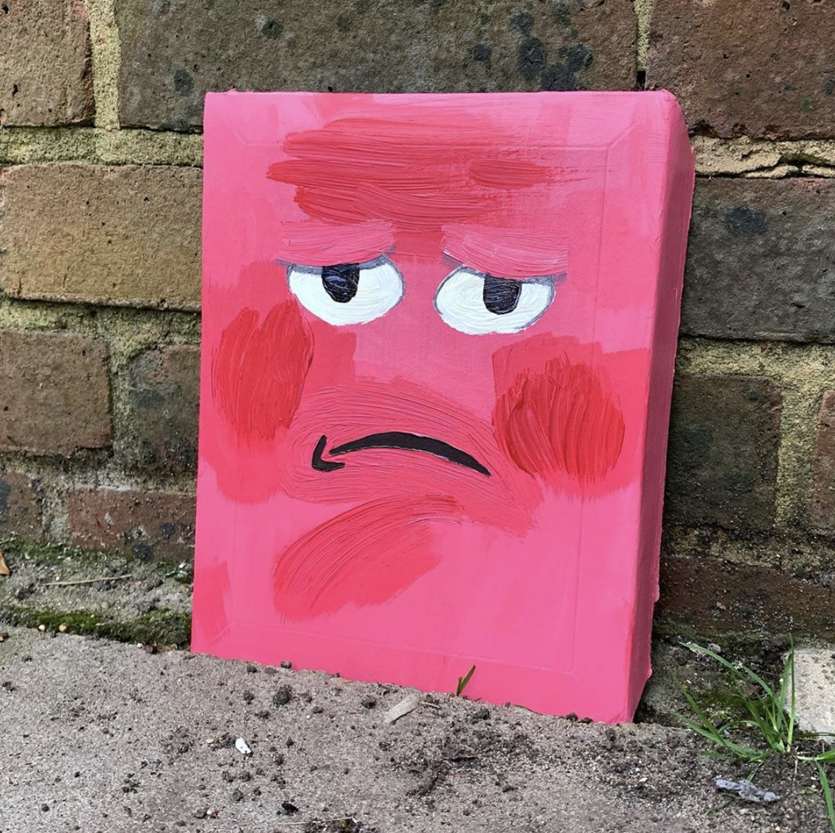
Having some fun with this project. Still not as good as Alan. @eyesonamazon over on Insta.
Aug 01, 2019
Jul 07, 2019
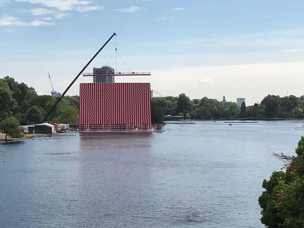
No Borders. No Carbon.

James has a point in this tweet the other day.

NASA image AS08-14-2383, taken from lunar orbit by astronaut William Anders on December 24, 1968, during the Apollo 8 mission. Image commonly known as Earthrise.
Jun 19, 2019
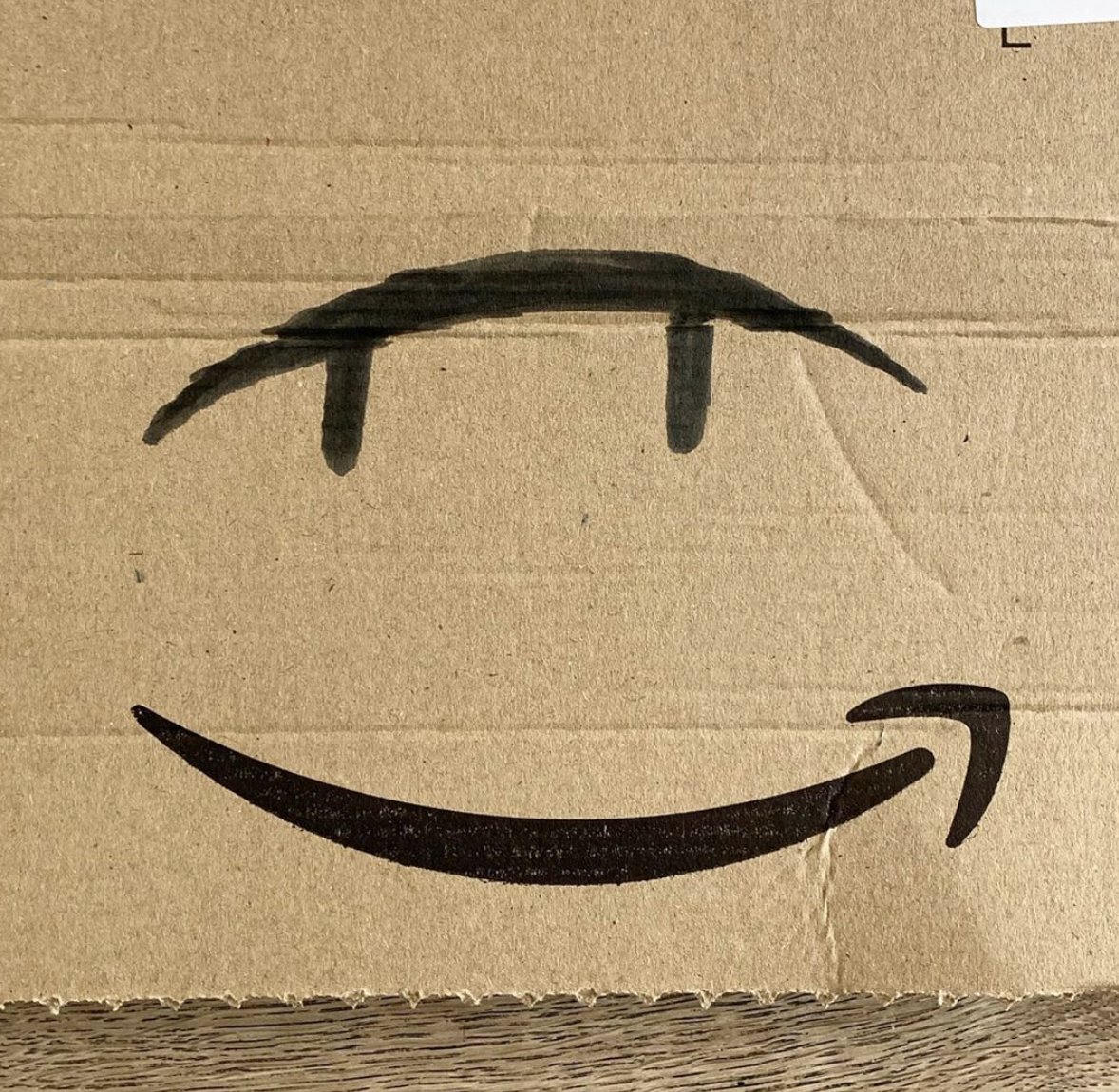
Eyes On Amazon: one last thing before the recycling bin
The other day I was looking at the recycling pile and I wondered what Alan Fletcher would have done with all that cardboard. Remember that he made these incredible animals out of rubbish he found with his grandson Tobia. Mike Dempsey has the full story here. Alan set the bar high for side projects and these ended up in the RA Summer Exhibition.

He made also lots of collages from found bits of cardboard. More of those here.

I thought Alan would definitely have done something good with all the Amazon boxes that you find in every recycling bin. The smile is crying out to to be played with.

Inspired by Alan I started drawing on the Amazon boxes we had at home. I started adding eyes to the smile. Here are the first few. Like all good side projects I started an Insta @eyesonamazon.

Worth noting that although Alan was my inspiration; whatever Alan would have done would have been far better than anything I am about to do.
Anyway.
May 30, 2019
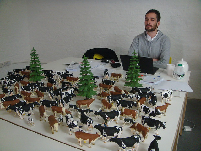
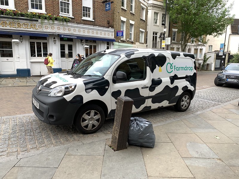
The graphic language of cows
Giles and I were talking about cows because he wrote about how he had a nice chat with some the other day.
I've always been a fan of cows partly because they are easy to talk to and partly because the black and white ones have a nice graphic quality against the fresh green grass. That's always appealed to my visual sensibilities.
Here's a good picture of that phenomenon by Guy. Lovely stuff.

All this reminded me of the magazine Pentagram's DJ Stout used to design. It was called Dairy and it featured a big portrait of a cow on the front cover of each issue. Not messing around, big, glossy portraits of cows.

I went to visit DJ Stout in 2010 when I was in Austin for SXSW. He had some of the portraits on the studio walls.
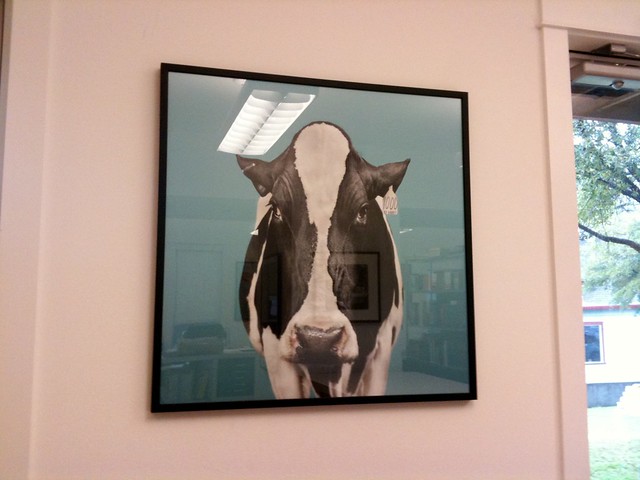
And let's not forget Matthew and his cows.
Picture by Russell
Cows, pretty much their own design system.
UPDATE:
Mayo has reminded me of Gateway 2000 and their excellent cow packaging boxes.


UPDATE:
I spotted this on the way to work and it reminded me of the Innocent cow vans back in the day when everything was nice.

UPDATE:
These bins by Hackney Council which I wrote about on this blog thirteen years ago.

I'm sure there are others. Send 'em my way.
May 29, 2019
Van Gogh and Britain review
You should go. Book in advance but beware it is still very busy. Russell only go if you can find a quiet time. Maybe first thing on a Tuesday.
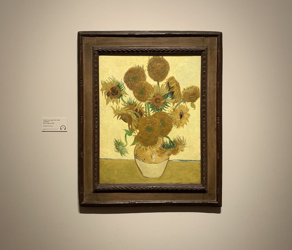
Some of the classics. The blockbusters. Which is always nice to see.
This exhibition isn't just about Van Gogh though. As the title says, but I hadn't really noticed, the exhibition is about Van Gogh and his time living in Britain and how that influenced him. So there are other paintings, prints and sketches from Britain at the time by other artists. They are very interesting but may not be what you are expecting.
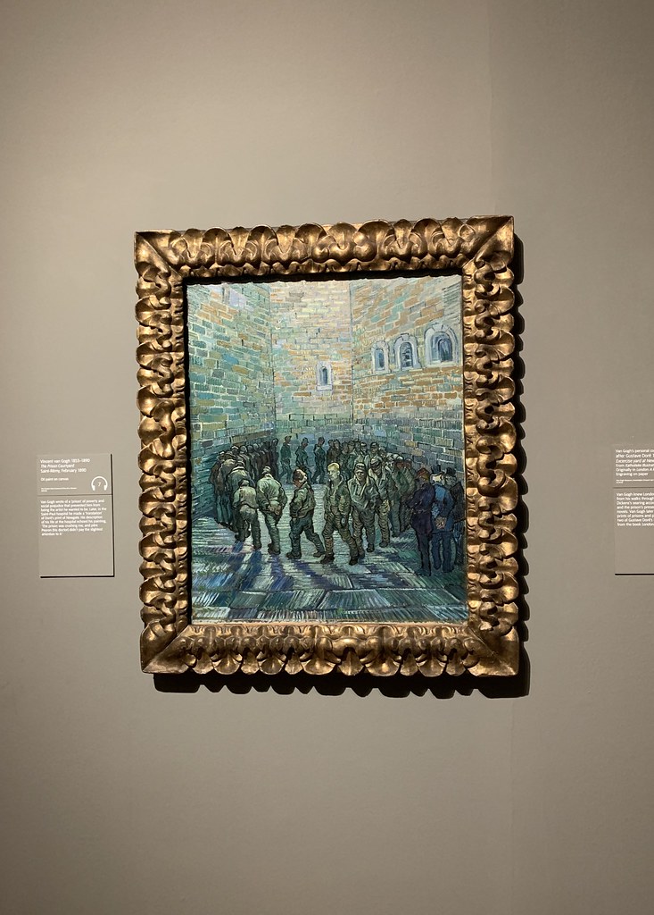
The Tate have constructed a well told story about Van Gogh. I learned more about him, which was good.
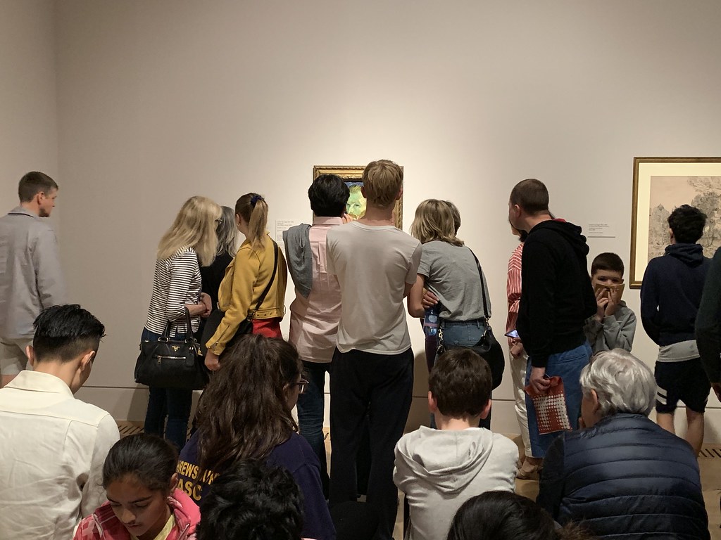
It's very busy. Of course. But you should still go.
May 20, 2019
Apr 18, 2019
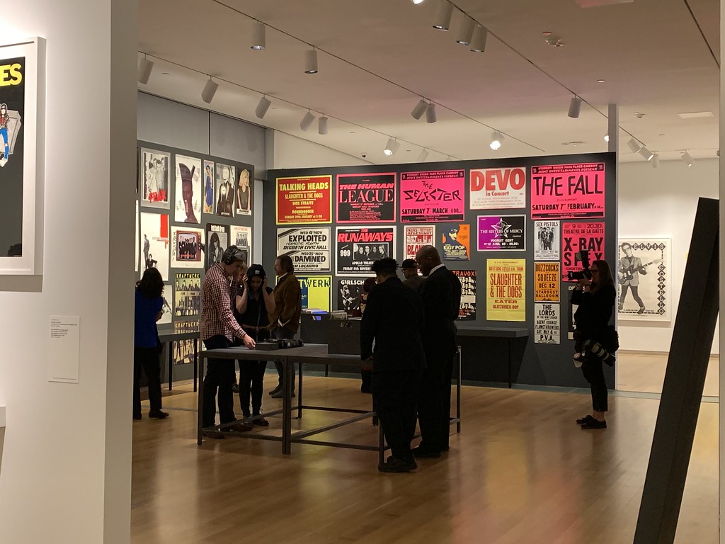
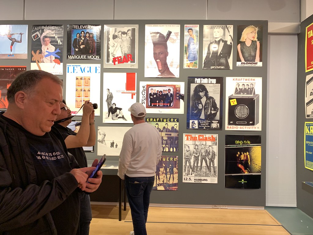
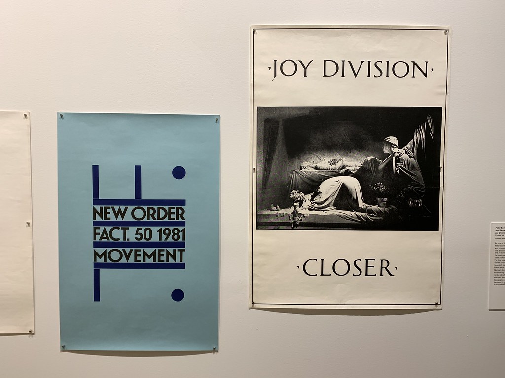
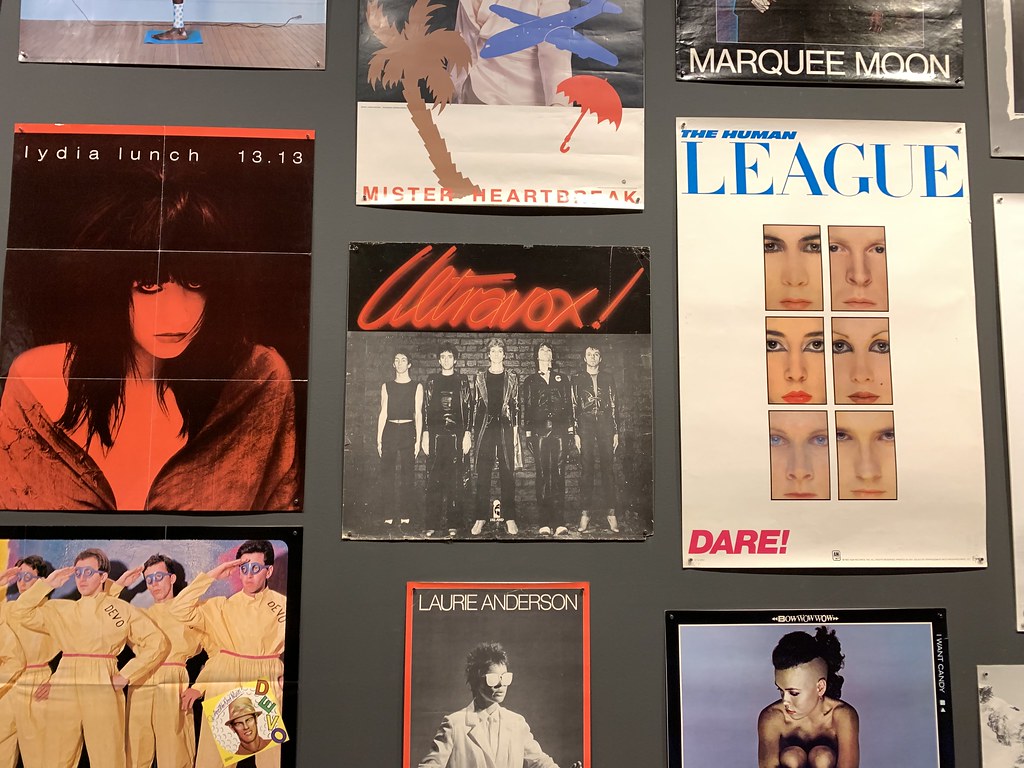
Too Fast to Live, Too Young to Die: Punk Graphics
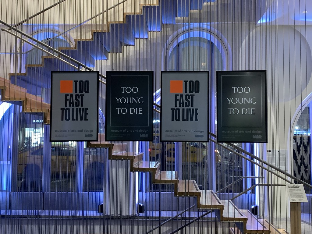
Over in New York the other day I was kindly invited by Malcolm Garrett to the opening of Too Fast to Live, Too Young to Die: Punk Graphics at MAD. If you're in New York you should go.
It's a brilliant, packed exhibition of the graphics surrounding the punk scene from the years 1976 - 1986. It's not just punk, there's a healthy dose of Peter Saville...
I really hope it comes to London soon.
Feb 28, 2019
The only good use for nostalgia
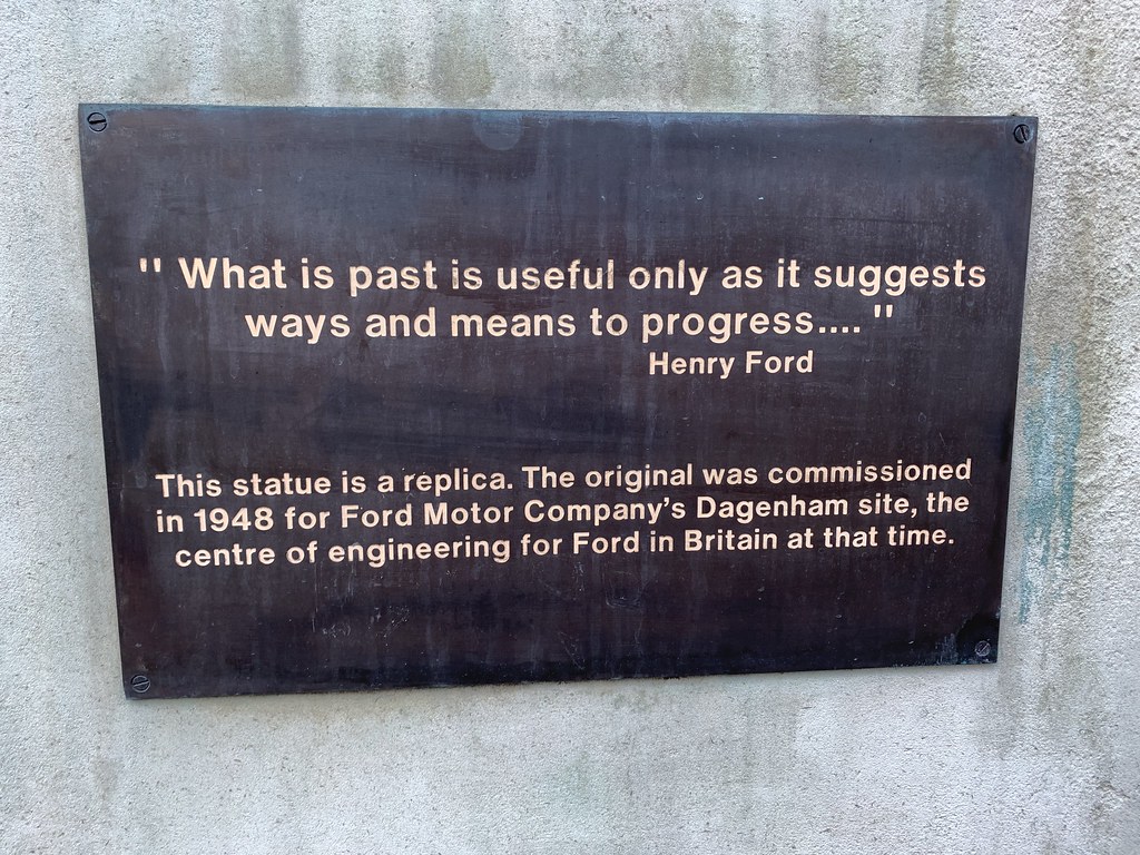
I liked this quote from Henry Ford. Only refer to the past if it helps future progress. Ignore nostalgia, learn from history.
No-one ever does that of course. Not designers, nor politicians. Too many people hark back to a rose tinted past. A biscuit tin painting version of a future. Well, fuck that.
(Phil, it's not lost on me that this plaque is from a replica of a statue which is the past copying the past and aiding no progress whatsoever. Literally a copy. Thus the medium destroys the message.)
Jan 01, 2019
Start Happy

Good advice for this year and any year. From a campaign we did at w+k with Anthony Burrill for The Guardian many, many rainbows ago.
Dec 16, 2018
Design research urls #18

88. There’s a movie made entirely of Russian Dash Cam footage found on YouTube.
Of course there is. Yet another thing you’ve never thought of but is startlingly obvious.
89. Tide designed some new washing liquid packaging for Amazon.
The official blurb says “to keep the convenience of online shopping for the consumer but reduce the overall impact of that convenience on our environment.” All the headlines scream how Amazon is forcing packaging redesigns. Easier to get in the warehouse and easier to deliver.
This flat letterbox friendly wine bottle is a much better example.
Two quick thoughts:
Retailers have always forced FMCG products to do this - remember for most FMCG companies the customer is the retailer not the consumer.
What's really surprising is that this has taken so long. Whatever next, making your website easy to find on Google?
How Amazon Now Shapes What Our Stuff Looks Like
The World’s First Flat Wine Bottle Won an Award for Packaging Innovation
90. Pentagram signed up three new partners
Three new ones since Jon Marshall joined in para 63. Astrid Stavro, Sascha Lobe and Yuri Suzuki. Stravro and Lobe are traditional additions to the Pentagram stable, but Suzuki is different. Well known for working with sound and technology. As Suzuki says, “I was quite surprised in the beginning that Pentagram approached me to join as a partner. But Pentagram wants to investigate the field of sound and interactive design. In a way, I think it’s a perfect match.” Suzuki and Marshall point Pentagram in a new, more truly multi-disciplinary direction.
Design Research urls #13 (Jon Marshall para 63)
Astrid Stavro, Sascha Lobe and Yuri Suzuki join Pentagram.

91. Meet the Humans of Flat Design
That strange phenomenon of abstracted non-identifiable humans, styled and flattened out of all recognition. Harmless and without personality, point of view or reality. You can follow the best examples on Twitter.

92. Another management insight from the Toyota Production System
Tom Taylor of Poplar discovered "Genchi Genbutsu" or "Go and See" recently. Genchi Genbutsu is a principle which states, "If the problem exists on the shop floor then it needs to be understood and solved at the shop floor." Obviously but rarely found in modern management or boardrooms full of PowerPoint. Genchi Genbutsu is also known as Gemba attitude. Gemba is the Japanese term for "the place" in this case "the place where it actually happens". Reminds me of Show The Thing and more broadly, user research.
Oct 21, 2018
Design research urls #17

83. Good advice about email
Let's start with this excellent article in the New York Times. Detailed and accurate.
84. Design Principles
There are many design principles. The internet has given them new vigour. Ben Brignell curates a good list of them on his site Design Principles.
Here are three new ones that grabbed my attention recently, The NHS design principles, the principles behind Bulb design and Lyft on Colour. The Lyft link isn't really principles but an article on how they use colour at Lyft and the tool they built to make better colour decisions easier. It's an open source colour algorithm called ColorBox.io It's pretty epic.
The Lyft Design team are worth keeping an eye on.
Bulb the principles behind our design
85. Ive interviewed in an echo chamber
I think I once said on this blog that although an interview with Jony Ive will never give away much, any glimpse behind the curtain is interesting. In this new interview the curtain stays tightly shut. As much as I like Jony Ive, Ruth Rogers, Richard Rogers and indeed the River Cafe this is an echoing interview in an echo chamber.
Still, here it is. Jony Ive on the Apple Watch and Big Tech’s responsibilities (might be behind a paywall for some).

86. Sketching elephants and other animals.
Paul Rand used to sketch a lot of elephants which reminded me of Durrell Bishop's wonderful, never-ending sketches. Which reminded me again that I must sketch more pointless stuff. Maybe I'll start something on here to force me to stick to it.
Paul Rand's Monkeys and Elephants
87. Working late, responsibly
Alice linked to an excellent blog post about working late and techniques for handling that. I was looking for an old email the other day and found this from my advertising days.

I can't really remember the incident but it's not the fault of a particular client or agency. It's the culture of the advertising industry that makes this so commonplace. It's expected that everyone will work late and that a deadline means you must work right up until that point. That's not healthy.
This article by Dan Carley is a good read and full of pragmatic, sensible advice.
Sep 25, 2018
The design of To Do lists

I think Richard Pope once asked Twitter if anyone had tried writing down things to do in a way that reflects the size of each task.
I used to do that.
I went through a period of writing a To Do list and putting everything in boxes that reflected the size of the task. I looked back through some old notebooks trying to find evidence of this. Inevitably I couldn’t find one that exactly matched my memory, but here’s what I did find.
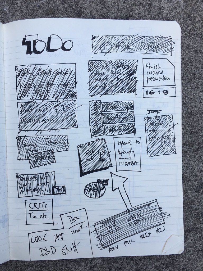
I used to try and write small things, like remembering to email someone, in a small box. And bigger tasks, like writing up End of Year reviews, in a bigger box. My thinking was that if something happened like a cancelled meeting, I could quickly look at the list and see the small tasks that could be accomplished in 20 minutes. In my memory there more variation between the small boxes and the big boxes. Maybe that has something to do with my hand writing.
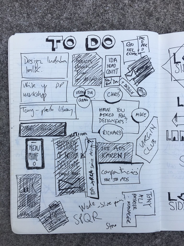
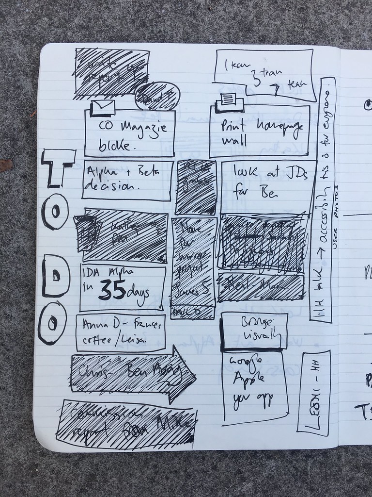
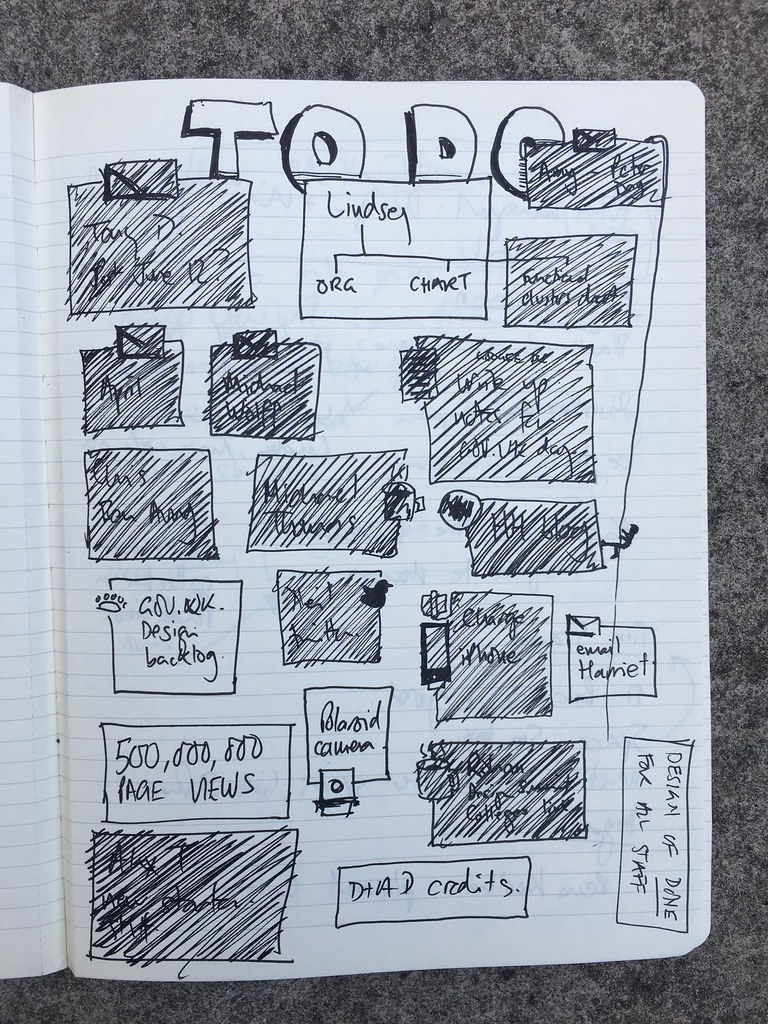
I used boxes because there’s a real satisfaction in being able to see the page getting filled in as the week progresses. It’s like a To Do list as a progress bar.
I also tried adding a little visual reference. Like a coffee cup or and email envelope. I can’t resist this sort of thing tbh. I always wrote these on a Monday.

I always aimed to get them done by Monday lunchtime. I found spending most of Monday writing a properly considered To Do list made the rest of the week far more effective. It feels like a luxury at the time, but it feels essential come Friday morning.
I tried a Kanban style one, but I don’t think this worked at the weekly ones.
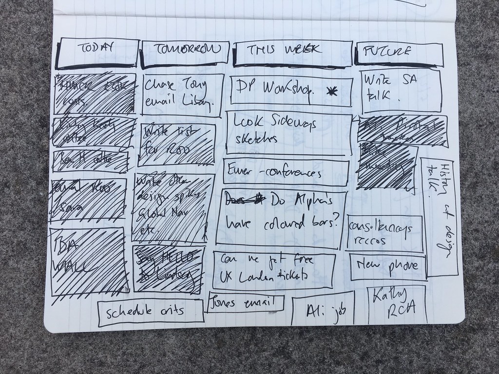
At some point I stopped doing this and went fully digital. It has the advantage of portability and it’s easier to generate work notes from and copy stuff into, but it loses the feeling of progress.
Sep 24, 2018
Jasper Morrison Penguin Huddle

I like Jasper Morrison's work. I like how Penguin covers look in an interior design setting. Therefore I like this.
It's called the Jasper Morrison Penguin Huddle. It's a neat little invention that clasps your books together so you can stand them up. Like a portable book shelf when you have the books but not the shelf. It's an elegant simple piece of design and it feels clever.
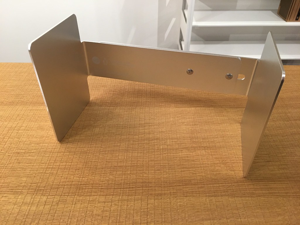
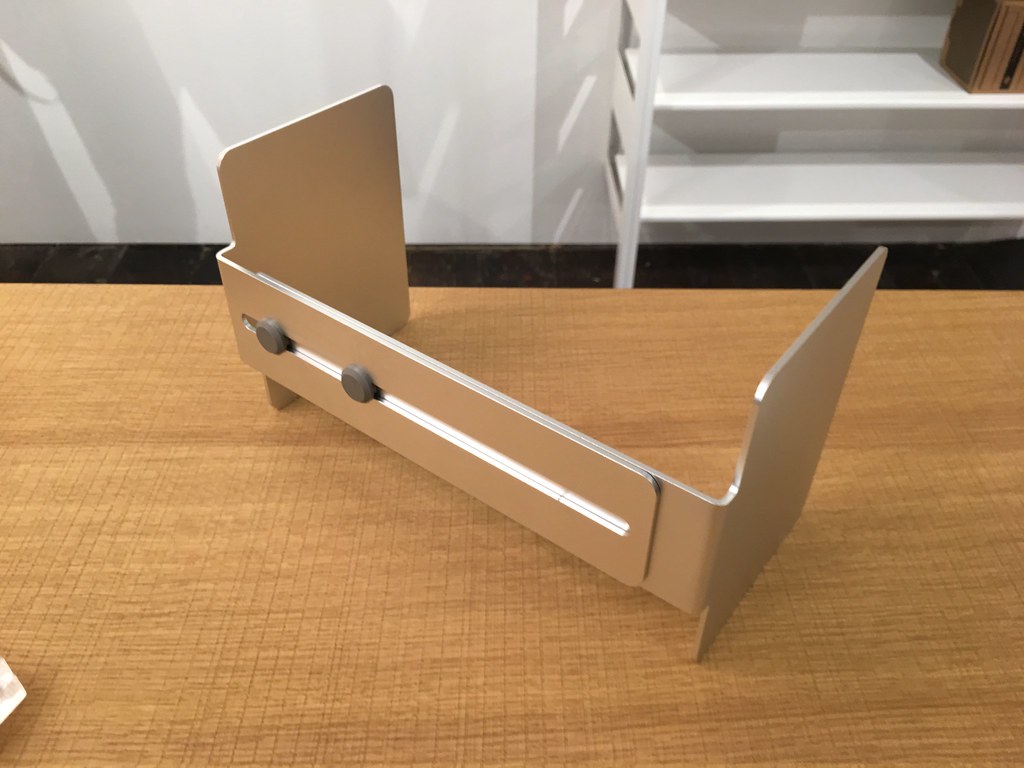
But it's a hundred quid. Which is a lot of money, but then I don't really know what the correct pricing would be for this. You could use mugs you had lying around and they would be free, but on the other hand one second hand Penguin book from a shop that sells Penguin books for an interior design setting probably costs £100 these days. Plus £5 for the coffee.
And who actually displays books like this? People with enough room to have spare room on the "side" who probably have a spare £100. I dunno.
Maybe you could use it for other things. It feels like you could. That would be fun. Anyway.
Sep 09, 2018
Design research urls #16

77. Pictures of colourful pigeons.
Beautiful. On Instagram too for a more regular fix.
Leila Jeffreys Instagram

78. Man puts a huge poster of himself up in McDonalds and no-one notices
There’s a serious point here, Jevh Maravilla noticed there were no Asians in the generic photos on the wall of his local McDonalds and so took a photo of him and his friend in the same nondescript style, added the same nondescript graphics, printed it online and managed to stick it to the wall inside McDonalds. It was 51 days before anyone noticed.
BBC News: Poster prank hoodwinks McDonald's
79. Fantastic series on interesting Art and Design schools
A collaboration between WeTransfer and Lecture In Progress has identified eight art and design schools around the world “doing things differently”. Refreshingly it’s not the usual suspects and includes institutions in India, Japan and South Africa. Beautifully designed too.
I was surprised not to see any Design schools from China as they are expanding quickly, but still well worth a read.
80. How a photograph nearly started the collapse of the global banking system
Fascinating tale of what (rich) FT correspondent John Authers saw on his own personal run on his Wall St bank in 2008. What did he see? Lots of other (rich) Wall St bankers withdrawing their cash.
“I was finding it a little hard to breathe. There was a bank run happening, in New York’s financial district. The people panicking were the Wall Streeters who best understood what was going on.“
Undoubtedly a photo would have caused a stir, he suggests it could have started a global run on banks and caused the whole system to collapse. Maybe it would. Maybe the photograph would have been a modern day Don Mccullin-esque image of suited financiers. He decided not to report the story as a journalist, quoting the phrase used commonly on social media these days “The right to free speech does not give us right to shout fire in a crowded cinema.” Was he right? Make your own mind up.
In a crisis, sometimes you don’t tell the whole story (may be behind a paywall for some readers)

81. Jaguar Land Rover have been testing self-driving cars with massive eyes on the bonnet.
They are used to look at pedestrians in the same way a driver would, to help the pedestrian know when they’re stopping and so on.
Easy to dismiss this as nonsense, but I would like to see more testing of “human-ness” like this in technology. Somedays it can feel like service design and user centricity are in an ever quicker race to the bottom.
82. Thread: Six errors in the opening scene of the Tom Cruise film American Made
Planes that didn’t exist until years afterwards. Planes they never operated. And so on. Errors in films are common, and understandable, but this seems quite major.
Aug 22, 2018
The London Mastaba by Christo and Jeanne-Claude
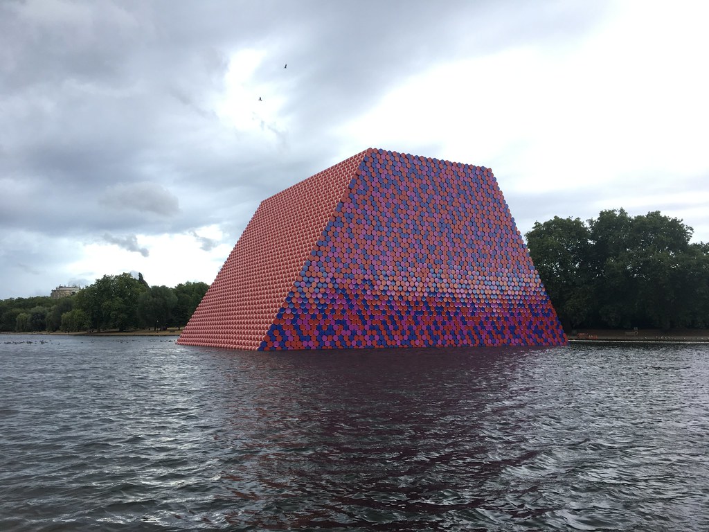
Went to see the London Mastaba the other day. I liked it, you should make the effort to go. It's dead easy, you can just walk past.
It's on until Sunday 23 September and then they will probably spend a week taking it down which I imagine will be fun to look at. The pictures of it going up were good.
Picture taken by Matt Brown used under Attribution 2.0 Generic (CC BY 2.0)
Aug 21, 2018
Design research urls #15

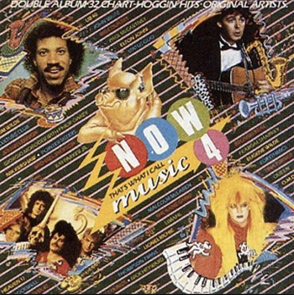
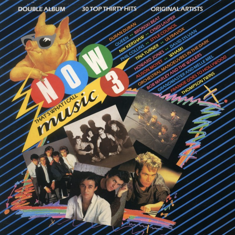
74. Now That's What I Call Music series reached 100.
If you're my age this is the biggest thing to happen in music ever. The Now series were playlists you could buy from Woolworths twice a year. The BBC have a fascinating story of the origins of the series. Usual business success story of opportunity, risk taking, smart people and huge amounts of luck.
"At that point, one of us said, "Couldn't we do this ourselves?" We looked at each other and literally got a piece of paper out of the bin and started writing down all the costs involved. Then we looked at each other and went, "Wow! This could be really lucrative"."
Buried away in that is a really good story about how the pig in sunglasses came to be used as a logo.
The Now website is as awful as you'd expect. Probably worse. But after all the 90s era whizzing you can look at the covers of all the albums. At the beginning they each had interesting, era-typical graphic design until 1991 (Now 20) when they tried glossy 3D rendered type and never, ever changed that. Strange and yet admirable that no marketing manager wanted a change in nearly 30 years.
If they'd stuck with a different design every time, imagine what a treasure trove of graphic design history that would be. Almost the perfect visual history.


BBC News Now That's What I Call Music: How one compilation came to rule them all
75. MAP project office has been bought by AKQA and therefore WPP
I'm a big fan of MAP, I think their work is elegant and smart and there's an intelligent crossover between the physical and digital product design worlds. Hard to tell who benefits most from this at this stage, but it's a very obvious signal that digitally connected physical things are more important than ever.
Barber & Osgerby’s MAP and Universal Design Studio to join AKQA
76. Threads 👇
How a tiny triangle of New York came to exist Thread 👇
The story of the 1970s great calculator race Thread 👇
When all the cool Sony stuff was yellow Thread 👇(original source image here).

Jul 25, 2018
We should have made a Monet scarf

I grew up in a small village in Wiltshire. There used to be a goat tied to the phone box and there was one bus a week to the nearest town. Today the population is 600 and they’ve built a housing estate since I left over 20 years ago. It was not a hot bed of contemporary culture.
When I was 13, I told Mum and Dad I wanted a career in Art and Design. (I will write more about that another day.)
When I was 15 my Mum took me to London to see an exhibition of Monet's most famous paintings - Monet in the 90s. It's still the third most popular RA exhibition ever. We got the bus to London which was a big deal, we never went to London. I don’t think I’d ever been to London before. I’d certainly never been to an art exhibition before.
30 years later this still isn’t uncommon, the Sorrell Foundation work with kids aged 13–16 who are interested in art and design. Every year they bring them all to London to visit exhibitions. Once they asked them, who’s been to London, who’s been to an art exhibition? Barely a hand went up.
Inside the Monet exhibition, stood in front of a huge canvas of lilies, my mum remembers me saying, “I can’t believe they’re real. I can’t believe I’m so close.”
It wasn’t the quality of the art that amazed me, impressive though that was. It was the whole experience. You didn’t get things like that in small villages in Wiltshire. I’d never been to a real art exhibition before. I’d never seen paintings by famous artists. And here I was, so close I could have touched them. I was awe struck.
That exhibition was held at the Royal Academy.
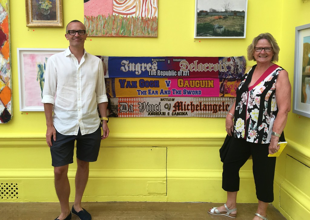
The Royal Academy Summer Exhibition is on until 19 August and features a little piece of work by Russell and I. My Mum came up to visit and we had a great time.
We should have made a Monet scarf.
Jun 12, 2018
Half and Half Art - Summer Exhibition 2018
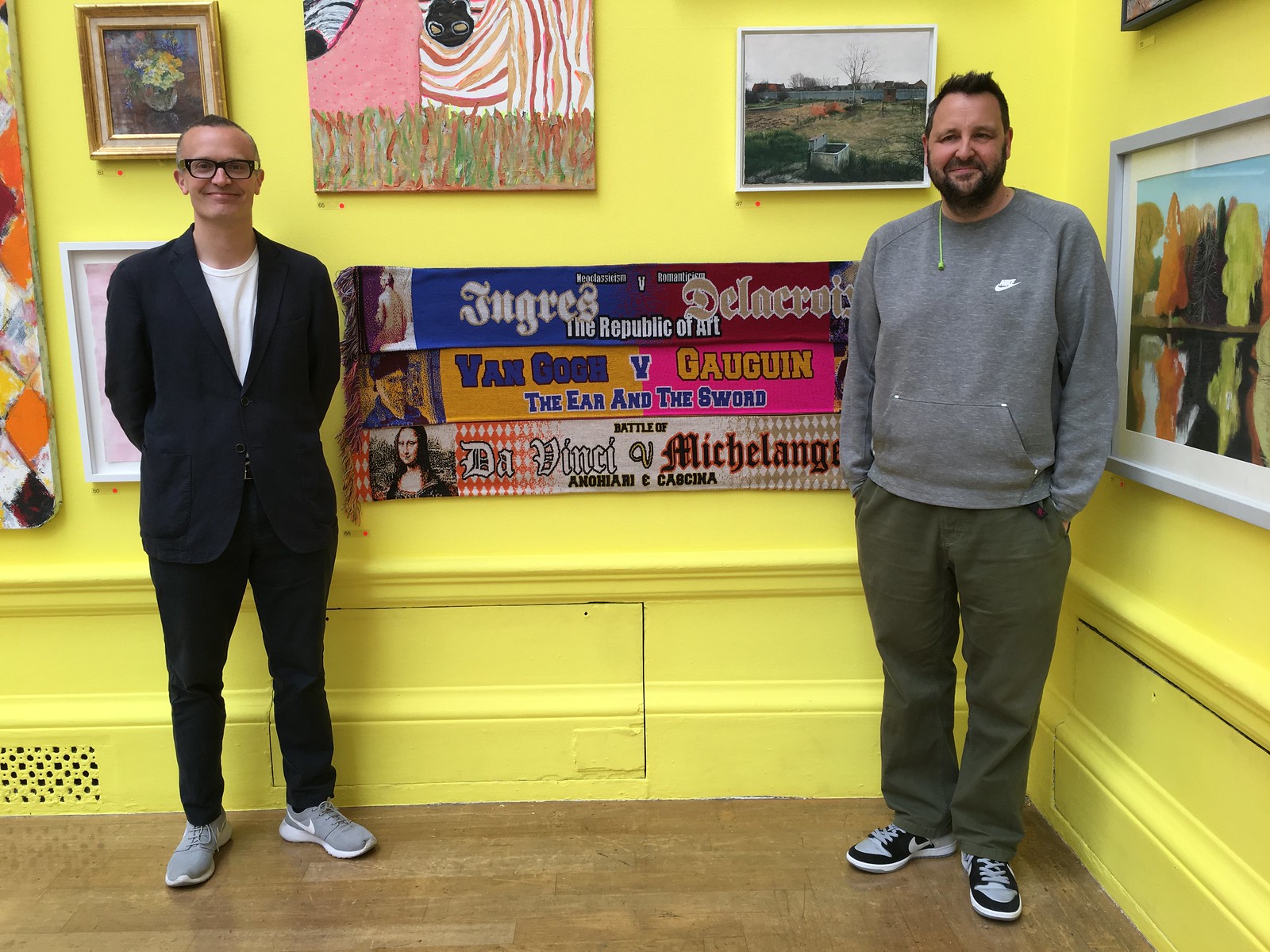
Russell and I have made it into the Royal Academy's Summer Exhibition this year.
Half and half scarves are a modern phenomenon. Football scarves normally show your allegiance for your team, but the half and half scarf is more like a tourist souvenir. You're going to watch Man United vs Man City game, two globally famous teams, and you would like a memento of that. But to a Man United or Man City fan it is incomprehensible that you would have the other team on the scarf. “Real” football fans hate them, but we decided to have some fun with the concept and commemorate other conflicts.
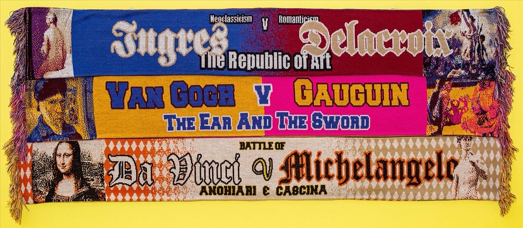
We decided to start with art conflicts, since we were aiming at the Royal Academy Summer Exhibition, and came up with three ideas. We did some typing on the internet and found a place that could make them. Then we nailed them to some boards, paid our £35, and entered them for the show.
And we got in!
The 'actual work' has sold but if you'd like to buy an individual scarf (cheaper and more practical than the 'actual work') just like one of the ones from the show go to www.halfandhalfart.com to do so.
May 28, 2018
The beermat in its next largest context
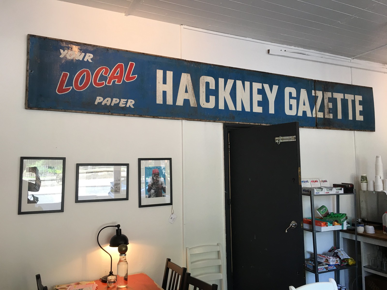
This is a wonderful sign. It's in a cafe called Beans love Greens on Calvert Ave in Shoreditch. The simplicity of the 'strapline' is nice and I guess it was once above a newsagent in Hackney. These days I'm sceptical that these metal signs are real. I think it is, I hope it is.
I've been listening to old Desert Island Discs recently, the other day it was Tim Martin the founder of Wetherspoons pubs. Surprisingly he talked about design quite a bit. He didn't actually talk about Design of course, but things that influence and affect the design of his pubs.
He tries to visit a minimum of 15 pubs every week. He always parks at least 10 minutes away and walks to the pub. He likes to get a feel for the town that the pub is situated in. How the pub should feel in that town. I'm reminded of the Saarinen's advice, "Always design a thing by considering it in its next largest context".
I've always thought lots of Wetherspoons pubs have quite different and location sensitive design. Not all of them, but enough to make me think about writing a blog post in the past. This will have to do now.
When I was at the Co-op, one of the smartest decisions we made was to make the first choice shop fascia, no fascia. So when the sign fitter turns up to fit a refurb, the priority option is to put the logo directly onto the building. There are many examples where this wouldn't work and many good reasons why you wouldn't do this, but making it the first choice makes everyone stop and think about it. There are too many brightly coloured plastic fascias creating an aggressive tone to the high street but this small decision has resulted in some lovely sympathetic shop fronts.


Tim Martin also talks about how he's pro Brexit. During the referendum campaign he printed pro-Leave beer mats and put them in all his pubs. Obviously – that's exactly what you would do if you were an anti-EU billionaire who owned over 1,000 pubs. "Always design a thing by considering it in its next larger context". The beermat, in the pub, in the town...
I bet that was more persuasive than anything the Remain campaign did.
Anyway. I hope that Hackney sign is real. I think it is.
May 16, 2018
Design research urls #14

68. This is a train that looks like a plane.
The Schienenzeppelin or rail zeppelin.
69. A lesson in non-compete agreements
Martin Sorrell has vowed to “start again”, weeks after his departure from WPP. A few weeks ago (para 64) it was revealed he had no non-compete clause in his exit agreement, unlike everyone else who’s ever done a deal with WPP.
What will he do next? From the FT article, “Leaving WPP had given him a better perspective on which parts of the industry were growing and adapting and which were held back by the “warts and problems that legacy companies have”, Sir Martin said, noting that countless clients had asked him “what is the new agency model”.”
He’s been gone 25 days. Very quick to find that perspective.
He goes on, “That model would be “more agile, more responsive, less layered, less bureaucratic, less heavy” than traditional advertising companies, he said, with a focus on technology, data and content.”
Begs the question why he didn’t think this before. (He sort of did and the share price does funny things to your perspective.) But the whole episode begs question after question. Much more to come on this I think.
Martin Sorrell vows to ‘start again’ after WPP exit
Martin Sorrell free to compete with WPP after exit
70. Long interview with Jony Ive about watch design.
Jony says all the Jony things in very Jony ways. The watch journalist thinks Apple have changed the way we think about watches (and time obvs) forever, just like the iPod changed music. I hadn’t thought about that before. But he could be right given Apple’s scale. I don’t have an Apple Watch but I have a Garmin and the notifications feels totally normal now. Worth a longer blog perhaps
71. 20 years since Apple unveiled the iMac
Tim Cook tweets the presentation. As ever Job’s enthusiasm is infectious.
20 years ago, the iMac changed the world
72. Amazon launches a kids books subscription box
A bit like BookStart from New Labour but backed by evil capitalism. Or something. All the usuals up in arms. I’m going to list the four easy learnings from this:
a) once you have all the platforms (identity, payments, relationships with booksellers, familiar e-commerce patterns, delivery system etc) it’s very easy to spin up a new idea.
b) Anything that can be (or could be) delivered to your door in a cardboard box is super easy for Amazon. If this is your business, be aware.
c) Subscription models for the business model win. At the moment.
d) Ideas are easy, shipping is hard.
Amazon is launching a $23 subscription book box for kids
Bookstart
73. Matt Locke wrote a good history of Liking stuff
Recent Posts
- Years in the domain, like tears in the rain
- Printing is still too hard
- No innovation until everything works
- "They'll be dancing in the streets of Total Network Solutions this evening"
- It was a pleasure
- Public Digital has won a King’s Award for Enterprise in International Trade
- Kids describing fashion ads
- Art at Mount St Restaurant
- Post match squeeze
- Unbelievably tickets are still available
Recent Comments