Noisy Decent Graphics
A series of blog posts by Ben Terrett about me | archives | atom feed
« May 2007 | Main | July 2007 »
Jun 30, 2007
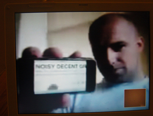
Noisy Decent Graphics iPhone Exclusive
Posted at 22:05 in New Thinking and Ideas | Permalink | Comments (0) | TrackBack (0)
Jun 28, 2007
SimLondon
Blackbeltjones accomplishes something I've been trying to do since I was 14.
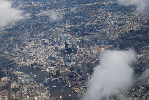
All pictures copyright Matt Jones. Usual stuff applies.
He's got some brilliant pictures of London from a plane.
Posted at 21:44 in Seen and heard | Permalink | Comments (3) | TrackBack (0)
The importance of grids online
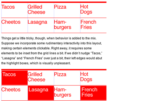
Via AceJet170 I found this brilliant article on Khoi Vinh's blog about the importance of designing online with a grid.
It's a really simple, powerful way of explaining a few differences that print based designers usually struggle with, like;
"in digital media we must make some compromises for the added factor of the way elements behave. Which is to say that, unlike the printed page, the components of a design — photos, illustrations, shapes, flourishes and type — can transform, change state, move, transform etc.".
Not only is it an important article, it's well written and it's easy to understand. Plus, Khoi is the Design Director of the wonderful New York Times online, so he knows a thing or two about grids.
If you're a designer who has designed mainly print all your life and you find websites a little bit, well, hard, then this is the article for you.
I'd like to know what you think about it.
Posted at 21:38 in Graphic Design Industry Stuff, Stuff I'm Reading, Things I've Learnt About Design, Typography | Permalink | Comments (0) | TrackBack (0)
Magically produced books
"people ask me from time to time if I’ve thought about writing a book. Well, as a matter of fact, I have… but thinking about it hasn’t magically produced a manuscript, as it turns out."
The brilliant Khoi Vinh (whose name I can never spell without checking at least twice).
Posted at 21:14 in Quotes | Permalink | Comments (0) | TrackBack (0)
Jun 27, 2007
The silver TV steel and glass stand
This is probably the piece of design I hate most in the world, right now. There's a high chance that you've got one of these at home.
There's a higher than high chance that if I came round your house and saw that TV I'd take an instant dislike to you. Instantly.
Don't worry, I'm sure there would be mitigating factors and I'd get over it. You read this, which is a start. And you've invited me round your house, which was very kind.
This design kind of sums up everything I hate about bad design in the naughties.
1. It's totally meaningless, devoid of any added value.
2. It's essentially a style that's been ripped off. Hugely derivative of something (probably from Ive) that was once good and then expanded and bastardised to death.
3. It triggers more poor imitations, and leads design buyers to say things like "I want it like they did it".
4. Everyone blindly buys one because everyone else has bought one. No one actually stops to think, do I like this?
5. It's so damn ugly and intrusive. Sat in the corner of your lounge looking shit.
It's changing now, as more and more people are buying "plasma" TV's. But still. You know what I mean.
Posted at 12:38 in Complaints Dept. | Permalink | Comments (34) | TrackBack (0)
Jun 25, 2007
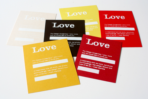
Cards for tonight
For more info see here.
Posted at 15:43 in How To Get A Job In Graphic Design (Kind Of) | Permalink | Comments (1) | TrackBack (0)
Graphis Diagram & Charts
Things To Look At posts a lovely selection of graphs and charts from some old Graphis annuals.
Whatever happened to Graphis? Someone once said to me that it always felt as though the magazine had sat on the work for 2 years before they published it. Still, I've got some issues from the 80's which are cool.
Posted at 12:27 in Stuff I'm Reading | Permalink | Comments (1) | TrackBack (0)
Jun 22, 2007
The Design Conspiracy Placement Scheme
All a bit last minute, but we've announced our first ever official placement scheme. Quite exciting really. The full details are down below.
When we moved into our new studio one of the things we wanted to do was start a proper, organised, placement scheme. This is it.
On Monday night we'll be at the D&AD New Blood Private View. We'll be walking round with a diary and some of these cards. If we like your work we'll book you in there and then. No messing around. No waiting. No bullshit interviews.
Don't email and don't ring, the only way to get a placement is to be at New Blood on Monday night. Placements will be for one week and you'll get travel expenses.
See you on Monday.
10 years ago the four designer founders of The Design Conspiracy were at the very same exhibition, so there's kind of a nice symmetry to it all.
Posted at 18:05 in Graphic Design Industry Stuff, How To Get A Job In Graphic Design (Kind Of) | Permalink | Comments (7) | TrackBack (0)
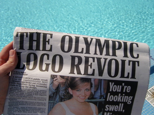
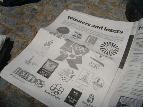
Long overdue post about the London Olympic 2012 logo.
When this launched I was on holiday. But, these days you can access the world media anywhere. Email on the move, internet on the train, news on the go, the Daily Mail in the hotel lobby.
I didn't blog about it at the time and I kind of thought my views would change with the hindsight that a few weeks gives you. I don't think my opinion has changed, nor has that of anyone else. I was actually invited to the launch event and lined up as a media commentator, but I couldn't make it due to the holiday pictured above. Given what I'm about to say, I think I'd have been on the TV all week.
I like the logo.
As Bono said, "there's been a lot of talk, maybe, maybe too much talk". He was talking about a song, I'm talking about a logo. For my money the best commentary on the whole thing was written by Mark over at the CR Blog.
So let's recap a little. David, really, really hates it. Claire Beale hates it. Beeker's receptionist is worried, Michael Johnson is crossing his fingers and Coudal Partners like what it isn't. Armin likes it and Bowbrick loves it. The Government isn't for turning and Wolff Olins don't ask to be liked. Which is just as well really. There's been a lot of talk about what could have been with, really, the only elegant suggestion being Daniel Eatock's. Although I doubt very much they'd let you do that with the rings.
In the Dead Tree Press the Daily Mail suggested it might grow on you with that special Daily Mail cynicism, the Tory Olympic spokesman called it "hideous" and asked "what do the rejected ones looks like?". Stephen Bailey (yes you read that right, Stephen Bailey) called it a "puerille mess, an artistic flop and a commercial scandal".
Before we continue I think that everyone agrees the 'london'' type is horrible. It is.
Mark's article is called, "Well, at least it doesn't have Big Ben on it". That's a valid point. How many 'British' 'Cool Britannia' 'London' logos have we seen in the Blair Years that have relied upon hackneyed, dated imagery of Big Ben, the Union Jack or Tower Bridge? Likewise how much Gill Sans has been expended in trying to recapture Beck's brilliance? To the rest of the world (and I mean the rest of all the world not just Europe and America) London and the United Kingdom do not mean Tower Bridge and Big Ben. Get over it.
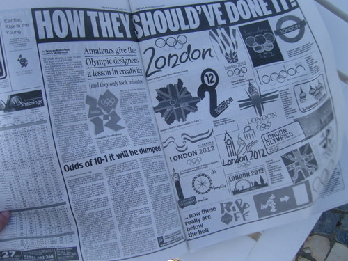
Happily the logo also doesn't feature any jumping, ambiguous androgynous eunuchs like these terrible, lame things do. How the hell these 'bent hairpin designs' convey Olympic spirit is beyond me.
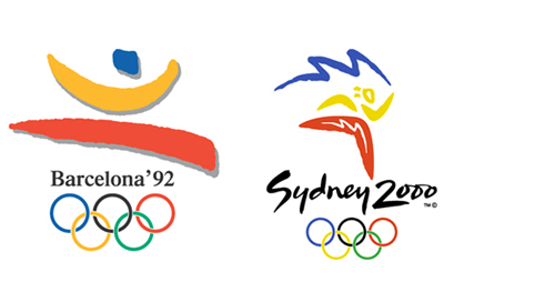
Suitably in this user generated world, hundreds of logo's have been sent in to the media. Most, if not all of them including jingoistic symbols and bent hairpins.
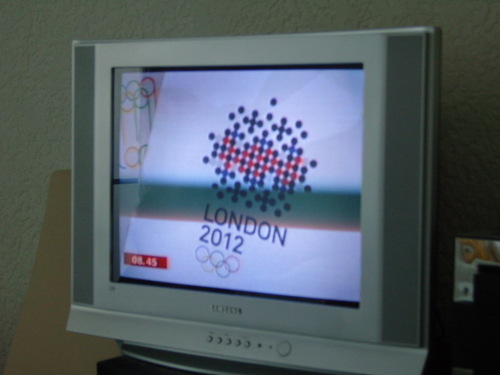
But it's not just the amateurs who are having a try, here's Tyler Brulé on BBC Breakfast slagging off the logo.
And here he is displaying (on very weak looking A4 foam core boards) some ideas his team had "knocked up" the night before. They were shocking as well.
Which brings me on to a wider point. Whether you like the logo or not the way our industry has responded to this has been dreadful. Using terms like "knocking up" on BBC air time don't help designers win more boardroom time. Not liking the logo is one thing, but comments like "£400k? My kid could have done better..." do every working designer a disservice. We all know that it's not a case of emailing Seb an eps and an invoice for £400k. We all know it's a poisoned chalice of a brief, we all know that £400,000 will include miles of implementation and we all know that the ad agencies and the management consultants are charging twice that.
London's Mayor Ken Livingstone even said he'd ask for his money back. If that's the case Ken, I'd like to have a word about a few elements of my council tax bill that I'm not entirely happy with.
A friend of mine used to work for a large accountancy practice in the north of England. He used to audit the books of several Premiership clubs and he reckoned that almost all football transfers were worth about a third of what the press had claimed the fee was. I've always thought it was the same for branding agency fees.
I haven't seen (and I may have missed it) anyone begin to defend the industry and it's processes. Next time you're working with a client who demands his money back after months of hard work, or disputes your already small fees - you've only got yourselves to blame, I'm afraid.
History is not a helpful reference point either.
Sure, the Munich one is gorgeous and so is the Mexico one, but that was 1972 and '19 something I can't quite read'. The thing that worries me is that left to most of the London based, Guardian reading, ironic tshirt wearing design community we would have ended up with another, yes another, HelveticaMunichWankFest, lauded by the design press and irrelevant to everyone else. Meaningless, stylistic rubbish. Graphic design at its worst.
I think it's important to remember, but not essential, that logo is aimed at a younger audience. Generally, the younger you get the less you hate it. For the purpose of this post I asked my 16 year old niece what she thought of it, "Err, it's OK. Not that bothered, really. Why? Did you do it?".
So, I'm pleased that we don't have any Helvetica. Pleased that we don't have any
Tower Bridges or any Big Bens. Pleased that Gill Sans hasn't been used again and pleased that some people don't like it.
What we have is the bravest Olympic logo in decades. A logo with an undeniable energy and an anti-establishment feeling that would be refreshing for any brand but is like an intravenous 10,000 volts for an Olympic logo.
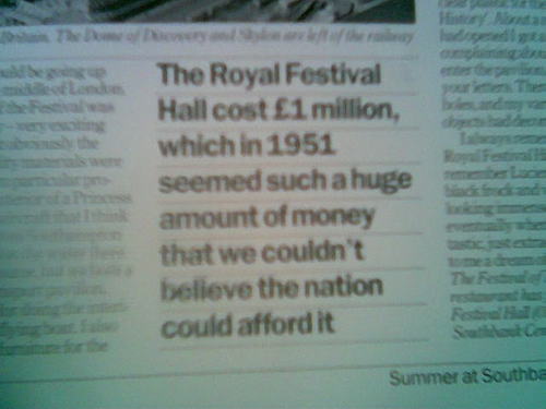
Last, but not least, take a look at Terence Conran talking about the opening of the Royal Festival Hall in 1951. Another big public design project, another huge amount of money and another set of shocking headlines. I bet most of the people who hate the logo would enjoy a glass of wine on the balcony of the RFH.
OK, OK, that's a building and not a logo, but the point is that these huge design projects will always get negative press.
So there you go, I like it. Special thanks to all the people who have written in asking what I thought of the logo, I was strangely touched by all of that.
Posted at 00:23 in Complaints Dept., Graphic Design Industry Stuff, Graphic Design Reviews | Permalink | Comments (37) | TrackBack (0)
Jun 20, 2007
Sky Magazine
Remember Sky Magazine? Nothing to do with the TV channel but a magazine aimed at 16 - 21 years olds that was started in the late 80's. It went off the boil around '94 and died in 2001. April brought these old issues in for something we're working on. The covers are great aren't they?
Look at those covers. Not a pair of breasts on show! Decent (but not brilliant) portrait photography! Men and women! Real stars, as opposed to semi-naked Big Brother stars! Sky also featured decent articles about social and political stuff that didn't read about elsewhere it you were 15. It was brilliant.
Those covers have a nice, simple, strong graphic style that stood out on the news stand.
Great dps' like this Lisa Stansfield one. Simple and distinctive. Confident.

Ever listened to a phone call over and over again?
Looking through I stumbled across this ad. I loved that ad. It seemed to make so much sense, it was so true. I guess it wouldn't be the same now with txt messaging an all. But at the time I guess that's what you call an insight?
Anyway. Sky Magazine - bloody great covers.
Posted at 22:33 in Graphic Design Reviews | Permalink | Comments (13) | TrackBack (0)
People Needed

Picture kindly borrowed from Russell, hope you don't mind
Does anyone know any Air Traffic Controllers? I'd like to speak to one.
Does anyone know anyone who works at Porsche? Probably someone in the Communications team as I'd like to talk to them about this.
If you do, would you be ever so kind and let me know via ben at thedesignconspiracy dot com, thanks.
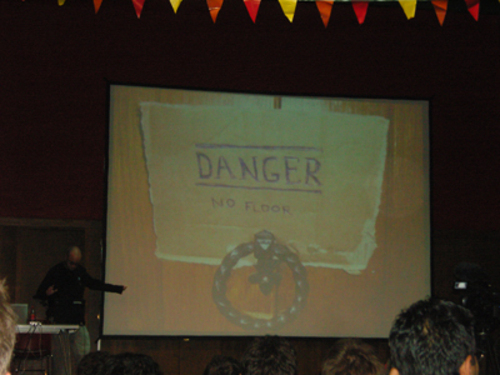
Posted at 10:44 in Conferences / Speaking | Permalink | Comments (0) | TrackBack (0)
Jun 19, 2007
The second longest review yet of Interesting 2007*
That was bloody good, wasn't it?

Lots of people keeping saying "I'm sure many people will write a lengthy review of Interesting so I'll keep it short". Welcome, my friends, to the long, unedited, directors cut, full length review of Interesting 2007. Well, a bit longer than most at any rate.
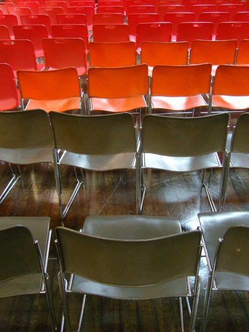
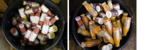
The Hall was beautiful. It seemed to be constantly bathed in a lovely dappled sunlight. It wasn't of course, but it just felt that way. The bunting was great. The colours of the chairs perfectly in harmony with the hues of the soft drinks and the wooden floor. That kinda colour co-ordination takes a lot of hard work.
The really nice thing about Interesting 2007 was the attitude of the thing was matched by the attitude of the people. Easy going, happy, grateful, friendly and pliable. Everyone and everything; pliable. I thought everyone just got it. Nothing needed explaining. No one needed telling. Everyone found the right way to do things.
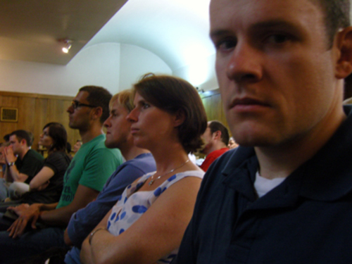
Easy going, happy, grateful, friendly and pliable.
There were some really lovely touches. In fact they were everywhere you looked. And it wasn't a PlannersphereWankFest either. Whilst there were lots of people who knew each other, there were loads who didn't. Which was a good thing.
Going back to pliable, the British randomness of the running order worked like a dream. You couldn't have planned that. In fact it's the kind of thing that would have been destroyed by a committee sat around trying to plan a Muppet talking after the editor of The Spectator. It just worked because it just worked.
It was great to see people collect their tshirts. People were really pleased to get them. That was nice.

People loved the vinyl too.
Personally I loved the three minutes talks. They had an energy that is missing from all traditional presentations and conferences. I found myself saying that the 20 minute ones were too long, but that's an absurd thing to say. The different pace of the speakers was really charming too.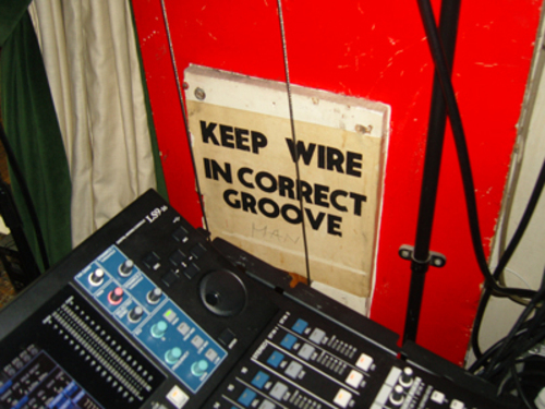
I can't write about all the speakers. I'd like to, but I can't. Really, I can't. So, here's my Top 5. It's my personal Top 5 and in no way means that someone I've missed was rubbish. Someone's gotta be 6th, as Enid Blyton used to say.
1. Dave Funny Pancake Showed some of his brilliant photos. Just side splittingly hilarious. He could still be speaking now and I'd still be laughing. No big tricks, just 200 photos and humour. Genuine fun for all the family. He should tour. Brilliant.
2. Rhodri Marsden Played the saw. Or rather he made that saw sing to within an inch of it's jagged life. In a good way. Watch the video here. So good I played it over the studio stereo this morning. And again and again. And what a choice of song too. Brilliant.
3. Fiona Romeo Spoke about how they created The Science Of Spying exhibition. I really, really want to go to this exhibition but I keep missing it. So this was the next best thing. But more than that, I learnt stuff. The two second learning in public rule for example. Brilliant. And she used the logo in her ppt.
4. Anne I Like Was a 3D version of her lovely blog. You knew she'd be good didn't you? She was. David helped her design the postcards too. Brilliant.
5. Beeker - Shared what the Muppets and Ibsen had taught her. I don't really know/like the Muppets. And I've no idea who the Dutch bloke was, but Beeker really made this come alive. Touching without being soppy. In depth without being boring. Funny without being stand up. Interesting. Brilliant.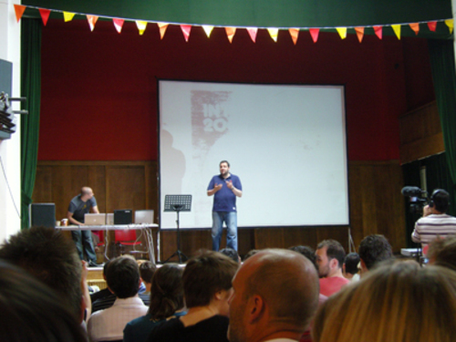
"You're all adults, it's only £20, so, you know, don't complain."
Russell asking the audience to be kind.
"That's Marcus. Do you know him, he's dead. Well, he used to be dead."
Clare trying to explain to a startled helper about Marcus.
"But I am dead."
Marcus' response when I told him the above story.
"Thanks. I'm doing a 20 minute slot."
Matt's response when I told him I thought the 20 minute ones were too long.
"The Muppets were only interested in the lower numbers."
Beeker telling us about Muppet snobbery.
"Knots were invented by Witches."
Tom deconstructs and reinvents history again and again and again.
I've got loads and loads to say about the graphics, but that will be another day and another post.
* The longest review yet of Interesting2007 sits nicely at here.
Posted at 00:52 in Conferences / Speaking, Interesting 2007 | Permalink | Comments (26) | TrackBack (0)
Jun 13, 2007
The very latest from the Official Platinum Design Partners of Interesting2007
| www.flickr.com |
There's lots of Interesting stuff going on at TDC HQ at the moment. Ink, bags, tshirts, pants, strange visitors and some surprises. Rather than write a post about it I thought I'd put this Flickr badge here where you can see the very latest images beemed live from the TDC Interesting team.
I'll try and work out how to do that thing where this post stays at the top of the blog for a while.
Posted at 09:21 in Interesting 2007 | Permalink | Comments (4) | TrackBack (0)
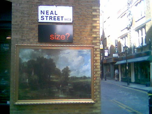
I saw a Degas on the way to work
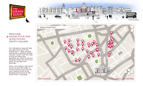
And I saw a Constable too. All part of a campaign called The Grand Tour by the National Gallery, "A collection of priceless paintings set free around the streets of London".
Pretty bloody good it is too. More details here.
Posted at 08:01 in Exhibition Reviews | Permalink | Comments (1) | TrackBack (0)
Jun 12, 2007
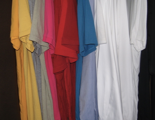
Clothes arranged by The Design Disease
Posted at 21:27 in The Design Disease | Permalink | Comments (12) | TrackBack (0)
Nice things in the post
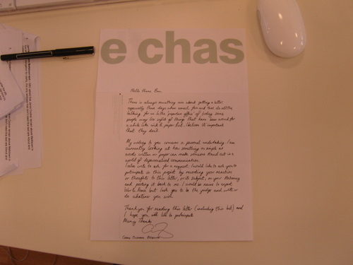
I got sent some lovely things in the post the other day. First up this letter from Craig at The Chase. He's doing a project to highlight the fact that we don't see much hand writing any more. He asks me to write something (anything) on our company letterhead and post it back to him. So that's what I'm gonna do. What do you think I should write?
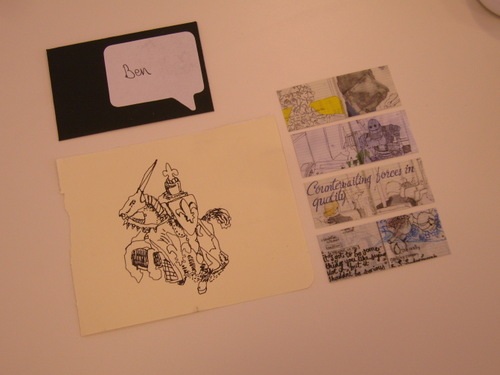
Secondly I got sent some ace Moo cards from the wonderful Ghost School. I also got a specially hand drawn horseman warrior soldier thing. Pretty fucking cool, eh?
Posted at 09:20 in Just Me Doing Stuff | Permalink | Comments (1) | TrackBack (0)
Jun 02, 2007
Closed for a week
Picture taken by dotx3 (usual stuff applies) and taken from the always interesting, always inspiring and always surprising Design Disease Flickr pool.
Posted at 01:09 in The Design Disease | Permalink | Comments (2) | TrackBack (0)
Recent Posts
- Years in the domain, like tears in the rain
- Printing is still too hard
- No innovation until everything works
- "They'll be dancing in the streets of Total Network Solutions this evening"
- It was a pleasure
- Public Digital has won a King’s Award for Enterprise in International Trade
- Kids describing fashion ads
- Art at Mount St Restaurant
- Post match squeeze
- Unbelievably tickets are still available










Recent Comments