
« December 2006 | Main | February 2007 »
Jan 30, 2007
Helvetica and Bodoni tshirts
I've been meaning to do this for a while (about 6 years in fact) and then these comments (and this and this and this) finally awoke me from my slumber.

And so, for your pleasure, Helvetica and Bodoni tshirts now available on eBay. Helvetica here and Bodoni here.
A handy text
I got sent this text message the other day.

Handyman is an absolutely brilliant service. It's a bit like a Rent A Dad service for lazy city dwellers. They're handymen on scooters who'll come round and fix the annoying little jobs that you can't do or can't be bothered to do. Small things, like fixing a loose cupboard door, fitting a plasma screen, new lights or putting up some Ikea stuff. Things you wouldn't need a builder or an electrician for. Things you'd ask your Dad to do if he lived next door.
Like a lot of new businesses they've got loads of cool ideas. For a start they all use scooters so they can move quick. All the handymen have their picture on the website so you can see who's going to pop round - which is reassuring. They're not cheap but they're good and efficient.
I've used them before which is why I got the text message. I didn't have any jobs for them but I admit I was racking my brains. After just moving office I think 10% off is a seriously good offer.
Back to the text message. Isn't this a good idea? Let's say they have got some bookings in the area, a couple at 9am, 10am, 4pm and 5pm. Doesn't it make sense to try and fill the gaps? Such an low intrusion way to send this information out. Seeing as I'm already a customer I don't mind the text. And it's cheap too.
Good show.
Isn't that better?

The Tube gets an adless make over. Almost looks like a design studio.
Jan 29, 2007
Oooooh this is nice
Perfect for a grey Monday. NYC Transit Authority Graphics Standards Manual Flickr Set.

Jan 27, 2007
If you only read one thing this weekend

Make sure you read these comments by Bruno Maag. If you like type, you'll find it fascinating.
"Let's get a little bit of history right. Arial was designed in the Monotype drawing offices, for Microsoft, in the late 80s"
"I am also no friend of Helvetica. In fact, I would love to see this typeface banned from use for a while. Just so designers can see that there is typographic pond life beyond."
"I'd happily give up my day job and wash plates if the rest of the world adopted Univers as the font to be used."
Read, learn and enjoy. You don't get this quality of typographic discussion everywhere.
Jan 26, 2007
Hullo
If you've arrived here via Delicious or Kottke, welcome. Have a seat and let me show you around.
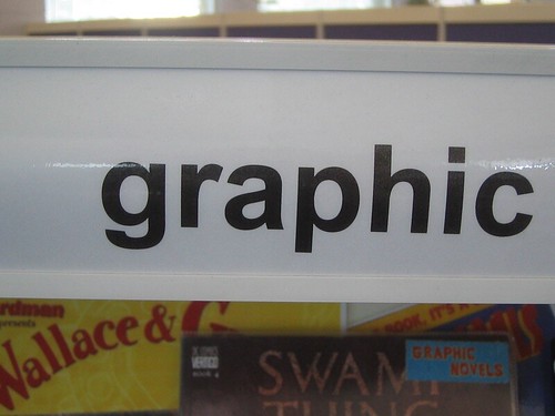
This is how we do things around here. We talk about design, most of the time graphic design and little else. You really ought to check out some of the stuff about Britain's Greatest Graphic Designer (RIP), a layman's explanation of kerning and this post grandiosely titled The Future Of Graphic Design. No humility around here.
Over here you can find out why the number 10 at Downing Street is wonky and if you're a student there's some stuff which may or may not be useful. Should you be so inclined you can contact me here.
Comments, comments, comments. We all love comments. You can be rude, obtuse, you can even plug your own enterprises, anything goes in the comments section. So type away.
There you go. Enjoy.
Two brilliant pieces of graphic design
Two brilliant pieces of graphic design from the Khoi and the gang at the New York Times.
I've been meaning to link to the first one for a while. It's called Faces Of The Dead. Each member of the US Services who has died in Iraq is represented by a pixel sized square. When you click on a square, and therefore a name, the pixels form that person's face.
It's very well done, sensitive, interesting and a powerful way of representing some powerful statistics that we normally just see as lists or numbers. It's graphic design at it's best.

The second one from the same people is a pictorial representation of the key words used in all Bush's State Of The Union addresses. You can highlight keywords and see how often he mentioned that each year. You can pick obvious key words like Iraq or Terror or you can search for more obscure terms - like design, which he said 3 times in 2003. Again it's very well done. Sensitive, powerful and elegant.

What I like about both of these, but particularly the last one, is how they take important, dry information and make it accessible and interesting to a wide audience. The design helps the comprehension of the information rather than hindering it.
And it's exactly the sort of thing newspapers ought to be doing online.
Identity 2.0
Another thing I've had kicking around for ages and forgotten to write about.


It's a video of a presentation by a chap called Dick Hardt which he terms Identity 2.0. Don't let that put you off.
It's all about the concept of digital identity. It's really good. Clever. A refreshing presentation style. As it says on the blurb, "I watched it twice, and greatly enjoyed it both times.".
Jan 25, 2007
All those in favour say "aye"

Dearest Tom,
Saying "What's wrong with Arial aesthetically?" is a bit like comparing Greta Garbo to Jodie Marsh.
Helvetica can be expensive and if you don't have it installed on your PC then, for you, Arial will probably suffice. But just look at the way the glyph's finish on these a's.
This is Arial.
This is Helvetica.
Oooh, isn't that lovely? They didn't make a film about Arial did they?
Although desktop printers don't use the same sort of screen as a Heidelberg they don't print solid colour. Only a screen print can do that. Deskdrop printers still measure in a dpi system but it's a little different. Macus will elaborate.
And lastly, seeing as you've opened Pandora's box, all those in favour of Helvetica say "aye" below.
UPDATE: Bruno provides some historical clarity here. A must read.
Jan 24, 2007
A Face Lift On The Familiar
I've had this bookmarked for absolutely ages and not done anything about it. Time to rectify that.
I have no idea where or when I found this but it's probably from Tony Spaeth's brilliant Identityworks website. The website is an amazing catalogue of all the major rebrands of the last 9 years, with a slight American bias.
Anyway, I'm linking to this article from the New York Times which crits the before and after of Kodak, Amtrak and UPS rebrands as well as others.

I'd love to post the article here, but the NYT have a scary looking copyright policy. So I wimped out, hence the blur.
This is the new That

Brilliant and lovely. Taken from thediagram.com with many thanks. Via Design Observer. If you follow thediagram.com link you can see a much bigger version.
Jan 22, 2007
Is this graphic design?
(Before we get started let me restate that this is a blog about graphic design. I make no case for or against the political issues pictured below. There are plenty of political blogs and if you're interested in that sort of thing you could do worse than start here. OK. Pantones to the ready.)
Take a look at this. Is it graphic design?

It's a poster, it's been thought about, it's been considered. Not as obviously 'designed' as Lennon's anti-war posters but that type still fills that space on purpose. The colour has been used to highlight the message. The big text shows awareness that the poster will be read from a distance. All these posters are communicating a message. All of them have been created to get across a clear message to a clear target audience. So, in effect, it's been designed, right?
Except it's not design. It's art. Have a look at this picture.

At the weekend I went to see Mark Wallinger's exhibition State Britain.
For those of you who don't know the back story goes something like this. Way back in July 2001 Brian Haw began a protest in Parliament Square, London. Bang outside the entrance to the Houses of Parliament. He was protesting against the economic sanctions in Iraq.
Obviously, given the events of the rest of 2001 Brian's protest grew and grew. And so did his site along the edge of Parliament Square. It's hard to capture in a photograph but the protest ended up looking something like this.

Better, more comprehensive, pictures here.
On 23 May 2006, following the passing by Parliament of the ‘Serious Organised Crime and Police Act’ all 'unauthorised' demonstrations within a one kilometre radius of Parliament Square were banned. Shortly afterwards the police raided Brain's protest and took all the posters down bar a short 6ft area.
It so happens that the one kilometre radius bisects Tate Britain (bisects it a little too perfectly for my cynical eye) hence Wallingers recreation of Haw's protest and hence the title State Britain. Each one of the posters (which were destroyed by the Police) were recreated in Wallinger's studio and are now on display in the Tate Britain. So that's art, then?
But a minute ago we thought it was graphic design, didn't we. So is it both? At least we can agree it's a protest, right? What if Charles Saatchi buys it for £1 million, what is it then?
And what about the target audience we talked about earlier. Are they still the same people the posters were intentionally created for? From a visual point of view the posters look better against the lush green grass and historic stone of Parliament Square. The protest had an organic, scrap book feel to it that added to the vernacular of the weathered posters.
I was very quickly stopped from taking pictures by the security guards in the gallery. Why? An art exhibit that charges the police with curtailing freedom of speech but you can't take pictures of it. Does anyone else find that odd? I can take pictures to my hearts content in the Design Museum.

I left with more questions than answers, which is maybe the point of art, but I'm sure these weren't the questions that Wallinger, Haw or the creators of the banners had in mind.
What do you think?
Jan 21, 2007
"Excuse me mate, can I speak to Dali?"
Popped down to the Dali museum the other day. Don't bother it's rubbish.
I saw this sign which made me laugh quite a bit.

Jan 19, 2007
Jan 18, 2007


Jan 17, 2007
Recent Posts
- Years in the domain, like tears in the rain
- Printing is still too hard
- No innovation until everything works
- "They'll be dancing in the streets of Total Network Solutions this evening"
- It was a pleasure
- Public Digital has won a King’s Award for Enterprise in International Trade
- Kids describing fashion ads
- Art at Mount St Restaurant
- Post match squeeze
- Unbelievably tickets are still available
Recent Comments